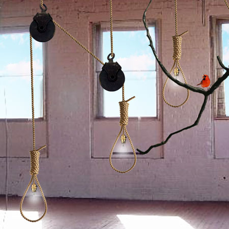
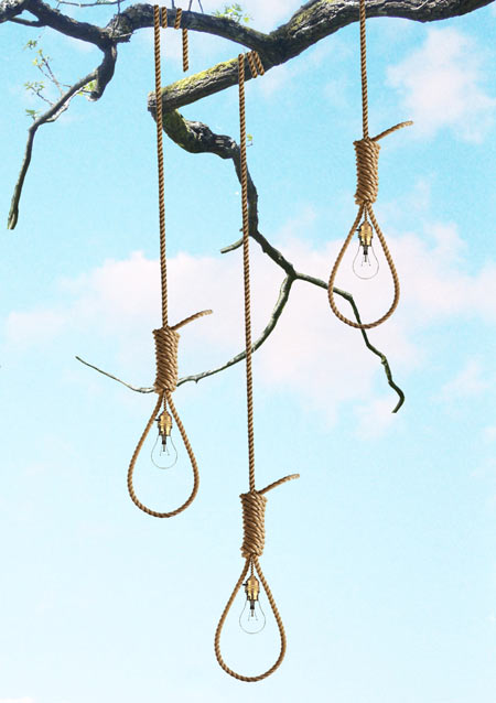
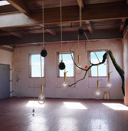
web tracker
March 13th, 2009

noose-light-by-ana-maria-pasescu-stewart-squ-noose-installation-1.jpg

Designer Ana-Maria Pasescu Stewart has created a light inspired by a hangman’s noose.

noose-light-by-ana-maria-pasescu-stewart-noose-pullie1dez.jpg

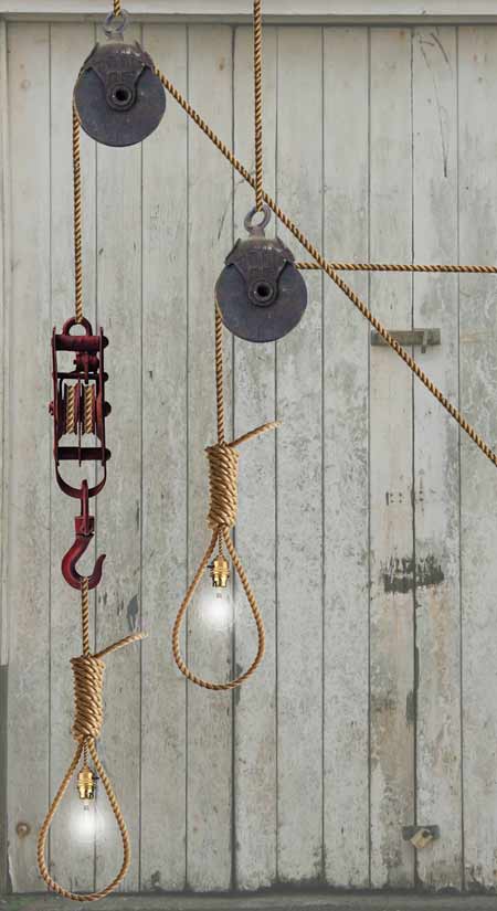
The lamps are made from thick rope with a power cable woven into the middle.

noose-light-by-ana-maria-pasescu-stewart-noose-pullie3-copy.jpg

“It is easy to assemble and maintain, and can be easily bent to many different shapes,”says the designer. “The idea is that you would purchase it along with its own metal or wooden pulley system, allowing the user to manipulate the height of the light as they please.”

noose-light-by-ana-maria-pasescu-stewart-noose-installation-1.jpg

The lamp is available in red, blue, green or black.

70 Comments

  1. tommi Says:

    great option as a gift & seriously love it!

  2. omar Says:

    this is horible.

  3. Ross McBride / Normal Says:

    Honestly, Why?

  4. Josh Says:

    Um… Strange fruit hangin on a poplar tree, anyone?

  5. mil Says:

    ……………………..and the shadows ?

  6. Anonymous Says:

    thats just wrong…

  7. ho0d0o Says:

    yikes – that is all.

  8. Adrian Says:

    Wow. I think it can be utterly improved by introducing a skeleton into the scheme and placing the lightbulb into the skull.

  9. G Says:

    I’m glad Ana-Maria Pasescu Stewart doesn’t try to be all political over a lamp, but then again, if it is not political, it should be judged on the merits of its design so what ’s the point.

    It is just plain ugly.

    House warming present anyone?

  10. rik Says:

    It is more art than lighting. I’m not sure about such nooses in the kitchen.

  11. Matt Says:

    Does it work as a noose as well? Because if you paid for this you may want to kill yourself when you get home. Sorry, had to say it

  12. orlovsky Says:

    Very tasteful.

  13. lars Says:

    dezeen beware! somebody is making fun of you here. she can’t be serious about that.

  14. jon Says:

    useless.. i might as well buy a normal light fitting and cut the cable accordingly.

  15. modular Says:

    The question is: why?

    - Is it hip?
    - Is it trendy?
    - Is it beautiful?
    - Does it mean anything at all?

    - No.
    - No.
    - No.
    - No.

    I really don’t get this. Is the ‘designer’ trying to be “different”? Or should we all make a quick sketch about hanging?

    Starck said that ‘design is dead’. I don’t say that design is dead, but I say that design nowadays is a piece of sh*t. Or at least some design.

  16. Rory Says:

    Sensationalist nonsense, like the cross sofa thing mentioned the other day, great blog though as usual, cheers

  17. superman Says:

    i’m not saying anything until i see a real photo.

    photoshop baaaaaad

  18. Georig Says:

    I agree Superman. Awuful Photoshop job. It makes it feel even more like someones taking the mickey out of Dezeen…

  19. tom Says:

    “The lamp is available in red, blue, green or black”
    ????

  20. Ana-Maria Pasescu Stewart Says:

    Hey all, thank you for your comments, i understand that the overall idea may seem shocking but that’s exactly the comments i was expecting … all i was trying to do is to represent life and death in a debatable form, and from the comments posted it seems different people are drawn to either the life or the death aspect which is very interesting.

    Thank you
    Ana-Maria

  21. BH Says:

    I reckon you’ve all been had – it is Friday the 13th after all!!!!

    Come on Dezeen confess, its a wind up right? Pleeeease tell me it’s a wind up! Did I win a prize??

  22. BH Says:

    Oops should have done a google search before posting – it seems ‘Ana-Maria Pasescu Stewart’ does indeed exist. Too bad, but great timing!

  23. lex Says:

    Gothic people will love this! :)

  24. Razor Says:

    To modular: Starck may have said that design is dead but Starck actually personally likes this piece from what i’ve heard…

  25. G Says:

    but I suppose I fall for it by posting a comment on here. Fool on me!

  26. Ana-Maria Pasescu Stewart Says:

    Thank you Starck does in deed like it………

    Ana x

  27. modular Says:

    Razor: pics/actual quotes or stfu.

  28. modular Says:

    Ahh!! Ana-Maria Pasescu Stewart is one of the designers to join Starck’s design school. I understand now.

    Tell me one thing Ana, how does that work? Are you guys – and girls – in Paris? If yes, give my best to Gaugain ;)

  29. Ana-Maria Pasescu Stewart Says:

    You will have to wait and see!! Thats if it is of interest to you …Gaugain? hmm Paul Gaugain french Impressionist…1839-1906…hmm

  30. modular Says:

    No, the other Gaugain. The one with the “T” ;)

  31. Partick Bateman Says:

    if only michael hutchence had this… he’d have been able to see what he was doing.

  32. mateussz Says:

    @modular: I agree!

  33. kelly Says:

    Perhaps in Europe this would fly but the social/political/racial relations here in the U.S. would have the designer in their own noose.
    I can’t help but think it is incredibly insensitive to propose such a design… not edgy.
    I grappling with this one… even if you are not from a place can you sell such a design globally? On the other hand how is it possible to know how the world over and its cultures will relate to your work?

  34. What!? Says:

    Please tell me this is a joke….

  35. Joe Says:

    While I’m sure there’s plenty of people who would buy one of these, the negative press would be awful, and for good reason. This isn’t just some other macabre image, the noose has some very, very serious cultural memories. Don’t sell these in the American South, your store may be vandalized or worse and you’d probably deserve it. Too many people have suffered horrible persecutions that are symbolized by the noose, this is just bad, bad business. Their marketing team needs to overhauled.

  36. Christopher Hewitt Says:

    I think the guys with the negative comments are missing the point, what Ana is trying to convey here conceptually is really strong. This is a great example of communicating an idea which obviously has no budget or funding behind it, lets not forget that.

    Awesome work Ana!

  37. andi Says:

    I don’t think it’s suppose to be design, more art or something. The backgrounds go very good with executions.

  38. ZUY, micro trends Says:

    Thierry Gaugain is the most important french designer after Starck, Chef of Starck’s Studio… According to Intramuros , leading french design magazine, he is often in fact a co-designer…

    http://cgi.ebay.fr/INTRAMUROS-N-125-THIERRY-GAUGAIN-DESIGN-A-MILAN_W0QQitemZ390020206581QQcmdZViewItemQQptZFR_GW_Livres_BD_et_Revues_Journaux_Revues_Magazines?hash=item390020206581&_trksid=p3286.c0.m14&_trkparms=72:1526|66:2|65:12|39:1|240:1318#ebayphotohosting

  39. ZUY, micro trends Says:

    killing ap
    http://www.enpieza.com/imagenes/productosEng/trabajos/colgao.jpg

  40. ZUY, micro trends Says:

    sorry after spanish kiler ap , it’s a french killer ap
    http://www.blogdecodesign.fr/wp-content/uploads/2008/11/suspension-noeud.jpg

  41. modular Says:

    zuy, exactly ;)

    But I totally disagree with one thing – “most important french designer after Starck”. Don’t forget about the Bouroullec brothers, that for me are the best designers in the World.

  42. SUki Says:

    Bouroullec smouroullec, there good and propbably Modular your right, after Starck theyre up there, but their press coverage outways their design talent, all we ever see in France is these two sleep depraved skinny dudes in any magazine or paper their agent can squeeze them in to, im soooooooooo bored of hanging fabric triangles etc…so delicately put together with a minimal ‘arty’ photo photo to boot, I would love to see some other cool people.

  43. kelly Says:

    I’m definitely not missing the point conceptually … its just plain insensitive to a large public who’s collective memory still remembers that darkness in our nations history. Let’s just say the body is still warm.

  44. modular Says:

    Suki… the Bouroullecs are ‘old school’ industrial designers. Starck has that 80s exagerated vibe that carries along a certain “superstar” look to it.

    Yes, they are skinny. And yes, they are one of the best design teams ever.

    Oh, and one more thing. You can’t believe the PR group Starck has working for him. You can’t really believe it :) But that’s another topic for another day.

    Cheers

  45. Pierre Sinsua Says:

    scores only for drama, nothing for aesthetics, design (unless design drama), concept, style and effect.

    i hate it because of those morbid ropes, i feel another alternative would be better but then again maybe i am missing the messege. maybe we are going heavy drama here.

    look deeper into it, take away all what we expect to see here, design, style etc and the work hits home. i hate it but i understand the messege and can read through the creators ability although i still find it a bit rude.

    point, it certainly pulls a crowd like terror news, like a drama about death, like really really ugly design people always talk about,utlizing the negative in us. this work hits home because……………

    IT ATTRACTS ATTENTION

    the creator is itelligent but maybe not skilled hehe.

  46. MONIKER Says:

    Yooooooo, I think someone ripped you off…

    http://www.cnn.com/2007/US/10/10/columbia.noose/index.html

    wow.

  47. ZUY, micro trends Says:

    ” the right hand ” and “righ eye” of Starck… here with the maestro…
    http://www.taschen.com/media/images/320/default_starck_exc_02_0706181718_id_49889.jpg

  48. ZUY, micro trends Says:

    Philippe Starck “To me anyone could be a designer, just so long as they contributed, and the most meaningful way for anyone to contribute was to come up with good ideas.”“The hero is the person with a new idea.”

    “Since design is all about getting the best ideas from everyone, be sure to leave no one out. It just might be the quietest person on your team who is sitting on the best idea.”

    “Chief designer know that it is their job to see the big picture. Don’t get caught up in managing minutiae. Surround yourself with great people and trust them to do their jobs.”

    “Articulate a vision, and spark others to execute it: That was the essence of CVO (Chief Vision Officer). Anyone who could express a vision and then get others passionate about making it happen could be a CVO.”

  49. ngised Says:

    who is this zuy? he/she is such a design tragic.

  50. Prof ZUY, micro trends Says:

    design tragic?
    http://www.trendsnow.net/.a/6a00d83451599c69e2010536d34b9a970c-800wi

  51. qwerty Says:

    No Ana-Maria, no, no ….. this isn’t called debating life and death.

    It is, I’m afraid, nothing yet.

    There are many great works of art – and design that debate life and death. This is really just childish. Not provocative, just a bit silly. The provocative side to he many responses is that people are amazed that this is actually posted on Dezeen.

    Are you a student or a designer?

    Try to start with ‘regarding the pain of others’ by Susan Sontag, or ‘The History of Torture’ , then try and make a new design. If it’s just a little joke, don’t bother reading those books.

    Simply presenting this to the world is not enough. Starck – maybe he can get away with the gun… but we do not know you – and so this…. this photoshopped image is just an idea from a sketchbook – which makes us only think – this is an idea from a students sketchbook, why is it on Dezeen?

    It takes much much more than this to make us think about death.

    My parent’s friend hanged himself – and his child found him hanging there dead. The reality of that situation is what you are up against with this nothing little skethbook joke.

  52. Prof ZUY, micro trends Says:

    Starck is wrong there about feminine design
    http://www.youtube.com/watch?v=J6hQpoLGcJw&hl=fr

  53. ana-maria Says:

    Let me begin by strongly stating that this is not a joke and i have also like the rest of us lost people in different circumtances, i do not come from a fairy tale background and my concept is deeper than what meets the eye…!

    Im really sorry to hear that about your friend.

    Student or designer, its a concept, like everyone has said a photoshop illustration of an idea!

    Olivero Toscanis -campaigns for Benetton from 1982 until 2000. Toscani would use controversial photographs of sick and dying people, along with ideas of racism to evoke emotion from the consumer. He also used his photographs for the campaign to comment on other global issues such as war, religion and capital punishment. His photographs were bold and gripping and generally the Benetton company logo would merely be placed on the piece as a caption.

  54. Hemi Says:

    Jesus.

  55. Dev Says:

    would be nice to see a real version rather than a photoshopped picture.

    I need convincing

  56. Evan Grant Says:

    Ana I always did think you were a dissenting pervert… Rope Me, I love it!

  57. ZUY, creative stategies Says:

    Le premier projet me fait penser à une lampe autoproduite par une ancienne diplômée de l’ENSCI dont Starck Ubik est l’un des employeurs importants…
    http://www.blogdecodesign.fr/wp-content/uploads/2008/11/suspension-noeud.jpg

  58. valters bruzgulis Says:

    it seems like your designer abilities has to be insufficient or you are having some lame concept of human beings existence.

    similar would be to design of a razor blades bed :) :)
    nice idea……………………….

  59. mihlka Says:

    Wow! I was looking for some bit of irony in the photos to make sense of this design. Not seeing it. Creepy. Maybe it’s the red bird?

  60. t Says:

    i think this has to an early april fools thing right?

  61. t Says:

    although on a second glance, i do like the way that the light bulb looks like its just hanging there in the circular ish rope space, (its suspention doesnt seem so obvious in some of the photos) – makeing them “light noose’s” ?

  62. t Says:

    actually, ive just been thinking – i couldn’t live with it and nor would i buy it but essentually, it seems (what i get from it) is that your takeing something with very dark conatations and trying to shine ‘light’ on it.. which i find both v brave and an interesting concept

  63. t Says:

    last thought – does the red bird (red robin?) represent love?

  64. Me - the ecologist Says:

    May be it is just a commentary about ecology?
    Have a look at: http://www.dodolivin.de/english/lamps_gangsta_cms.php

  65. Georgia-Rose Says:

    What a response…

    Ana-Maria is constantly full of ideas, to see the response to such a unique piece of work makes me immensely proud of someone I can call a best friend.

    I know nothing about product design… But I do know that everyone out there has ideas… Right or wrong – matter of opinion as you’ve all proven by posting your individual comments.
    Each of those ideas someone has are unique to a person and tell a story, and hold inspiration for others…

    Well done bean x

  66. asdfghjkl Says:

    t
    “takeing something with very dark conatations and trying to shine ‘light’ on it.. which i find both v brave and an interesting concept”

    oh god….no no no… using something with ‘dark conatations’ [sic] is just simply easy and callous. Being given a gun for Christmas and then shooting a blind old dog with it is not ‘brave’ nor ‘interesting’ it is just obvious and quite frankly boring. (please learn to capitalise your ‘i’)

    Please before anyone anyone anyone writes anything about this poorly photoshopped cliche image please refer back to the swastika and crucifix tables by Richard Hutten. Hutten makes some ‘interesting’ and ‘brave’ research into the notion of symbols with highly sensitive iconography. The piece here is tacky, vastly out of date, and insensitive. Not provocative. Not controversial.

    The ‘controversial’ aspect is Dezeen’s bravery to show something so half baked.

    …………………………

    Georgia Rose, I’m sorry but:

    “I know nothing about product design… But I do know that everyone out there has ideas… Right or wrong – matter of opinion as you’ve all proven by posting your individual comments.”

    thankfully – design is not art, and not anywhere near the complexity of art. Here it’s a bit more clear cut than that. The positive opinions are simply misguided, possibly by other people who know nothing about product design?

  67. Anarchitekture Says:

    sorry to dissapoint you, but you failed at what you were trying to do, an object of debate ..life vs death. 94% of the comments, including mine, hate it. when i first saw it, i didn’t think of death and the deep meaning of life, enjoying it while it lasts, conserve energy so we don’t all die in the future..etc
    it is just a SIMPLISTIC way to do that and unskillful, the links that ZUY posted are based, probably, on the same idea but the design is way better.
    @ valters bruzgulis : good point on the razor blade bed :)
    if i really wanted to make a statement about that, i’d probably choose something more contemporary, something that kills people NOW, like a cigarette type of desk lamp, or some guns/grenades with a fancy glow, when i see a rope with a bulb attached on it, i can only think that it was the 1st thing that came into mind and you didn’t bother improving the concept.
    The only good thing is the idea of a debate life/death, but like i said, there are better examples of that (ZUY posted) and this just shows how little you worked on the idea & the design.
    I hope theese comments help you to see the reality and hopefully make you improve yourself.

  68. Ana-Maria Pasescu Stewart Says:

    The noose quite obviously overpowers the light/life aspect of the idea which is why people have reacted the way that they have….my intention was to leave it as it is ….I didn’t want to hide the reality and the symbol which is the noose and I don’t want to make it ceramic for instance use electroluminescent material…..I figured people are drawn to glamour….glamorising something which is seen as frightening makes things more acceptable….therefore I just wanted to keep it as real as possible….material wise…..

  69. asdfghjkl Says:

    No:

    “The noose quite obviously overpowers the light/life aspect of the idea which is why people have reacted the way that they have….my intention was to leave it as it is ….I didn’t want to hide the reality”

    people reacted badly because it’s a very lazy design.
    That’s what all the comments above focus on.
    There is no controversy. Only cliche.

  70. jonesy Says:

    I am not sure about the noose design lighting and judging by the above comments some people find it offensive.
    Having watched Design for Life however, i was intrigued by your efforts and personality on the programme and i was especially impressed at how willing you were to fight for what you believed to be right .. especially as Monsieur Starck came across as such an overpowering personality.
    Good on you !!

Submit a comment

See our comments policy