
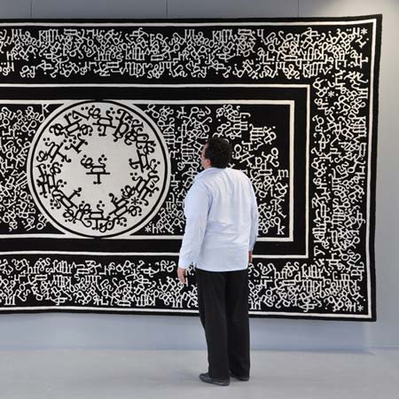
French design student François Mangeol has designed Occidorient, an interpretation of a Persian carpet that features Times New Roman letters.

The design makes use of the ubiquitous typeface to create a pattern similar to those found on traditional carpets.

Here’s more details from Mangeol:
–
Occidorient (Occident/ /western – /Orient// East)
Occidorient is a carpet. It conceals an essential function of representation. It tries to cross two different, oriental and western cultures, using representative codes and try to offer, a second reading and an update of a know-how.

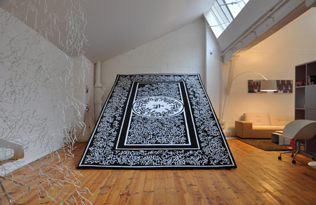
Historically, the Persian carpet deals with divine. It always filled in East a double function, practical and symbolic. So it is built as a work of architecture, representing a plan. It establishes a magic space including the sphere of the universe. The size (format) “kelleghi” or “kelley” is very close of 16/9 of our cinema and tv screens, this screen where we design our world.

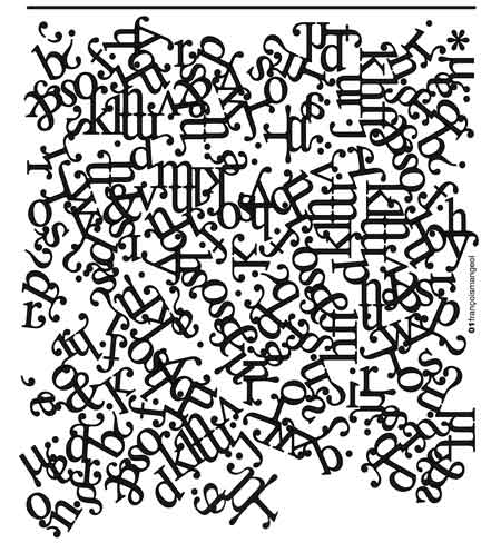
Very symbolic Times New Roman, western and Anglo-Saxon typeface, but also well-balanced, elegant, simple and all over the world known is used in a historic way by the press and Microsoft as default. So It is used by software and tools of publication, designers of our world. It is used here as unique pattern. It performs, by aggregation and without any deformation of the typographic characters, a lots of “odalisque”.
The method used by Persians is pushed to the extreme: the repetition of pattern to create a new language, familiar and abstract.
It was made in France.
–
Posted by Brad Turner


May 24th, 2009 at 2:22 pm
You know what? I really like this one… yet it can be a bit ‘graphic design’ geekish! Even though, it’s great that new reinterpretations of persian carpets appear.
At least is something “different” from the Moooi works, that are also excellent. Good job François!
May 24th, 2009 at 4:30 pm
This is amazing. This is just awesome. Things, we see every given day and hour, but used in totally another way. And having another look. You look at the carpet, and see not so bad (i’d rather say “minimalistic”) arabian carpet, but, when you see Times New Roman. 10 out of 10. Brilliant.
May 24th, 2009 at 9:50 pm
Very cool, I like this very much! Would like to see it in colors other than b&w. Would like to see the same idea executed in a variety of western fonts — I think Verdana would make for a very pleasing appearance. Good effort, great idea, kudos to the designer
May 25th, 2009 at 5:10 pm
you can’t make butter with soy milk.
May 26th, 2009 at 9:37 am
why he used times new roman?
May 26th, 2009 at 4:37 pm
Copperplate Gothic, always black and white.
May 26th, 2009 at 9:18 pm
novelty carpets wear quite thin, quite fast i could imagine….
May 26th, 2009 at 11:16 pm
it’s really simple, simplistic (in a negative way). I prefer the reinterpretation of a persian carpet by Richard Hutten, more conceptual, beautiful and original
http://pan-dan.blogspot.com/2008/09/play-with-tradition.html
May 27th, 2009 at 7:13 am
very interesting! i would like to have your email if you dont mind.
May 30th, 2009 at 1:32 pm
have a look on his website…
contact@francoismangeol.com