Emporium by Sergio Calatroni Artroom
Italian designer Sergio Calatroni has completed the interior design of Emporium, a fashion store in Tokyo.
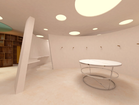
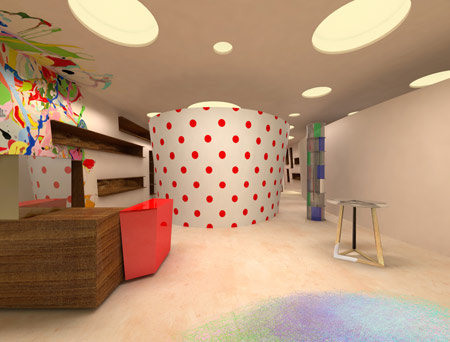
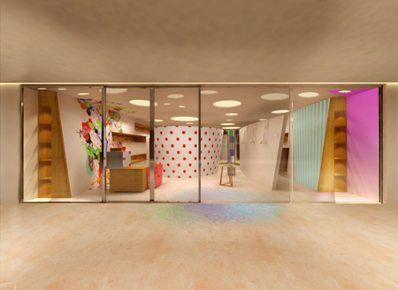
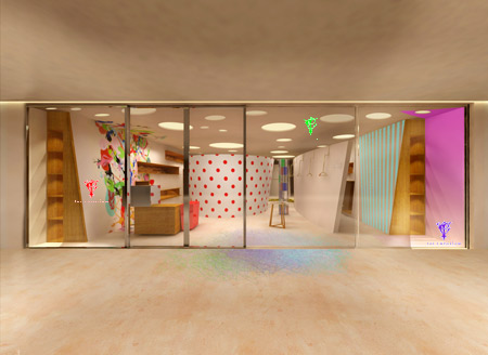
The store features a series of free-standing, slanted walls, which can be moved to change the layout of the store.
Here's some info from Calatroni:
--
Emporium shop project Tokyo, Japan
Text by Sergio Calatroni
The Emporium Shop of Tokyo is organized as a select shop dedicated to the young fashion which grow continuously in Japan. The shop needs a new display scenery.
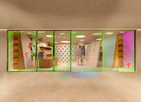
Single enviroment of 220 square meter is organized with 4 principal paths who start from the shop window which gives a total view of the shop interior.
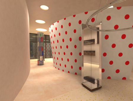
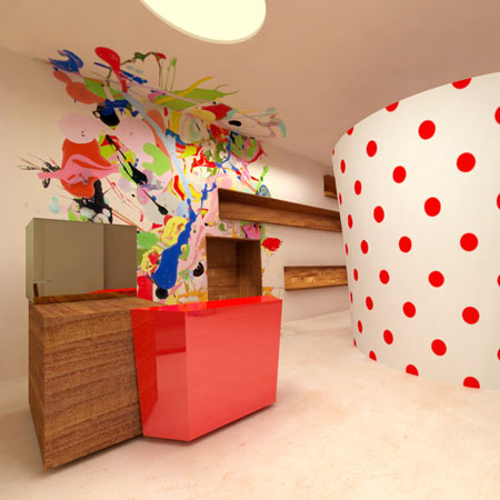
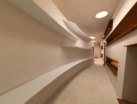
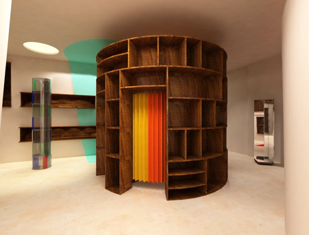
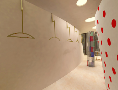
The paths are the result of the position of several movable slanted walls, some of the wall have different thickness to serve as a cloth stand or merchandise display.
The wall doesn’t arrive untill the ceiling and the free spaces are left for the interventions by different media as, graphism, photography, art, video etc. The type of intervention will change sincronized with the change of the season’s collections.
The showing zone are created by the wall wave at the inside and outside of the walls, the spaciality is always differents, dipends of theirs torsions. That creates the sense of course like the labirinth who let the public to discover the marchandises.
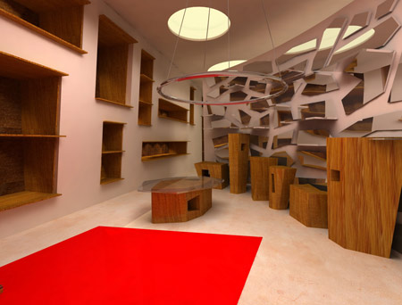
All the employed materials for the commercial space are the combination of naturals and syntetic materials with the effect of the particular textures. The wood are the mixture of precious and not precious wood, and them aspects are left in the natural way.
All the furnitures untill the small accessories are designed customized. The cashier is a geometrical solide with mixed-materials, and are composed by various modular and movable elements between them.
The techinic of the illumination exploit the most recent technology which regulate the light effect by the computer programming.
The inspiration of this shop design is to obtain the selling place with the flexible and interchangeable scenary from time to time, by the shift of wall-display and the redecoration summary of some elements in order to charecterise strategically the Emporium.