Blu Apple by Budi Pradono architects

| 33 comments

blu-apple-by-brudi-01a.jpg

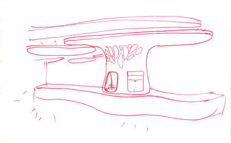
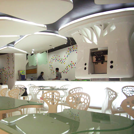
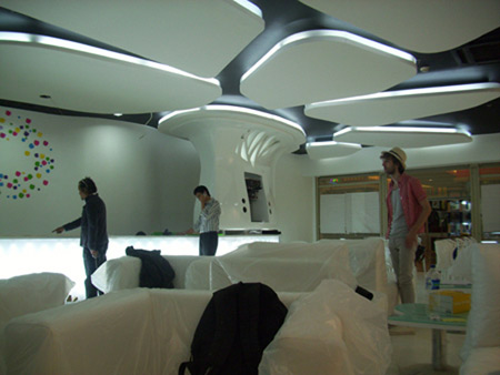
Indonesian architects Budi Pradono architects have designed the interior of a frozen-yoghurt shop in Jakarta, Indonesia, based on melting ice floes.

blu-apple-by-brudi-02.jpg

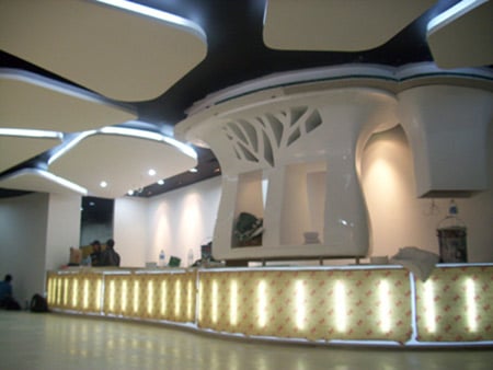
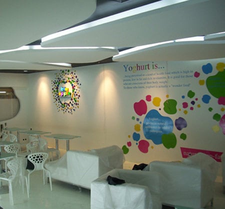
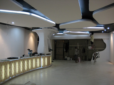
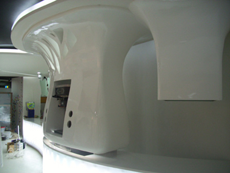
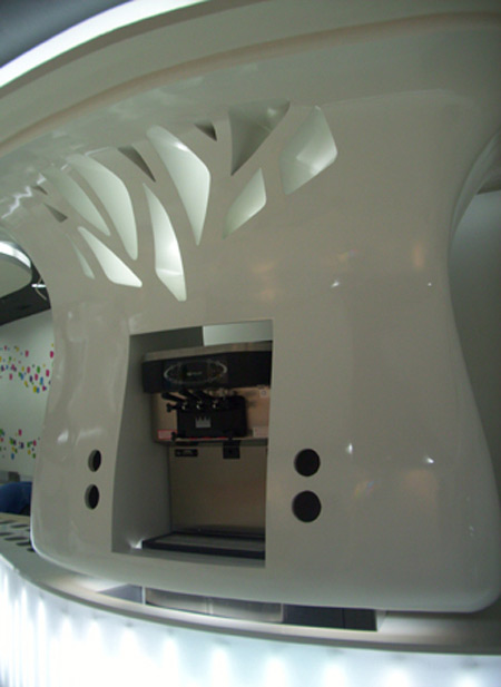
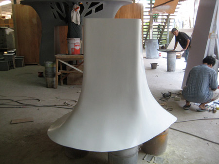
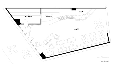
White, back-lit slabs are suspended from the ceiling of the space, which is composed of a bar, seating area and storage facility.

blu-apple-by-brudi-03.jpg

The shop is due to open next month.

See our other stories on frozen yoghurt shops:

Soho Snog by Cinimod Studio
Snog Frozen Yoghurt Shop by Cinimod Studio

blu-apple-by-brudi-04.jpg

Here's some text from the architects:

--

Blu Apple

Frozen Yoghurt café, Jakarta

blu-apple-by-brudi-06.jpg

Designed by Budi Pradono is to be opened to the public by 1st week of August 2009.

blu-apple-by-brudi-07.jpg

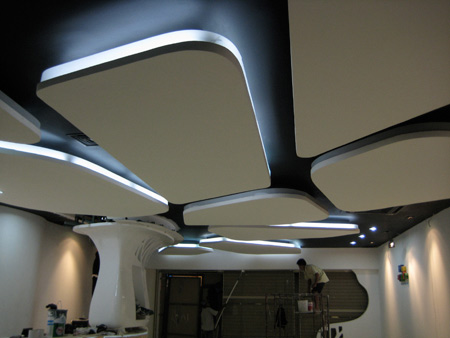
The interior for this café selling Frozen Yoghurt and pancake is like ice floes that fly in the air, some have to melt and fall since the world is getting hotter and hotter, all furniture are made completely white and arranged informally.

blu-apple-by-brudi-08.jpg

There are 30 types of Indonesian typical fruits that are presented as toppings on frozen Yoghurt and hot pancake.

blu-apple-by-brudi-09.jpg

Project data:
Name: Blu Apple Frozen Yoghurt café
Size: 130 m2
Location: Plaza Semanggi Mall, Jl Jend Sudirman, Jakarta, Indonesia
Design stage: May – June 2009

blu-apple-by-brudi-11.jpg

Construction stage: June – July 2009
Architect: Budi Pradono architects
Project architect: Budi Pradono
Assistant project architects: Yuli Sri Hartanto, Rina Nur Aisah.
Design supervisors: Budi Pradono, Yuli Sri Hartanto, Rina Nur Aisah, Ian Flood.
Graphic Designer: Ahmett Salina.

blu-apple-by-brudi-13.jpg

Contractor: PT. KANG, Rukamto Laksana.
Project manager: Yohanes Sembiring.
Site supervisor: Indra Sukmana.
Workshop supervisor: Sukandar.
Signage specialist: Rhino advertising, Aming.
Sofa specialist: PT. KANG.

blu-apple-by-brudi-12.jpg

One Response to Blu Apple by Budi Pradono architects

  1. FERRAN10 says:

    VERY COOL

  2. modular says:

    too much information. makes me dizzy

  3. mr t. says:

    good god…the concept driver for this design is based on “melting ice floes”…what an ironic way to highlight our current environmental blight. Overuse of materials and manufacturing processes to build out a concept that they are fully contributing to.

  4. rach says:

    no sharp edges
    cool

  5. Ajay says:

    Wow. I love the forms used in this project…very cool indeed, definately a unique place to eat your yoghurt…..

  6. h says:

    way too many things going on here. urgh.

  7. n_and_o says:

    attractive.. make people wondering how delicious the yoghurt is… yummy

  8. anton says:

    love the melting down concept..cheers….
    ready to go that place… (=

  9. cody says:

    mr t., Im going to guess you don’t like curvy or smooth things.

  10. Imal says:

    A cave of Ice for a frozen yogurt cafe,, Nice ambience!

  11. rin says:

    cant wait to eat yoghurt at blu apple.
    Cool design.
    :D

  12. Clark says:

    That must be some seriously expensive Frozen Yogurt.

  13. gaque says:

    i agree with mr. t. furthermore i must ask, when will we get over the cellular structure ornament, applied with a bit of subdivision smoothing, and do something really integral and useful?

  14. fitri says:

    The Design is amazing….I like the ice melting concept..No sharp edges and organic form concept…so dynamic!!!

  15. mr t. says:

    Cody, I don’t understand your comment.

    Why would you suggest that I don’t like curvy or smooth things?

    That would be making the incorrect assumption that I would be judging the merit of this project strictly on the form. I suggest you read what I said and maybe think about it….The irony of this project was just too much not to point it out.

    a wasteful project contributing to the concept that it is based on it’s just so superficial.

  16. ronici says:

    nice concept, and how you to realize it.

    I know budipradono with the ideology of “glocal” which is focus in locality, and naturality in architectural concept,
    not just form, shape, and sculp,,

    in this project the form is different, look a bit organic, and the design seems to be mainstream, than “glocal” taste…,

    Where is your sense bout materialism, and locality? Is it already gone somewhere?
    or you just follow the mainstream “organic” style, afraid to be call ancient,or just wanna be called up to date

    There’s somebody tell me, where is the glocal goes on…?,,

  17. vebri says:

    Speechless..
    Architecture + global warming issue = cool design

  18. husna says:

    woooow….it’s from indonesia….my country…..I LOVE INDONESIA
    it’s very fantastic design, very amazing work ^o^

  19. irwanpermono says:

    melting pot….white as yogurt
    i see the blue….so stunning i love it
    but i don’t like the lighting arrangement
    not dramatic yet….please enhance the effect…of light
    LDP (light distribution panel) ex. Korea is much better…..than visible straight neon tube…just input…
    great & excelent design mr.pradono!

  20. roman kralya says:

    It reminds me one of the Antoni Gaudi`s project.

  21. Maria says:

    its simple, catchy, sophisticate…
    Speechless…

  22. anton says:

    no offense….
    glocal didn’t mean it should be used for the local material…
    it can be transform into the concept…(i think)
    maybe just simple concept then how it can connected with a global condition…

  23. Saldi says:

    Well made.. Everything is hand made I assumed.. Fabb..

  24. ricky says:

    wow……an awesome interior design…..
    have a good looking and also a good feeling if i looks at the design…..
    mr.pradono…you are an awesome architect…

  25. Nice…
    keep it up!
    maju terus arsitek indonesa :D
    Cheers…

  26. av says:

    A very refreshing design! can’t believe it’s actually in Indonesia!

  27. dinho says:

    just visit yesterday…
    dont like much about ambience…dont know….just too cold and empty maybe…IMHO

  28. Renita says:

    wonderful design..and unique

  29. agent p says:

    first impression it looks abit more ‘toyo-ito’ish

  30. gembul says:

    i don’t see the indonesian character,,,is it gone already?,,,

  31. Fernad0 says:

    New Year 2010 critics:

    Great minded design ideas of BPA.
    The design form relate with the yogurt characteristics.

    But it will be nicelly done if all the form integrated into one fluid form…it will be fantastic architecture expression…

    Cheers,
    Fernad0

  32. marc says:

    agree with mr.t
    –> the concept is indeed ironic… unless he used recyclable material. (but i doubt it)

    agree with gembul
    –> yes, this kind of design is something like a ‘trend’ and sadly all the trends seems to lost their indonesian identity.

  33. haha buldum restorantımın tavanını :)

Leave a Reply

Your email address will not be published. Required fields are marked *

*

You may use these HTML tags and attributes: <a href="" title=""> <abbr title=""> <acronym title=""> <b> <blockquote cite=""> <cite> <code> <del datetime=""> <em> <i> <q cite=""> <strike> <strong>