web tracker
August 11th, 2009

apartment-by-peter-kostelov-25.jpg

Russian architect Peter Kostelov has refurbished an apartment in Moscow using industrial materials.

apartment-by-peter-kostelov-27.jpg

The project involved dividing a studio apartment to create separate spaces.

apartment-by-peter-kostelov-6.jpg

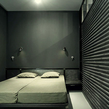
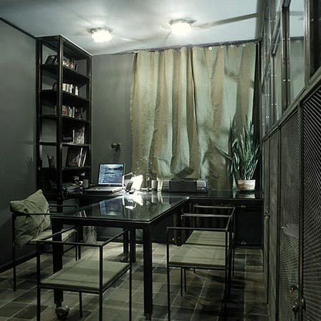
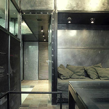
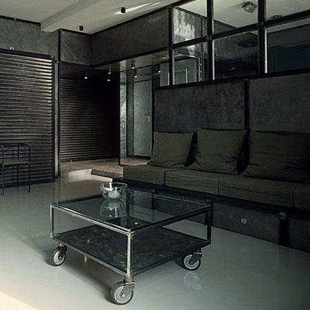
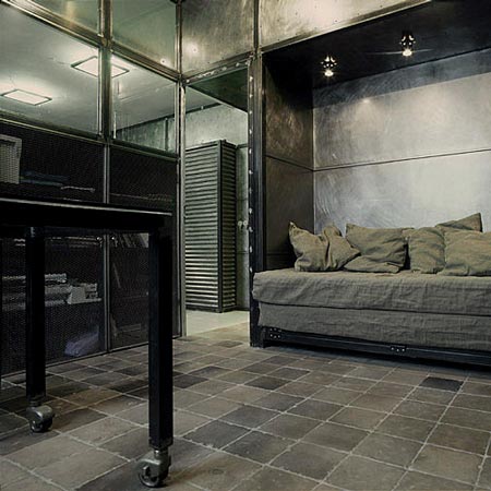
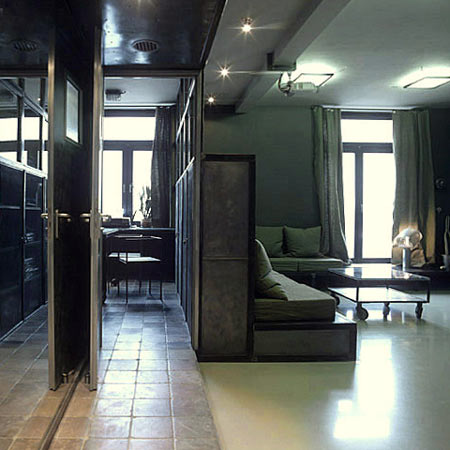
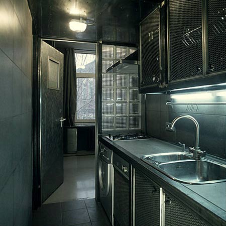
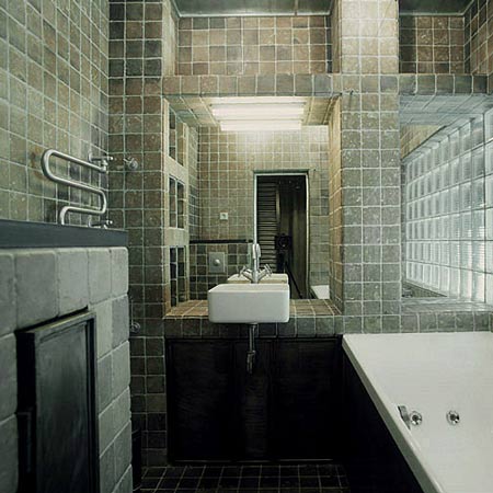
Kostelov used metal throughout the interior, with visible welding and a raw aesthetic.

apartment-by-peter-kostelov-8.jpg

Photographs are by Zinon Razutdinov.

apartment-by-peter-kostelov-19.jpg

Here’s some more information from Peter Kostelov

Apartment

Earlier it used to be a studio apartment; practically it was a one bedroom apartment. After reconstruction there came out a few more separate rooms: a spacious living room, a bedroom, study room, library, two wardrobe rooms, a kitchen, a bathroom and a lavatory and shower for guests.

apartment-by-peter-kostelov-26.jpg

All these were placed around the space of 86 sq. m. As a result a bedroom and a kitchen became far smaller, hence the living room bigger, therefore the space left worked well for a wardrobe room, adjusting to a bedroom as well as for many other places. Besides the ceiling was lowed giving space for an entrance to store house hold things.

apartment-by-peter-kostelov-17.jpg

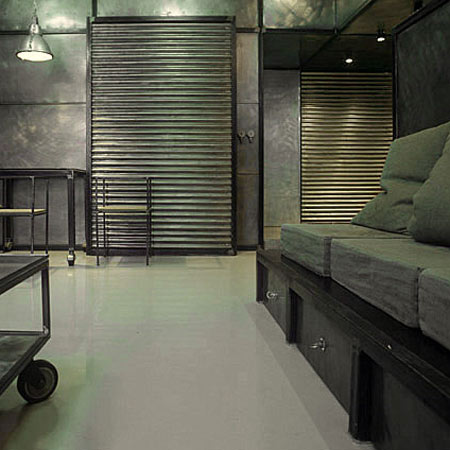
The open space with a column in the center was filled with a frame made of steel tubes. The frame hasn’t been trimmed with any decorative materials except of metal cover, which can be easily replaced by wood, stone, paper wall, cart or whatever. The conception goes first and stays the same.

apartment-by-peter-kostelov-20.jpg

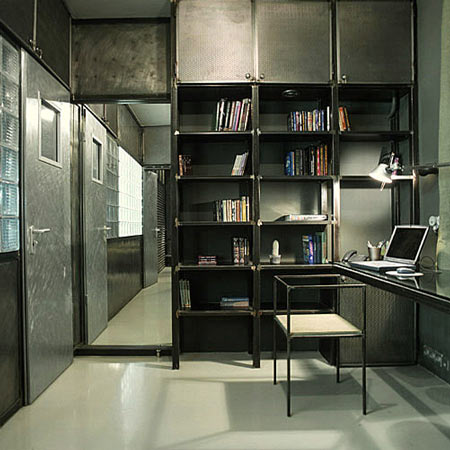
How the idea of a module works. 2,8 m ceiling conventionally divided by 4 is 0,7 m. pace which can be accepted as a module for a spatial interior design. For instance: 0,7 m times 3 are 2,1m, it’s  the height of the doors and entrance location; double 0,7 m is the height of display cabinet unit in the living room, 0,7m times 4 is for bookshelves.

apartment-by-peter-kostelov-2.jpg

The principle of a module works and is traced all around the apartment. For me it was a matter of an utmost desire to create an indivisible architectural design. Practically it is deprived of any decorative elements. The most essential of it is the functional purpose of a design together with the principle of unities of all the elements of the space.

apartment-by-peter-kostelov-29.jpg

67 Comments

  1. modular Says:

    Re-invented gulag for the common citizen?

  2. bartek Says:

    moscow spirit!

  3. camron Says:

    step in for human rights in russia, and you will get an apartment of this kind for free.

  4. Timothy Says:

    After a cold day in stark, gray Moscow under stark, gray Moscow winter skies coming home to a cold, stark, gray apartment. Inspiration perhaps for a writing a book on Dostoyevsky or Russian Nihilism or the Gulag in Soviet Culture.

  5. SALVADORE Says:

    i really like this one. even tough its not very contemporary, it has spirit.

  6. famul Says:

    Is this a jail ?

  7. orlovsky Says:

    looks really comfortable.

  8. tanya telford - T Says:

    This flat does have some interesting ideas but its a bit extreme & cold etc. I like the stone tiled floor, more of that kind of thing with recycled industrial metal could be good? & I actually think the couches are ok (again even better if using recycled industrial metal materials & objects etc)… and the information says the frames or panels? are interchangeable with wood etc which could make a difference. Another couple of human rights people have been reported as murdered today, very sad, apparently they helping children, i don’t understand the politics of it.

  9. Cr Says:

    Look like a f___ing jailcel !

  10. john Says:

    hahahahaa – true. or a smaller wooden one.

  11. kur0yi Says:

    looks like an inviting setting for a porno movie

  12. dha Says:

    it looks like a prison..

  13. Rokas Says:

    Eee…As fas as I know,there’re a lot of bandits in Moscow-but I’ve never imagined,that the nostalgia for their “home,sweet home(the jail)” so overwhelmed them!

  14. Antonio Conroy Says:

    I like it. And I think it’s comfortable too

  15. michael Says:

    looks like a g-star store!

  16. J* Says:

    Where’s the nasty dentist who’s gonna torture the poor victim? ha ha!!

  17. Mark Says:

    80s industrial-chic nightclub set. In many ways, very nostalgic, very Russian. And, as you know, with private interiors, it takes two to tango.

  18. Juampi Z Says:

    Very original… and a little cold. BUT REALLY NICE!

  19. Nisse Says:

    The only frame of reference concerning Russia/Moscow for most of Dezeen’s imbecil (American?) readers consists of the following:
    1) Grey coldness
    2) Gulag / prison camps
    3) Human rights violation
    4) Depression
    5) Lack of toilet paper

    It’s as if, let’s say, the US was ONLY associated with: junk food, overweight people, uneducated provincial stupidity ála Dubya Bush, excessive/shallow consumerism and meaningless gory imperial wars in the Middle East. “Everyone” knows there’s more to the US than that.

    I don’t particularly enjoy the design of this apartment. It is indeed cold and industrial. Nevertheless it represents a novel and somewhat unique approach that could possibly be evolved into something respectable. But that is nothing in comparison with the offensive stereotypes presented by Dezeen’s readers, which one would think should be somewhat educated. At least beyond the stereotypes of sitcoms.

    Of course it’s “only a joke”. But the jokes is somehow always on the Russian/any other country far away from the US. Let’s discuss design instead of offensive associations between Russia and their designers.

  20. KJS Says:

    Actually, I kind of like this. Although it does remind one of the interior of a submarine!

  21. eugmir Says:

    Design-wise it’s very counter the typical modern, Russian styles, which tends to be colorful and flamboyant, and screaming that wants to be called modern.

  22. Gallego Says:

    Nisse, if you don’t want the stereotypes to prevail, please stop acting as one of those archetypical Russians being offended by any non-laudatory comment on “the greatest of them all” Mother Russia, will you?

    and to the design: it is hidious! you can either take industrial materials and make a beautiful place for living, or.. that! but make it a theme hotel in Mocsow and it might atract freaks and lunatics from the “free world” (oh no, Nisse, they did it again!)…

  23. ricardo Says:

    Where is to fire place? Looks as cold as a Moscow winter……

  24. Judith Says:

    Wow! I’m with Nisse on this one and support his comments (most polite). Perhaps we would be challenged if we had only industrial elements to work with. Peter Kostelov’s site has photos of other projects. I spend a lot of time in Liepaja, Latvia and observe a lot of Russian architectural and interior design. We can recognise it is easily distinguishable from European architecture and it is a reflection of not having the years of access to an open world as most of us have experienced. For example, I often observe the Russians spend huge amounts of money buying (mostly) top of the range Italian designer home furniture and fittings but haven’t got the knack yet of how to put it together. I drove from UK to Latvia, in a van full of designer radiators for the LuxLoft because I could only get the ones that are in his images on his site in Eastern Europe. To me, they are an eye sore. But I have the passion to do so and the knowledge that other products DO exist in the wider world. I wish the Russians ongoing success, the people whom I have met are absolutely wonderful and they are developing their own style as Eugmir says. Let’s face it – who wants to live in a homogenised world?! Let’s encourage the differences.

  25. Al Ire Says:

    Bernard Madoff’s jailcell?

  26. John Says:

    This place looks like the written reports of the Gulag – dark, sterile, raw, oppressive – just like the current administration of the White House in the good old US(SR). Barack and his cronies would love this pad/cell.

  27. wentao Says:

    an expensive cell

  28. Nisse Says:

    Gallego: my humble intention was to comment and (possibly) stop the stereotyping of Russians (or other nationalities) in the Dezeen comments. I was also appalled by the unimaginative and uneducated associations made by many readers.

    Your reply have only proved me right, since I’m NOT Russian but Swedish (hence Nisse) and you keep ignorantly ranting about Mother Russia and other stereotypes. Why not add some borscht-allusions while you’re at it as well?

  29. royal creme Says:

    It does have beautiful elements, but a feels a bit relentless…There is no relief anywhere, except maybe the bathroom…

  30. Bt Says:

    I wonder what the comments would be if we didn’t know the designer is Russian.

  31. Gallego Says:

    Judith, I’m with you, that differences are vital and necessary for our world, but nobody’s arguing against this. critics here don’t say “this is different”, they say “this is ugly”. you can try to support ugly by upholding it as different, but it will still be ugly. Mies v.d. Rohe said, that it is better to be good than original; however, this is neither: it is not good, and there has been a plenty of examples mentioned that this project resembles ( like a cell, maybe a nuke shelter, though even that could be much more bright and less depressing)… well, the idea that somebody would actually like to live in this seems to be new and original… that guy simply took a probably nice flat and destroyed it with some ugly pieces of furniture from army’s sale. it is different, nothing else… instead of praising him we should learn from his mistakes, for this is clearly a DON’T example…

  32. hair piece Says:

    In Russia the apartment designs you.

  33. Tyler Martiné Says:

    I love it. Rich with texture and contrast. I bet it feels great in the winter… heavy, cavernous, and warm. I’d hibernate in there for sure. Why is everyone so afraid of the dark? I don’t know about the rest of you, but I am sick of the plastic-fantastic-disco-train that has been chugging through european interior design for the last decade. This project is refreshing.

  34. a-ngine Says:

    Thats really a man’s place. Lets pee in the spotlight and make a fire in the corner – I like it very much!

  35. Boby Says:

    It likes typical Russian military barracks.
    Peter have forgotten to put somewhere the Russian boot!..

  36. ahaus Says:

    I actually like it. It unexpectedly has a certain timeless feel to it (could be in the 80’s, 90’s or today).
    Unfortunately the tumbled tile on the walls and floors looked like an afterthought. Steel, concrete, or rubber tile would be more appropriate.

  37. Judith Says:

    Gallego, we don’t know the history of this flat other than it is 86 sq metres. In Soviet times all the people were allocated 56 sq metres, believe it or not :-) Usually of many rooms, so I guess this apartment was changed if it was a one bedroom flat that he started with. Anyway, it is irrelevant to the project. what I am getting at is, we don’t know the history of the building this flat is in. Kostelov has chosen to break it up to get more utility from it, which to me is an old paradigm. Putting storage into the ceiling is “different”, but I don’t see the need to cover the entire ceiling area of 86 sq metres to do so. The architect I worked with in Latvia, insisted I have the 5.5 metre ceiling (at the apex) of a top floor new build apartment of 112sq metres covered over to reveal just over 2 metres of ceiling height and put in two extra bedrooms. Instead I put in 6 Velux roof windows and have a magnificient one bedroom penthouse apartment, with a part mezzanine floor. He said I was crazy. On inspection as it nears completion, the architect is now pleasantly surprised:-) Believe me, that type of furniture is NOT from an army sale and I think someone who writes so eloquently would recognise this. It looks to be very well executed and beautifully crafted, including the kitchen cupboard doors, tables and chairs. If the property has an injection of color and personal items it would look very different. I guess the architect has been restrained in his use of materials as I also know these tiles and (external, functional) light covers, both of which I do not find remotely attractive. The floor to the main room looks like resin, which would be “innovative”. I think he is using his background in creative media to play around – purely that. I often see works from people in Russia and Latvia, whereby they get lots of low priced inputs and have fun with them. That is probably what he has done. His other works are nothing like this one. We are not told the reason why he chose to create this environment. I think the Editor of this site has a duty to us to find out what the brief for the project was, as it would put the project into context for us. It was probably for a TV program like Changing Rooms, (yep, they have it over there as well), using discarded materials . As we should all be more environmentally savvy it should give us some inspiration ;-) cheers!

  38. Bozo Says:

    I love this

  39. l. Says:

    nice. a bit like maison de verre in paris.

  40. longlong_ago Says:

    good look,but a bit like prison

  41. max habib Says:

    Soylent Grey

  42. gregory Says:

    I like it. I doubt i could afford it…and I suspect it gets cold….but I like it.

    …gregory

  43. kurt Says:

    You could use refrigerator magnets EVERYWHERE! Sweeet!

  44. Horst Says:

    What Nisse Says.

  45. Madness Says:

    why is this a DON`T example? I find it quite atractive; it`s simpe, functional…has windows (hahaha). The metal fits perfect in this context and makes a kind of romantic atmosphere… why this rage towards classic? there’s an explosion of colors, a trend…in this case gray is actally very sophisticated and creates an elegant and sober space. There’s an explosion of power flower, lots of colors and materials that most of the cases lead to kitsch! are you an architect or a designer Gallego?

  46. jack the ripper Says:

    and it is like living in the Potemkin kitchen …

    but bravo for the ingeniousity…

  47. SALVADORE Says:

    come on GALLEGO!!!! since when do we have in todays world beautiful or ugly things in art ??? this is a very good design from any point of view! stop being trendy! its all about the expresion the image that was formed in this design. and it is a complete succesful work!

  48. Tobias Says:

    Looks like an ideal appartment for GSTAR RAW…..;-)

  49. Paul Says:

    Oh but there are so many analogies we haven’t even gotten to yet! A meat locker, for one. Or a loading dock. (And what could be more American than that?!) Or the Unistrut company’s secret executive love nest.

    Actually, it’s not bad for all that.

  50. martinbeck3 Says:

    Putin´s Holiday Inn

  51. howard Says:

    This is a really good effort Peter Kostelov! Don’t listen to all the chat room – they don’t know how to live. One question, are you only allowed to eat food in the grey colour range too?
    No seriously, you’ve used cold materials and actually made something quite warm. I think that is quite a hard thing to pull off – even if it is a little perverse.

  52. Dave Says:

    It’s gorgeous. An acquired taste for some, maybe, but I’m in lust.

  53. Nitzan Says:

    I would love if the architect wore army fatigue in the house, so that he was completely camouflaged by this hyper industrial world he has so obsessively created.

    Fascinating to watch a not so good idea, go this far….

  54. Aloysha Says:

    My fellow comrads, behold the new design of Mother Russia.

  55. roman kralya Says:

    Вот жесть. Создается впечатление, что интерьер заказал бывший зек. Чтобы осенними дождливыми вечерами вспоминать под завывания Круга о своих нарах… Для жизни совершенно не приспособлнный проект, особенно для детей! Это больше похоже на место съёмок фильма или окружение 3D игры. Впрочем, если воспринимать это как концептуальное решение, то ставлю пятёрку! А если – место жизнедеятельности человека – 2

  56. Vitali Says:

    I visited Peter and his wife Olga few times in this flat and we had some crazy parties in there too. I can assure you that it is boolet and sound proof.
    There are no cluster places in the flat. Everything is smartly hidden away from your eyes. Nothing realy disturbs you. It is good place to work, socialite, meditate or do some yoga. There are some funny small things which you could not see on the pictures that make you smile (switches, sockets, lights, rollers …).

  57. student101 Says:

    i havnt seen entire metal designs in awhile so this is quite interesting… nicely designed and thought out, however, in context, its quite stark and cold. thats not a bad thing so much as a observation

  58. ai Says:

    reminds me of a japanese (rabbit) house. very functional. cheap and easy to install. what is the name of the standard unit to express the size? tatami?

  59. sluijters Says:

    am I the only one that feels like Winston Smith is about to walk in on this appartement? I still like it though…but that’s probably the result of doublethink…

  60. 0hzone Says:

    Another Concentration camp?

  61. mng Says:

    The fact that this interior PROVOKES discussion makes it already a gooooood design. Stimulation for the brain ain’t it?!?!

    This genuine design could be a start point for many other conception. Moreover as a design work itself is so well done that many other more “colourful” interiors could only wish such an attention…

  62. lukan Says:

    im in love with it.

    wouldnt live there in a thousand years of course, but im not the client, am i?
    i think its obvious that wether or not the space is “warm” or not is irrelevant. its not meant to be warm, and even if its not, it does have a personality, and a life to it.
    it succeds at being what it sets out to be, and what its meant to be is not an easy task. the level of creativity and imagination required to pull this type of atmosphere off blows my mind.

  63. Martin Says:

    It is sad most of the comments here are so stereotyped, prejudiced, narrowminded. Like Nisse pointed out – those one liners really sound bit of stupid…
    What sense does it make to write 20 times comments like: “prison, jail, gulag”? I understand there is some common sense of beauty, which most people recognize, but I do not condemn immediately if something different occurs. Not without a thought,at least.
    I do not particularly like this one project, but it gives me some interesting thoughts and in some way is inspiring. All you need to do is to read through the text, watch the images, have a little thought what the designer tried to achieve here.

  64. Ztef Says:

    Wow, only one word comes to mind.. Raw.
    I want my appartment to look like this.

  65. First Apartment Says:

    Wow, I absolutely love the look! But, I think it would get really depressing living there for more than two months. Dark, dingy, place… cool to look at, yet I can’t help but think it’s just a depressing place to live in.

  66. Niels Says:

    ..… now I am one of the privileged ones who has experienced this gr8 venue in several aspects, and I can confirm this place is comfortable, warm, open and bright – an empathic energy can be felt and even at midnight with the light’s off, it’s still bright – U don’t have to like it to love it, it’s about the experience, not the opinion; opinions are given from the stand, experience you only get on the field – experience the place, then revieuw your first opinion …

  67. trimtab21 Says:

    it has all the warmth and charm of a morgue

Submit a comment

See our comments policy