
Estonian architects Kosmos have completed a five-storey apartment block with a ground-floor shopping area in Tallinn, Estonia.

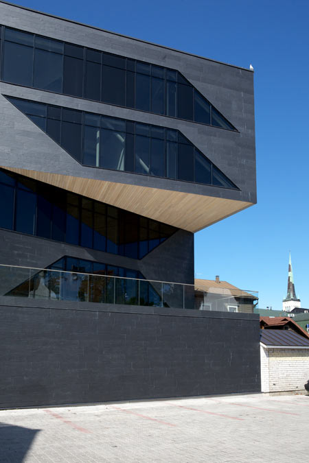
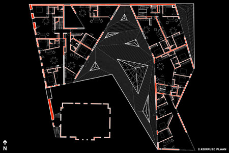
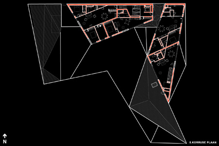
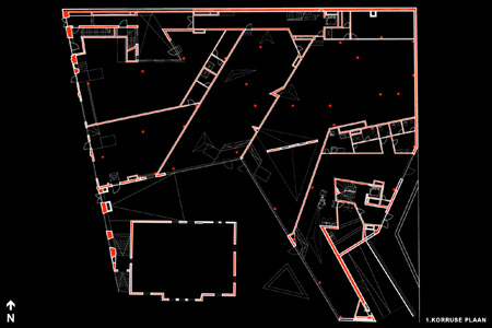
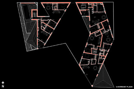
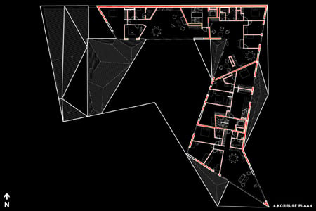
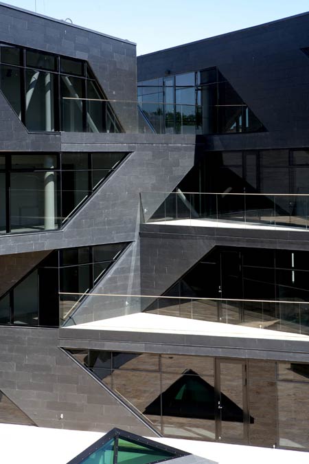
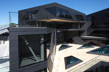
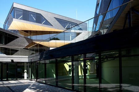
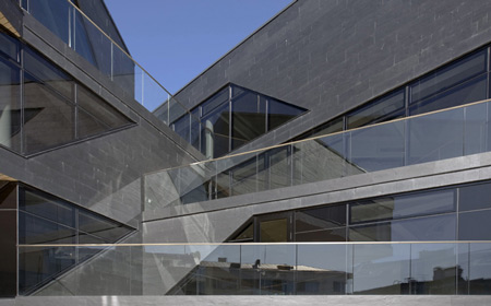
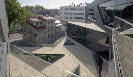
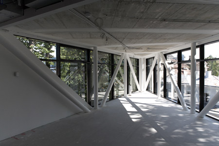
Conceived as a series of interconnected units, the building is broken into facets and punctured by shard-like windows.

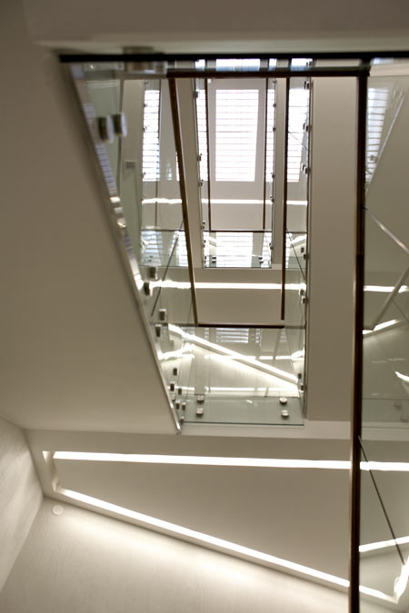
The structure is made of steel frames and reinforced concrete.

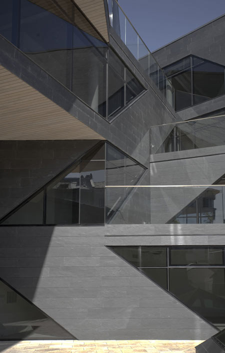
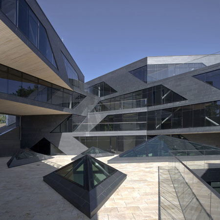
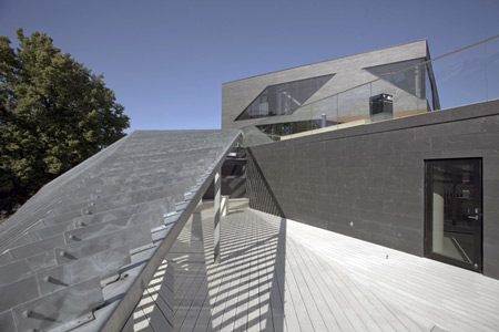
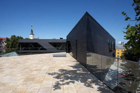
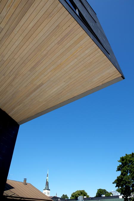
It has a stone-tiled facade and each apartment has a wooden terrace.

Photographs are by Ott Kadarik and Paco Ulman.
Here’s some text from the architects:
–
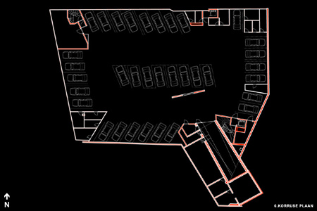
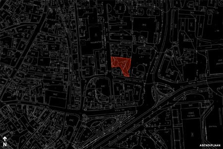
The 5-story apartment building is situated on the edge of the medieval old town of Tallinn.

It is not dominant from the street level, nor does it seem too high in the surrounding context.

The dynamic mass of the building is situated in the northern and western side of the plot.

In connection with some old historically valuable buildings, it creates an environment of small interconnected units, characteristic to the architectural whole of the old town.

Every apartment has a large terrace, bringing private house typology into the very center of the city.

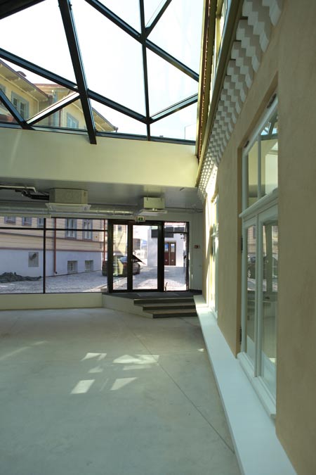
The ground level opens to the street as an active shopping space.

The construction of the building is a combination of reinforced concrete and steel frames.

The non-supporting walls are finished with natural stone tiles, making the building visually smaller, while alluding to the surrounding stone houses of the old town.

The timber-clad terraces and the horizontal surfaces of the overhangs link the apartment block to the neighboring wooden house, while decomposing the building´s volume into a variety of spaces.

It is an inner-city landscape house of different qualities.

Architects:
Ott Kadarik, Villem Tomiste, Mihkel Tüür


–
Posted by Zaynab D. Ziari


August 14th, 2009 at 12:26 am
I wonder if the architecture would affect the way people walk because it not only limits where and how you can go but also how you see things. Maybe change the way they react to others in realm of their surroundings. I’m sure they would but I guess it would be more interesting to see (especially with architecture like this) than to conceptualize in the head.
August 14th, 2009 at 3:24 am
this project has some dramatic and fun outdoor spaces but is otherwise an unliveable disaster. the tyranny of angular forms trumps all in the worst possible way. the interiors leave me speechless. please give up architecture now.
August 14th, 2009 at 6:00 am
Sick project….can I see a section though?
August 14th, 2009 at 6:11 am
Exposed pipework! Nice!
August 14th, 2009 at 7:55 am
fantastic..
August 14th, 2009 at 8:09 am
too sharb but i like it
August 14th, 2009 at 9:29 am
I want to have this kind of projects in Berlin. I think its great that a lot of eastern countries are not afraid to give projects like this one a chance.
August 14th, 2009 at 9:34 am
And it is also remarkable that this is not a museum , memorial center or other cultural facility but seems to be private investment. I would like to know more about the client and the project develpement process. Good job Kosmos.
August 14th, 2009 at 11:57 am
i luv it when architects wax lyrical about their work. how is this not dominant to the street level. how is this connecting to the historical level? i suppose they are dying to be modernise!
August 14th, 2009 at 4:32 pm
I found the glass shard motif rather overwhelming, giving me a constant sense of danger rather than of peace…
August 14th, 2009 at 5:26 pm
When I first looked at the photos of this project I thought, “The 70’s have returned.” Aspects of it remind me of buildings being constructed when I was much younger.
I get an oppressive vibe from these photos. The structure looks “heavy”, even though there is a lot of open (ie. glass) wall space. I suppose it’s the dark color which is to blame. I suspect it will feel better once some people take residence.
regards,
G.
August 14th, 2009 at 10:44 pm
I’d kill to have William Shatner narrate the description of this project
August 17th, 2009 at 6:14 am
Someone was trying to emulate Libeskind. Looks like it could be the next Brit Sci Fi set.
August 17th, 2009 at 8:22 am
i wanna do work like this…. really nice:)
I only like to see some more interiourshots
August 17th, 2009 at 2:00 pm
Not sure where to start? Clumsy (structure and windows frames), poorly detailed (see balustrades), unusable space (see the corners in the bedrooms). Whilst its great to see people exploring all avenues of design, surely this is just a badly resolved pastiche of angular architecture. If we take it back to first principles this building fails on some many levels, as it is a poor place to live. I’m not really sure what it’s doing on this website, which is usually quite critical about which projects it choses to publish.