web tracker
August 18th, 2009

double-00-09-by-case-real-05a.jpg

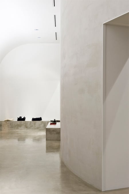
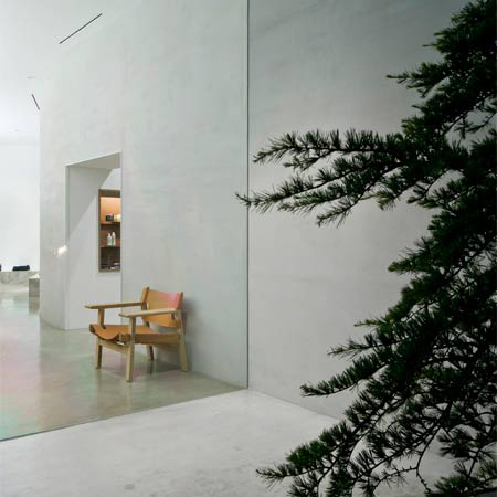
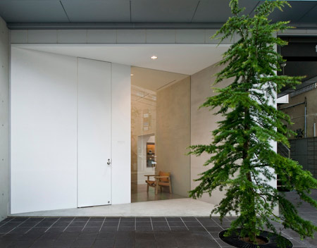
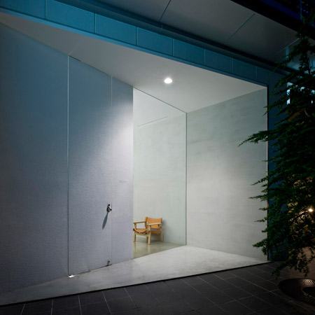
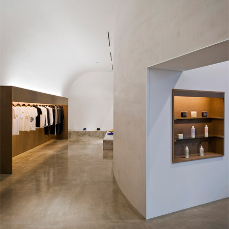
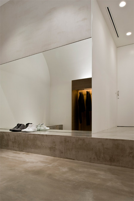
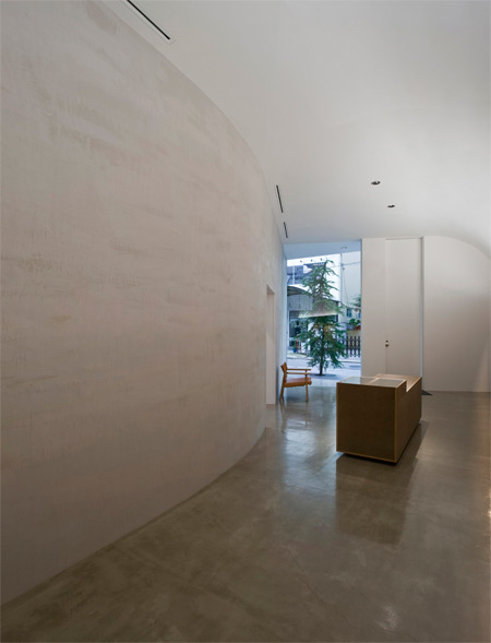
Japanese designers Case-Real, headed by Koichi Futatsumata, have completed a boutique interior in Fukuoka, Japan, with a curved wall dividing the space.

double-00-09-by-case-real-04.jpg

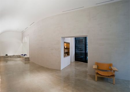
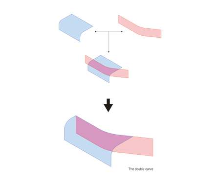
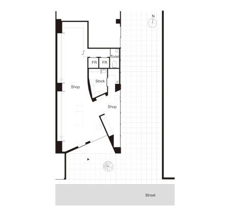
Created for retailers Alohanine, the interior has a curvilinear wall that begins at the entrance on the south side and ends on the north side of the shop.

double-00-09-by-case-real-03.jpg

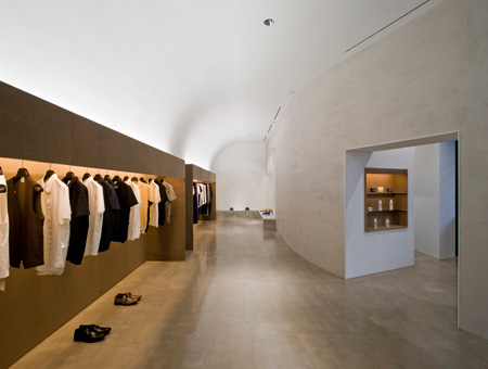
The ceiling is also curved along the length of the shop.
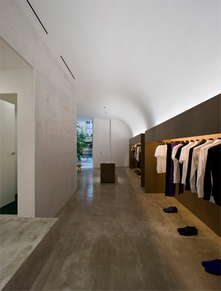
double-00-09-by-case-real-06.jpg

“One big curve expands obliquely into the inside considering the view from a street in front and the movement line and another gentle curve of the ceiling link in three dimensions,” says Kayo Yamaguchi of Case-Real.

double-00-09-by-case-real-07.jpg

Here’s a tiny bit of text from the designers:

Project : DOUBLE OO ‘09 (A boutique)
Design : Koichi Futatsumata (CASE-REAL)
Site : Fukuoka, Japan
Floor area : 74.6㎡

double-00-09-by-case-real-08.jpg

CASE-REAL is an atelier office based in Japan which is organized around Koichi Futatsumata and plans various designs such as spaces, constructions, furniture and products.

double-00-09-by-case-real-09.jpg

double-00-09-by-case-real-02a.jpg

double-00-09-by-case-real-10.jpg

double-00-09-by-case-real-01.jpg

double-00-09-by-case-real-15.jpg

double-00-09-by-case-real-16.jpg

8 Comments

  1. Pete B Says:

    i love the walls! – how have they been constructed/finished?!

  2. gab xiao Says:

    a beautiful interior; the entry is stunning. there is an interesting similarity with Steven Holl’s early projects

  3. Trish Says:

    I really enjoy eh subtlelty of the light against the walls and the way the glass meet the walls. Very nice and clean.

  4. Jacob Says:

    Love!

  5. Rokas Says:

    nice and pure..good play of volumes…Ok,as I see,being inside the shop actually should be different yhan those photos,and the feeling we get should be different-but still I think,even being there actually would be very fine and comfortable!

  6. armeyn Says:

    remembering the “kiasma’s shape”…

  7. Evan Says:

    Reminds me of Frank Lloyd Wright’s V.C. Morris Gift Shop in San Francisco, both in the understated entrance, and how introducing a few simple curves can really lighten up the typical boxy storefront. http://www.youtube.com/watch?v=obLIFhQuFP8

  8. ElP Says:

    Without the text I would have bet it’s a Silvestrin

Submit a comment

See our comments policy