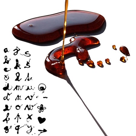
Czech graphic design student Marta Maštálková has designed a typeface by pouring liquid caramel onto glass.

Karamel Sans CE can be used to decorate cakes, she tells us.

Maštálková is a student at AAAD Prague's Graphic Design and Visual Communication Department and is a member of Czech architecture group a1architects.

Here's some text:
--
Karamel Sans CE – font to eat
the author‘s alphabet
Ingredients:
1kg of sugar
1dcl of water
1 glass plate
Instructions:
Pour sugar and water into a medium-sized pot and stir mixture until boiling-point. Boil untill blend turns brown. (caution! Font may burn easily). Set pot aside and wait for the blend to set. Blend is ready when viscous. Thereafter pour any text onto glass plate. Now you are ready to serve. The font Karamel Sans CE is best for creating ligatures and other typographic delicatessies.
Recommendations: Karamel Sans CE is also excellent for decorating sweets and birthday cakes.
Awarded: The Outstanding Student Design by the Design Centre of the Czech Republic

It’s so sweet! :)
Great idea for a typeface! The photos of the caramel are very good too.
its just kind of okay… i really like the caramel photographs but is that really a typeface? outstanding student design?! its like that line from art school confidential: “go draw something !”
haha! Sweet!
I mean it…!
why ?
reinventing the wheel,
some patissiers apprentices and cooks was at least starting with this one and improving since they started earlier dcorating millions of cakes.
They just do not claim themselves as typographer, or fonts’ designers.
congratulation to Marta, for her great discovery, and the AAAD Prague’s Graphic Design and Visual Communication Department and is a member of Czech architecture group a1architects. :)
so sweet! indeed.
“caramel sans” is a hilarious name.
The words from the author are the best. A font type and design project described by a recipe, which in a sense, is like a descriptive drawing. The use of so few words to describe this project is refreshing; one can easily conceive an attempt to over-rationalize a work such as this, and in doing so, loosing the delight of personal interpretation.
Well done. . . . . . and the photos are excellent too.
And the point is? Calling this a type font is stretching it.
http://www.oistudio.co.uk/rusblog.html <<<<<< very bottom of the page
@ The Fake Sartorialst: Duh, you answered your own question. The point *is* to stretch the definition of type font. In a witty way. What’s so complicated?
It s nice and sweet.
this is ridiculous, it seems like you are missing some letters and some are repeated… am i wrong? if i’m wrong, it is not at all legible.
Mike: If I’m reading this right, it’s not a font for your computer, it’s a recipe for caramel lettering. The flavor is the “font”, so you’re writing in a gustatory “typeface” instead of a visual one.
If that is the thought process behind this, it deserves the award simply for being a totally new idea of what typography means.
really nice. and i am sure someone on the web will do a computer font of this sooner or later…
this entry was also copied without attribution here:
http://joaochavesblog.blogspot.com/2009/10/karamel-sans-ce-by-marta-mastalkova.html