web tracker

Split Level House by Qb

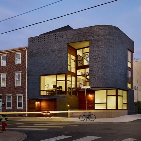
Design studio Qb of Philadelphia have completed a house in Philadelphia that features a glazed interior wrapped in a curved brick facade.

Called Split level House, the three-storey residence is located on the corner of two streets and is elevated just above street level.

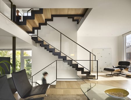
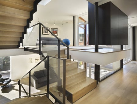
The interior features bleached and blackened oak, polished concrete and steel.

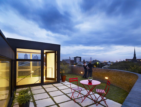
A roof terrace is enclosed by the top of the brick skin.

Here’s some more information from Qb:

Sited on a vacant corner in Philadelphia, this newly constructed house stitches itself into the neighborhood by responding to local cues.

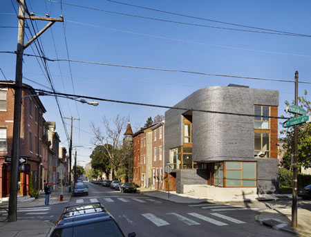
Curved brick corners negotiate the irregular street grid, while the cadence of typical rowhouses and a palette of brick volumes and stone bases are translated into a new vocabulary.

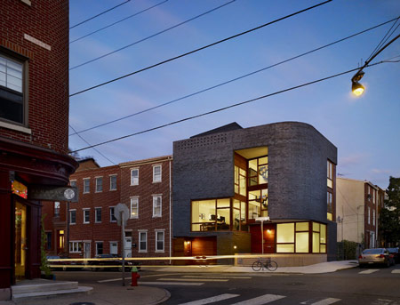
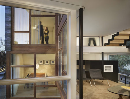
A three story brick skin wraps the glass-lined interior, forming intimate exterior spaces where the two diverge.

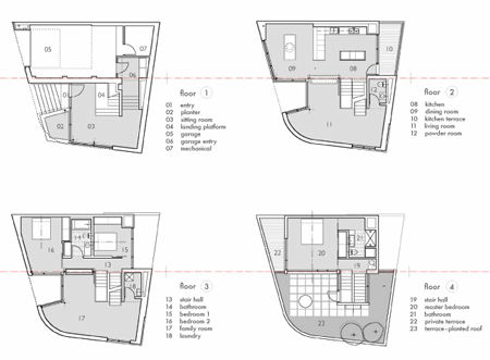
An interior palette of bleached and blackened oak, polished concrete and patinaed steel contrast the rich wood, hammered concrete and brick of the exterior.

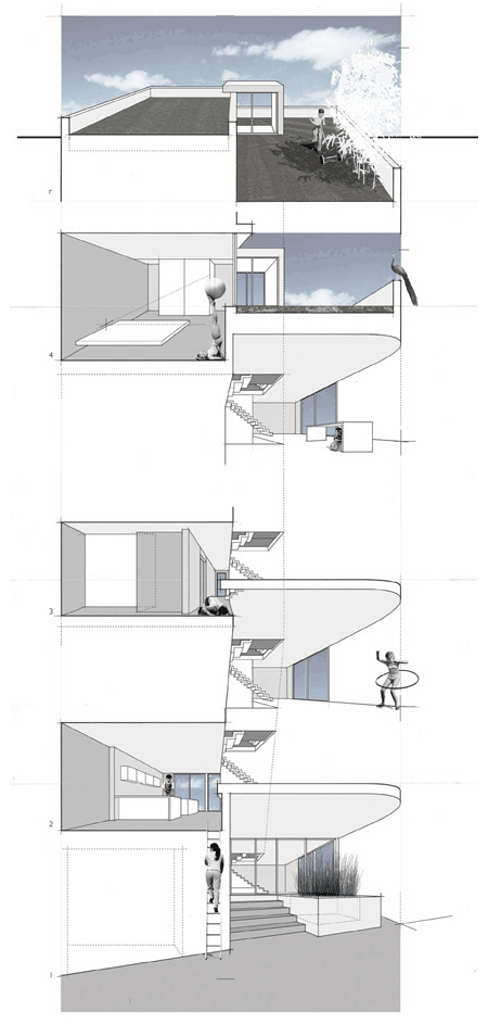
Floating just above the streetscape, the interior spaces wrap around the three-story glass entry, framing views out and back into the house. The brick skin shelters the interior and becomes the roof garden parapet, creating a sense of complete privacy.

One Response to Split Level House by Qb

  1. jeremy says:

    Beautiful

  2. prem says:

    exterior and interior with different concept. mild but could have been more balanced

  3. Messiar says:

    Beautiful project! Very vibrant configuration of spaces and contrasts between solid and void.

  4. Tyler says:

    From a preservation point of view, I love how it fits with the scale and mass of the surrounding buildings, yet remains contemporary. The interiors are spectacular, and that roof terrace is to die for. Excellent work!!

  5. Oliver says:

    I love split level housing … great way to use minimal space

  6. andy says:

    I can’t get over how much I’m digging this massing. Nice materials too. Harmony of int and ext could use some work, but whatev, it’s still a very nice little project.

  7. BenBen says:

    The external treatment reminds me a bit of some of Steven Holl’s work. That doesn’t mean I don’t like it though! Nice work.

  8. George says:

    One of the best designs I’ve seen for the urban enviorment!

  9. Nick says:

    Great design. That brick cuve is very sexy!

  10. lior says:

    Beautiful house and needles to say, a massive contribution to the street.
    I love the sculptural shape and the right balance of the material. It is simple and yet has a warm and “homey” feeling.

    general note: I realy hope that one day the plans will be published in a readable size

  11. Masie Brydson says:

    Visually it is less like a home and more like a working office & the bulky grey facade appears out of scale with the attached well proportioned brick town houses.

  12. LOW says:

    That is just bite-the-back-of-your-hand gorgeous

  13. DS says:

    Pseudo sectional perspective is quite enjoyable…

  14. anna mak says:

    Very interesting! It made it likes there is lots more room, magic~

  15. ADL says:

    WHATS THE COST PER SQUARE FOOT ON THIS BAD BOY… BEEN ADMIRING IT FOR MONTHS WALKING BY ON THE STREET. VERY ALVAR ALTO.

  16. Jason says:

    The form and materials used seem to reduce the visual weight and massing of the grey masonry cladding. Very well done!

  17. Q says:

    really nice, dezeen posted great projects this year, =)

  18. @Masie I agree it is out of scale with the surrounding buildings. I would be in love with it if it were just the same height as everything around it! It fails at integrating with the neighborhood by being the center of attention, though maybe increased verticality is a necessity of future architecture?

  19. Rutger says:

    The first photo and last photo is really good (great photographer), it seems the building does integrate with the surrounding building. The color of the wood matches the streetfacade. Then again I get totally distracted by the second-last picture, where there seems to be no coherence whatsoever and the building stands out as a massive object. Which is also the consequence of the harsh detailling.

  20. EDA says:

    Homey.

  21. yrag says:

    Beautiful! And in my own hometown!

    ADL, you write that you’ve walked past it for months.

    Where is it located?

    Initially, I thought Northern Liberties, by in photo five the distance to the Ben Franklin Bridge looks too far. Is it all the way up into North Philly?

  22. sullka says:

    wow….remember seeing the renderings about 2 years ago, and now it's built…..nice.

  23. Donna says:

    Love it, one reason I enjoy just walking through Nolibs whenever I’m in the area to shop.

  24. Martin says:

    Who can tell me what is the address of this project please?

Leave a Reply

Your email address will not be published. Required fields are marked *

*

You may use these HTML tags and attributes: <a href="" title=""> <abbr title=""> <acronym title=""> <b> <blockquote cite=""> <cite> <code> <del datetime=""> <em> <i> <q cite=""> <strike> <strong>