
Swedish architects Elding Oscarson have completed a modern house in a street of traditional terraced cottages in Landskrona, Sweden.

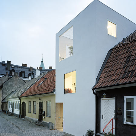
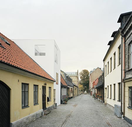
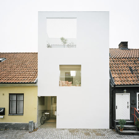
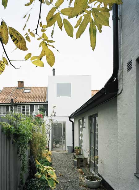
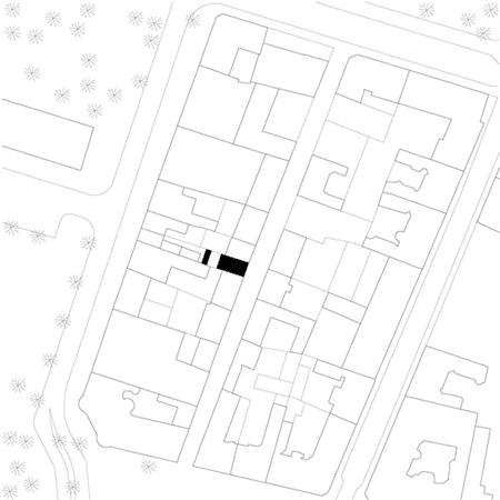
The house, which is just five metres wide, fills a gap in the street that has been vacant for over 50 years.

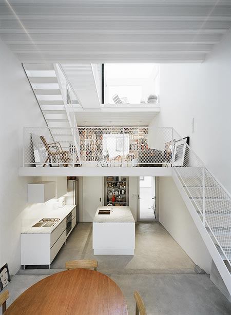
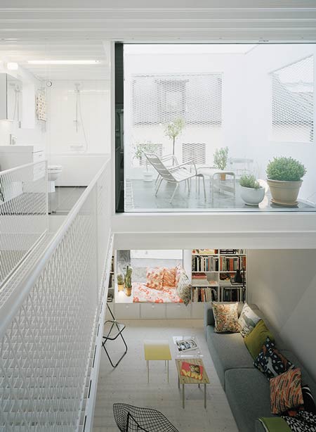
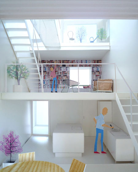
The interior consists of a single space, divided by three steel floor plates.

Photos are by Åke E:son Lindman.
Here’s some text from the architects:
–
The narrow site is sandwiched between very old neighboring buildings in Landskrona, Sweden. Since mid 20th century it has been empty, waiting behind a wooden fence. It is only 5 meters wide with a tiny area of 75 square meters.

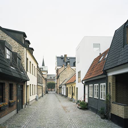
Immediately adjacent buildings are low, but the street is lined with buildings of various height, size, facade material, age, and approach. Behind the row of buildings is a colorful world of back yards, brick walls, sheds, and vegetation.

We find this small-scale, motely, naturally worn place extremely beautiful.

The building relates to the surroundings in scale, proportion and in the way it adds to the established rhythm of low and tall buildings along the street.

A perpendicularly inserted crow-step gabled house a few lots down the street is a particularly important ancestor. Yet, our aim is to create a razor sharp contrast, to express inherent clarity, but more importantly to highlight the beauty of the surroundings.

Our clients, a male couple that love art and run a café in a bigger city closeby, plan to settle here for good. They see the potential in this small town, beyond its current economic and social problems.

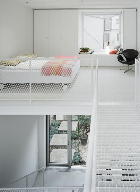
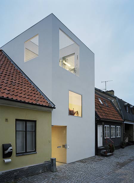
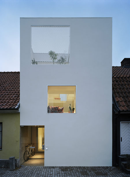
Compressed slab construction, unconventional ceiling heights, and the ground floor flush to the street level, permitted fitting three floors into a volume aligned with the neighboring rooftops.

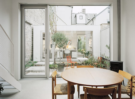
The interior consists of a single space, softly partitioned by three exposed steel slabs.

These span the entire width of the house and divide its program – kitchen, dining, living, library, bed, bath, and a roof terrace.

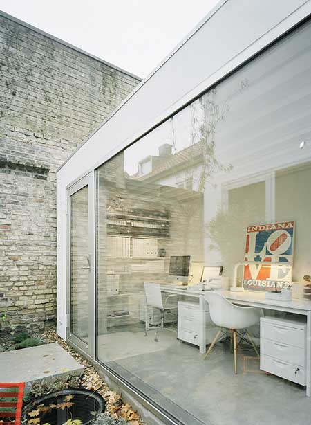
A home office for a growing side business of art dealing is located in a separate building across a small garden in the back.

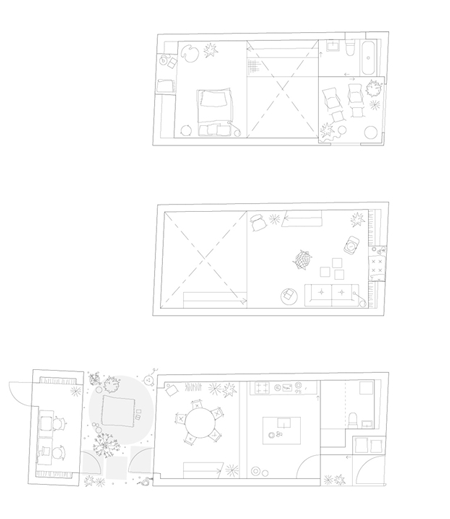
Mechanical and service spaces are housed next to a glazed entrance from the street.

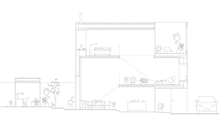
Our intention is to use small means to create an array of different spatial experiences in this very small project.

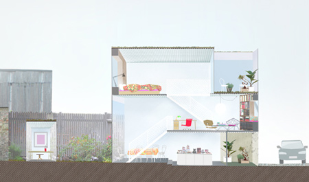
The division of the single space aims at a non-minimalistic and lively sequence of confined and airy spaces, niches, interiors and exteriors, horizontal and vertical views as well as carefully framed views of the site.

The continuous interior space is opening up to the street, to the middle of the block, and to the sky above.

The openness to all directions generates a building both monolithic and transparent.

All facades are treated equally, exposing the interior and offering views through the building with similar apertures whether on the front, back or sides.

The neighboring facades are closed, yet there is something deeply humane about their tactility, detailing, and ornaments. We want to contribute to the street with a faded border to the private sphere, with artifacts, furniture, plants, and patios; traces of human presence, consideration, and care.

Project: Townhouse
Location: Landskrona, Sweden
Architect: Elding Oscarson
Structural Engineer: Konkret
Builder: Skånebygg
Structure: leca-masonry, metal deck slab
Gross Floor Area: 125sqm
Construction Cost: 280,000 Euro
Completion: 2009
Materials/products
Structure: concrete foundation, leca-masonry, metal deck slab
Roof: Moss Sedum vegetation on inverted flat roof system, solid zinc edge detail
Finishing of wall inside and outside: amphisilan plaster coat, silicate paint
Glass and windows: Anodized aluminum sash, low iron glass
Heating system: Heat pump with return air heat recycling, waterborn floor heating throughout
Floors: Steel throwelled concrete topping slab treated with silicate sealant
Solid spruce floor, treated with pigmented lye and natural soap
Stairs and railings: steel, expanded metal mesh
Kitchen Saari/pinjasto


January 18th, 2010 at 4:01 pm
it seems lowered from the moon
I hope that with time it remains so (it is not in Portugal)
very attractive
January 18th, 2010 at 4:04 pm
Clean and light + +
side note – 280 k € seems a bit expensive unless I am mistaken
January 18th, 2010 at 4:07 pm
the house is lovely, though because of the location is becomes a bit of a minimalist attention whore
January 18th, 2010 at 4:12 pm
Too much violence… too much.
January 18th, 2010 at 4:17 pm
sanaa???
January 18th, 2010 at 4:21 pm
Just beautiful !!
January 18th, 2010 at 4:46 pm
This is a beautiful project/building. Never really been a fan of the whole white thing until this.
Bookmarked for the future…
January 18th, 2010 at 5:07 pm
wow, this literally blows me away, exquisite
January 18th, 2010 at 5:31 pm
lovely!
January 18th, 2010 at 5:37 pm
Japanese architecture is spreading worldwide !
January 18th, 2010 at 5:39 pm
when i saw this on the front page, i thought SANAA is copying itself.
January 18th, 2010 at 5:55 pm
comfy. Where can I get one?
January 18th, 2010 at 6:03 pm
I’m totally confused by the statement that by a “razor sharp contrast” they designed something to show how beautiful the OTHER buildings were.
Do you think they were successful? :)
January 18th, 2010 at 6:25 pm
Nice concept, the only disappointing thing is the balustrade which makes it feel like a bird view inside a cage. Otherwise the exterior façade is really cool and I liked how all spaces are connected;
January 18th, 2010 at 6:31 pm
To Eldin Oscarson Architects:
My first comment here is: you’ve created a beautiful corbusian house, the inner space clearly and cleverly articulated, and full of light. It must be a delight to live there. And I like the way you let the terracota-colored facade of the neighbor follow the depth of the entrance.
My next comment is not so nice: Take a second look at that street. By the pictures, it seems to be a place inspired on medieval design. If you pay close attention, you’ll notice that most houses are scaled horizontally, and then go on a crescendo until the vertical spire at the end of the street. That’s a kind of harmony that only time can give. Your aim is to disturb that harmony, as you yourself stated: “our aim is to create a razor sharp contrast”. If that’s what you wanted, the client wanted, and the city permitted, there’s nothing anybody could do about it. But then you go on to say: “but more importantly to highlight the beauty of the surroundings”, and “The building relates to the surroundings in scale, proportion and in the way it adds to the established rhythm of low and tall buildings along the street”, and yet “We want to contribute to the street with a faded border to the private sphere”. These are void attempts to validate your disturbance of that setting, to give this house the aesthetic right to be there. That’s dishonest, and you know that. We architects need to stop inventing excuses for our whims; that’s not instructive, not to mention ethical.
It is possible to create something different, yet contributing to the surroundings, as Michelangelo proved with his masterful intervention on the Campidoglio. But here, you killed a beautiful street with your beautiful house.
January 18th, 2010 at 6:35 pm
they bit sou fujimoto real hard
January 18th, 2010 at 7:04 pm
nice design
but i think they had already designed it for somewhere around tokyo!!
January 18th, 2010 at 8:02 pm
someone at the planning department got a nice brown envelope! cant imagine how this got planning permission!?? i think the locals would hate it.
January 18th, 2010 at 8:16 pm
from their website:
“Jonas Elding was an associate at Kazuyo Sejima and Ryue Nishizawa (SANAA), Tokyo, for 7 years, in charge of the design for the New Museum of Contemporary Art in New York.”
there you go.
January 18th, 2010 at 8:22 pm
Jonas Elding worked for SANAA between 1999 and 2007. He was administrating the project for the New Museum of Contemporary Art in New York among other things.
January 18th, 2010 at 8:42 pm
The SANAA similarity is not coincidental… Elding was project architect on SANAA’s New Museum in NY.
It’s certainly a beautiful house – but weren’t architects supposed to have learned, that copy/pasting International Style white buildings all over the world didn’t solve anything?
January 18th, 2010 at 9:57 pm
I wonder what the neighbours think.
January 19th, 2010 at 4:10 am
I’d love to see the town hall’s permit papers! And this building will stay white for how many months exactly?
January 19th, 2010 at 4:40 am
definately credible work nonetheless. Since so much about the context has been mentioned, it would be interesting to see how the grey side imprint profiles of the adjacent neighbouring houses on either side affect the white box. Seems like a missed opportunity.
January 19th, 2010 at 5:06 am
lovin the space, yet I totally agree with steve.
the locals would hate it.
January 19th, 2010 at 6:56 am
its nice
but
it changed the view ao its street and in my opinion its misplaced and may done in another street in a newer place by modern view.
kind
January 19th, 2010 at 8:29 am
i like it! Nice house, nice space!
but:
when do we get over that clean nice architecture has to be white?
It could have been plasterd yellow or black like the little house next to it. or done in brick!
why are europeans tying to run after paper architecture when you can take it more earthy. We don’t live in an earth quake country.
starting to hate the japanese white totalitarianism!
by the way – why do japanes (or jap. influenced people) always put the toilet right next to a glas wall to be seen? you minimalise and hide everything else. You thin it out, until it is a 4H pencil drawing and then you present the toilet as the only remaing clean high tech device like you are pooping pure silver?
January 19th, 2010 at 9:56 am
Very pleasing but a little more respect should have been shown towards the neighbours & their homes by putting it somewhere else.
January 19th, 2010 at 11:23 am
Beautiful work. I too would think that it could have been a SAANA project, but thats okay, they don’t hold a patent. Love the courtyards, clear visual connection and honesty about it’s time, well done in such a old context.
People in the street probably hate this project, for being too modern and not miming the neighboring buildings, but we need little surprises like this once in a while. Our cities shouldn’t be museums, just cities reflecting passage of time, and different stylistic periods, otherwise we will get bored living there. Overall thumbs up!
January 19th, 2010 at 11:36 am
i prefer kasuyo sejima, but she don´t have a site… aff!
January 19th, 2010 at 12:03 pm
@ Govan:
280 k € is probably correct. It is VERY expensive to build in Sweden.
January 19th, 2010 at 12:19 pm
I like it.. and the juxtaposition within the streetscape is interesting. The only thing is, I doubt it will be so interesting in 20 years time though.. :-/
January 19th, 2010 at 12:30 pm
@ everyone regarding site/neighbourhood/context considerations:
Actually the City Planning Antiquarian up until this spring, Örjan Eklund, worked with this area (dating back to 1750) just before his retirement. He worked hard to promote this project to the City Planning Office.
Loosley translated his standpoint to this project was (is) that we should 1. take care of what we have inherited and 2. that what we build today should reflect our own time so that future generations will get the full historic picture for them to take care of.
For beeing in sweden these are refreshing thoughts. Mostly everything built in Sweden are pastisches because of city planning directors and regulations. Sad but true. I.e. often flat roofs are prohibited.
But this project brings hope back.
Actually no neighbour filed a complaint :-)
January 19th, 2010 at 1:02 pm
i find it non detracting from the other buildings, for me they look just as beautiful and steeped in craft and history and some how their details are highlighted.., I think its because the building is simple in form.
Wondering if the locals are upset or not, any difference to life in the street etc.
January 19th, 2010 at 1:20 pm
It’s really fine detailing. Both the new and old buildings are beautiful. The contrast between them is really interesting. It’s inspiring! Looking forward to seeing their future projects.
January 19th, 2010 at 3:21 pm
forgot to say, i really like this house, seems very open and with lots of light, somehow looks very welcoming and easy to socialize in it.
January 19th, 2010 at 4:01 pm
Self-serving and temporal. A beautiful sculpture for living that ignores context and social responsibiliy. It is a tear in the fabric, and if the house down the street decides to build something similar the street will be rendered lost. Such is the plight of design in the modern age.
January 19th, 2010 at 4:33 pm
Since the city authorities allowed the change to take place in the area, they may have been aware that the street looks traditional in style but actually of little historical value. No? I wonder what if in the future similar flat-roofed houses are built on the adjacent plots and views from the 2nd-floor windows are lost. The planning is well suited to the clients’ lifestyle and congrats to them that the architect showed due concerns about their safety and used metal mesh to cover the spaces around the railings in disregard of designer’s preference for simplicity in details.
January 19th, 2010 at 6:06 pm
Nice but maybe in another place.
January 19th, 2010 at 6:20 pm
Please let’s just stop this already.
January 19th, 2010 at 7:28 pm
I like this white tooth in medieval jaw.
January 19th, 2010 at 7:44 pm
fine the house in it self is stunning, but truly how did they allow such inharmony? an d for over 300,000$ in urbans, thats alot after all the house is not gigantic.
January 19th, 2010 at 9:59 pm
Ten years from Now, someone’s probably going to put a gable roof on it.
January 19th, 2010 at 10:10 pm
Very eye-catching exteriors, not so much with the interior!
January 19th, 2010 at 10:33 pm
Wow, how totally inappropriate for the setting!!
As with others, I have no objections to the pretty design, but really? Look at the intrinsic beauty of the existing buildings….. how on earth did this one get through?
Just because we can, doesn’t mean we should.
January 20th, 2010 at 7:54 am
I see a lot of comments here and there about the context.
The fact such a house was allowed to be built there brings hope I think, shows that there are still smart people who think there is better to do to preserve the existing urban fabric rather than trying to mimic old buildings. ..
Perhaps none of us would have considered how nice the existing houses looked without this intervention, somehow doesn’t it reveal the beauty of the street?
January 20th, 2010 at 8:35 am
If you remember Ando was awarded in 1976 for breaking the “row” with his concrete architexture, and what has happened to the street since….in a different context.
January 20th, 2010 at 10:50 am
Jeez! if i read one more comment on ‘how it doesn’t fit in blah, blah, blah’. Open your eyes, , is there consistent colour of render, roof tiles, storey height or roof line in the street – no, no, no, no!
Are medieval towns typified by standardised plots size, height and age, – er no, no, no!
Its the beauty of a medieval town! The aesthetic eclecticism of a built environment that has evolved over a long period of time, with buildings built, adapted, differing plot sizes, differing ages, differing materials. The only thing a building really has to do is not be to big and violate the range of scales found within the vicinity – which this doesn’t.
I think this building is amazing – responsive yet doesn’t succumb to an architectural language of lies from excessive deference to its surroundings other than (crucially) through it’s scale.
January 20th, 2010 at 2:03 pm
It is not a valid proposal for the street. The House broke with the profile, the typology and the environment, I consider it a bad precedent for Landskrona.
We are creative and innovative architects and I think it is easy to validate this proposal in another place.
January 20th, 2010 at 4:30 pm
eh? i don’t really see how a house breaks the house typology. houses are housey type of buildings because of the way they’re used, not cos of their formal characteristics.
nice house. but it does look like an sanaa replica, a good one mind you.
January 21st, 2010 at 11:06 am
Everyone has become so used to their dogma of context they can no longer see. Great project and I love the contrast. Stop living in the past.
January 22nd, 2010 at 6:23 pm
Far too industrial for my liking.
January 23rd, 2010 at 12:09 am
Great contrast, it works very well.
January 24th, 2010 at 9:52 pm
Did anyone spot the door to the toilet???
I can’t figure it out where it is and it does look hidden to me but simply does not exist.
Gosh, imaging being a guest in this house….
January 25th, 2010 at 1:28 pm
if i live over that street.. i hope its in the white house
January 25th, 2010 at 7:36 pm
This will seem unrelated, but I really wonder why that spot was empty for the last 50 years.
Afterall the white house can exist there because that spot was already empty, right? Could it have been built had there been a recent demolition? If yes, then the region is not so historic(al, whatever) and so there is no point in fretting about change here, because change there will be. If the answer to the question is no, and the house’s existence is only a matter of opportunity, then there is no need to worry, as this incident will not repeat, and the neighborhood will stay the same as long as the current regulations are in effect.
I do wonder the story behind the empty spot, though.
April 29th, 2010 at 9:23 am
awesome. i would love to live in a house like this some day.
May 3rd, 2010 at 11:19 pm
nice object…wrong place…
nice place…wrong project…
just dont fit !!!
June 11th, 2010 at 6:42 pm
This house got a prize from Landskrona city!