
Architects Standardarchitecture-Zhaoyang Studio have completed a visitors centre next to a river in Tibet.

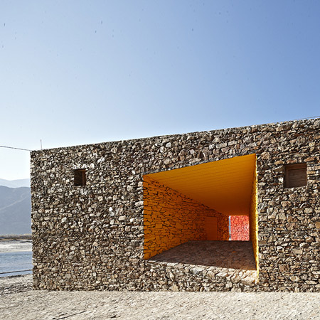
The building was constructed using local vernacular techniques and brightly coloured pigments from local minerals have been painted directly onto the stone walls of the interior.

Called Niyang River Visitor Center, the building contains a ticket office, changing room and bathroom.

Photographs are by Chen Su.

The text below is from the architects:
Niyang River Visitor Center
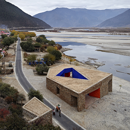
Mirui Road is a tourist road that meets Highway 318 connecting Tibet and Sichuan province. This road meanders southwards along the Niyang River. Within this 20km distance to the Brahmaptra Canyon, the specific terrain and landscape of Niyang River can be enjoyed from the road. Daze Village was chosen to be the entrance to this tourist attraction. There is little land left for further development in this village, therefore the river beach along the road was the only choice for the site of a tourist center.

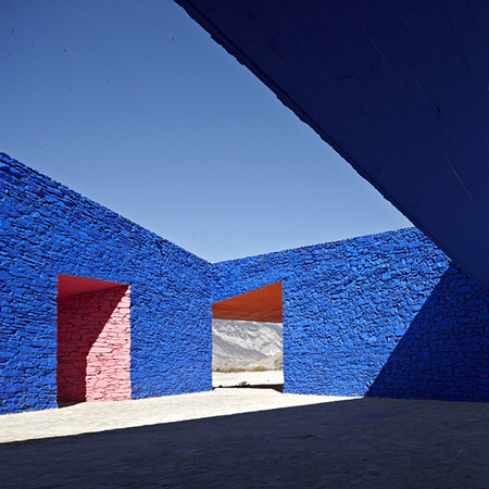
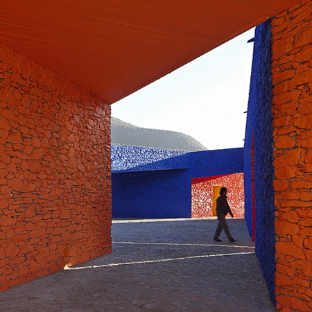
The road separates the river beach from the nearby mountain. How to establish relationships between an isolated building and its surroundings is the main concern of our design. The building’s exterior boundary is a response to the border conditions. The inner public space is “carved” out from the irregular-shaped volume. The central courtyard connects four openings, responding to the orientations and circulation. The left over mass after “carving” accommodates three major interior functions- a ticket office, a dressing room for rafting and toilets. This seemingly arbitrary plan is actually shaped by circulation, program and site conditions. The geometric character of the volume and space forms a dialogue with the surrounding landscape.

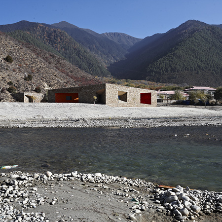
The construction of this building adopted and developed the techniques of the Tibetan vernacular. On top of the concrete foundation a 600mm thick load-bearing wall is erected. Most openings have deep recessions. The 400mm thick walls at both sides of the openings work as buttresses, increasing the overall structural stability and reducing the interior span as well. Beams for bigger spans are made from several small logs bonded together. A 150mm thick layer of Aga clay covers the waterproof membrane. Aga clay is a vernacular waterproofing material. It stiffens when tampered with water and works as another layer of waterproofing and heat insulation. Its plasticity allows gutters to be shaped. Roof drainage is well organized with these gutters and channel steel scuppers.

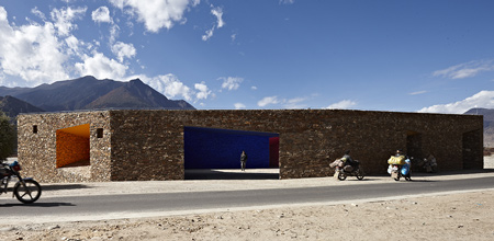
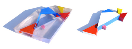
Color is a crucial element of Tibetan visual culture. We introduce a color installation into the building’s inner public space. The local mineral pigments are directly painted on the stone surfaces. The transitions of colors highlight the geometric transitions of space. From morning to dusk, the sunshine changes its direction and altitude angle, penetrating through the different openings. When passing through the building, people perceive ever-changing color combination from different perspective and at different time. There is no cultural symbolism in this color concept. These colors are abstract. They multiply the spatial experience and also work as an performance of colors independent from the concept of architecture.

Location: Daze Village, Linchi, Tibet
Client: Tibet Tourism Ltd.
Floor Area: 430 m²
Structure System: Stone Load-bearing Wall + Timber Roof
Cost: 1,000,000 rmb
Design Phase: Jan.2009 – May. 2009
Construction Phase: Jun. 2009 – Oct. 2009
Architect: Standardarchitecture-Zhaoyang Studio, Beijing, China
Design Team: Zhao Yang, Chen Ling
Critic Team: Zhang ke, Zhang hong, Hou zhenghua
Photographer: Chen Su


March 19th, 2010 at 2:08 am
love it! so simple and beautiful. eat it Zaha
March 19th, 2010 at 3:31 am
Only 2 words : 漂亮 !
March 19th, 2010 at 3:47 am
I would have preferred just the one orange path. The blue was a bit much for me.
March 19th, 2010 at 4:22 am
wow, this building is incredible!
the manipulation of perspective
the basic color composition
and all incorporated within raw materials!!
who ever thought of this is great and should design in Philadelphia
wow
March 19th, 2010 at 5:26 am
Nice hombre !
March 19th, 2010 at 5:58 am
This is so cool… I can’t take it.
March 19th, 2010 at 7:08 am
First of all: FREE TIBET!
But it’s a good sign if chinese creatives deal with tibetian culture.
I like it very much: pure, modern and traditional and fits very good into the landscape by being iconic in the same way.
March 19th, 2010 at 7:41 am
Faorms are very interesting, but colours are too agressive! If I traveled to the mountains, I would not want to see these colors..
After 2 years of snow storms and rain this building will be more attractive!
March 19th, 2010 at 7:54 am
impressed………..! :)
March 19th, 2010 at 8:21 am
Beautiful project. A little bit of reverse logic. Where open landscapes attracts the visitors, close the space within the visitors space with almost No connection to the subject-nature. Perhaps it helps raise awarenss about the rest of the nature such as sky. Perhaps it may have been betler to opt for a single roof… project.
March 19th, 2010 at 9:07 am
that looks just fantastic!
March 19th, 2010 at 9:11 am
beautiful. simple yet quite amazing. haven’t seen colors used so skillfully in such a setting since Luis Barragán’s time.
March 19th, 2010 at 9:35 am
so peaceful…. it bleds in into the enviroment
beautiful
March 19th, 2010 at 11:10 am
i love the colours!give another dimension to the building and the landscape!
March 19th, 2010 at 11:10 am
Simple and nice. Love it.
March 19th, 2010 at 11:27 am
wow) looks unreal… unexplainable feelings
yeah, kind of another dimension…like a lost martian town
March 19th, 2010 at 11:39 am
beautiful project. Nice colors and very fresh.
March 19th, 2010 at 11:39 am
I agree with @Shawn. Like the first pic best :)
March 19th, 2010 at 12:28 pm
Indeed, free tibet. But what a remarkable building. Beautifull entourage and scerery also!
March 19th, 2010 at 12:36 pm
Sublime
March 19th, 2010 at 12:43 pm
Piranesi – M. C. Escher – Faberge – all come to mind with this project.
The unfolding of space or unwrapping of space to reveal a sensory spatial journey is tantilising indeed.
March 19th, 2010 at 2:33 pm
Loved it. The bold use of vivid colors reminded me of Rietveld and Ettore Sottsass.
March 19th, 2010 at 2:42 pm
The stone is gorgeous and the setting is amazing! The colors are bright but being the natural pigments of the region incorporates a true richness into the building. It is serene and interesting.
March 19th, 2010 at 4:39 pm
Barragan would be proud of the colour scheme – I still don’t think they work in such a environment, but as was mentioned above the weather and time will clean it up a bit. The maze of cut outs and paths are confusing and based on the photos I can’t see it’s relation with any landmark or natural feature. Seems like a simple exercise of cutting voids out of a solid form in a random manner. Or perhaps a metaphor of what Chinese imperialism has done to Tibetan culture – howled it out with empty promises of brighter future? Time will tell – perhaps the interior will turn red with the passing of time
March 19th, 2010 at 8:16 pm
wow. the power of color.
March 19th, 2010 at 10:50 pm
This is a Corbusian masterpiece! Simply amazing!
March 19th, 2010 at 11:06 pm
cool. happy colors are always nice.. but where are the interior images?
March 20th, 2010 at 9:10 am
空间、时间、颜色,三个元素都考虑进去了。非常棒的作品!
March 20th, 2010 at 1:52 pm
Superb! I don’t understand the criticisms about the use of color. The project description states that “Color is a crucial element of Tibetan visual culture.”
March 21st, 2010 at 11:20 pm
The colours that are used are part of Tibet culture and it suits the building well. The way only the interior was painted, gives respect to the surrounding landscape by leaving the exterior in the raw form. The angles are carefully thought out and from certain perspectives almost seems to flow with the surrounding jagared landscape lines. Have to give props to the use of natural local materials and respecting the courtiers vernacular architecture! Well Done.
March 22nd, 2010 at 3:52 am
This building is beautiful. They used the color in a strange way. It seens kind of magical, like a dream.
March 23rd, 2010 at 1:26 pm
beautiful! but why these colours? why would you?
March 23rd, 2010 at 3:53 pm
sorry, it would be a lot better without paint¡¡¡
March 24th, 2010 at 9:01 am
a dream
March 24th, 2010 at 9:41 pm
Keep the colors only on the walls in the recessed space. Leave the courtyard stone wall unpainted. That will be a much better and stronger design.
March 25th, 2010 at 3:10 pm
The architects would like to thank Claude Parent for his ideas of habitable circulation and the function of the oblique…and Luis Barragan for his ideas about chromatic planes…Without them our project would not have been the same.
March 25th, 2010 at 4:11 pm
beautiful!
March 25th, 2010 at 7:00 pm
Beautiful! I personally love the bold use of color… reminds me of Barragan…
March 25th, 2010 at 7:29 pm
fantastico!! bellissima idéia!!
March 25th, 2010 at 9:13 pm
I love how the architects have translated the colours of local pigments and applied them.
For those who don’t ‘get’ the colour, then perhaps you don’t know Tibetan culture? Orange is a dominant colour in textiles and you just have to look at the Tibetan flag to get a vivid blue reference.
March 25th, 2010 at 9:32 pm
i would change the paint for colour glass…
it’s perfect shapes combination…
March 25th, 2010 at 11:24 pm
…this colors….in the stone…
its horrible!
March 26th, 2010 at 2:08 am
A building to contemplate. Love the design elements and in particular how they empathise with the surroundings. The elevated photo to me, shows the perspective and how it harmonises with the other visual elements in the photo. I guess that being in Tibet they know whether flooding of the river takes place. Hope that folks get to see the building from that elevated perch d;-)
March 26th, 2010 at 12:43 pm
Remedios the Beauty, Zhao Yang, a true beauty indeed. Congratulations!
March 26th, 2010 at 1:40 pm
muy innovador con la combinación de colores se parece mucho al conjunto de colores que hace el arquitecto Luis Barragan
March 27th, 2010 at 8:21 am
formalism. the stone is too much and the color is too strong!
March 28th, 2010 at 1:38 pm
c’est superbe, juste là par pure beauté, ça fait aimer l’architecture!!!!!
April 1st, 2010 at 7:18 pm
good shots and perspective angles.
April 3rd, 2010 at 9:16 am
beautiful
April 5th, 2010 at 1:43 pm
fantastic!! the use of perspective, materials and colors… it is perfectly integrated with the river and mountains… great job!!!
April 5th, 2010 at 7:03 pm
If you know Tibetan Art you also know that that particular shade of blue is the most beautiful and powerful color there is, and the most expensive. It’s granulated Cobalt.
It is as much brutal as it is beautiful. Perfect
It should be photographed in Winter when the snow will cover the ground, then the colors and the stone will show their full strength.
April 12th, 2010 at 9:05 am
Mixing the time, space, color, terrance, comparison and Fongsui together, it’s such a beautiful artwork in the mystic Tibet. The sky, earth, human, soul and air mingled with each other perfectly and harmoniously. Three steps a view and five a landscape. More appreciation more understanding on appreciation. It is real art :-)
May 20th, 2010 at 4:42 pm
very good