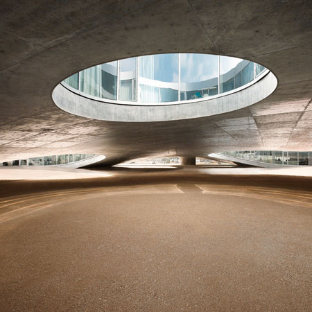
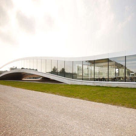
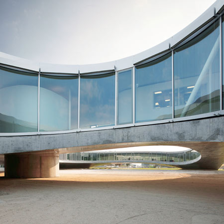
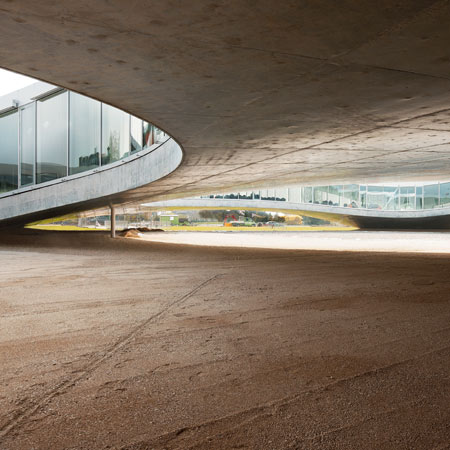
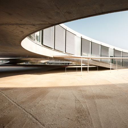
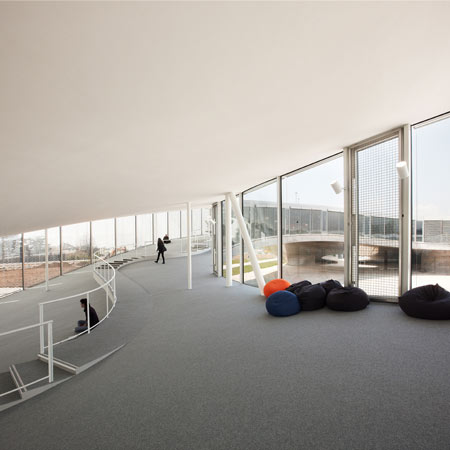
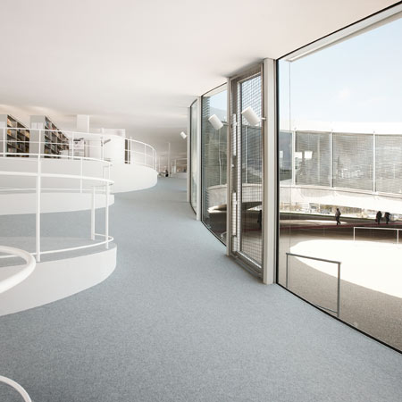
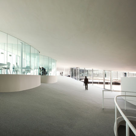
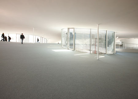
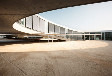
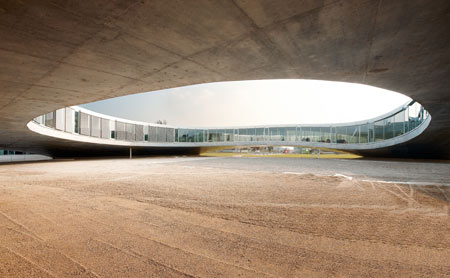
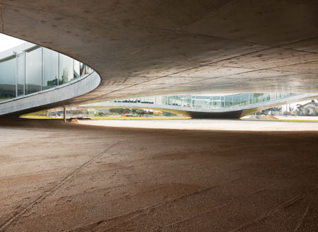
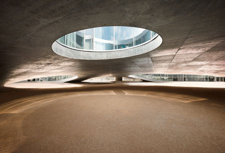
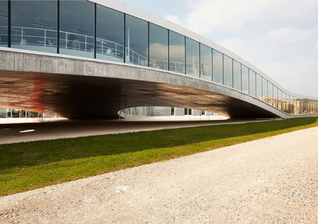
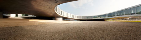
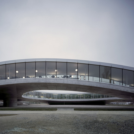
Rolex Learning Centre by SANAA
Photographer Julien Lanoo has sent us his series of the Rolex Learning Centre in Switzerland, designed by Japanese architects SANAA.
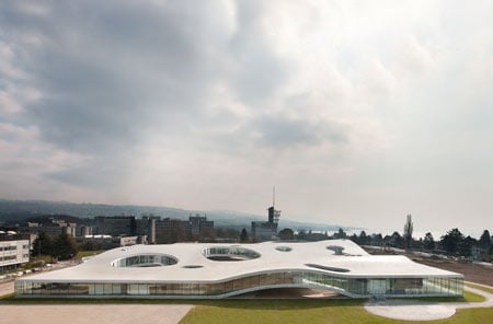
The centre opened in February and is located on the campus of science and technology university EPFL (Ecole Polytechnique Fédérale de Lausanne).
More information about the building in our earlier story.
See also:
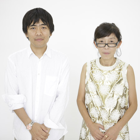
SANAA win Pritzker Prize
Selected projects by SANAA
All our stories about SANAA


See also:
.
 |
 |
 |
| More about this project |
All our stories about SANAA |
More photography stories |