
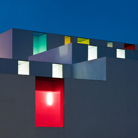
Spanish architect Alejandro Munoz Miranda’s kindergarten in Granada is designed for children up to three years old and has windows in rainbow colours.

It is built around a central courtyard onto which all the classrooms open.

Communal spaces such as corridors are scattered with multicoloured light while the windows in classrooms are colourless.

Photographs are by Fernando Alda.
The following information is from Alejandro Muñoz Miranda:

EDUCATIONAL CENTER EN EL CHAPARRAL, ALBOLOTE (GRANADA)
The project is designed as a variable section of wall and ceiling that involves compressing and decompressing the space accommodates.

The change of section depending of the uses (corridor / access-bathrooms / classroom / porch (outside covered corridor) / garden and outside covered playground), the sun’s movement and the longitudinal slope of the plot are responsible to design interior spaces that open to garden and outside covered playground.

The compression-decompression game makes its effect when changing space both longitudinally and transversely in the sequences: corridor / access-bathrooms / classroom / porch / garden-outside covered playground (across) or classroom / bedroom / classroom (longitudinal).

The orientation in space makes the classroom uncompressed glass cracks appear in the upper corners of South tightening diagonal space in the North to the ground facing the interior garden and covered with large windows.

These fissures South controlled light will be colored (rainbow color gamut) in dynamic areas of the corridor or in the outside covered playground. Inside the classroom, these cracks will be light South colorless glass.

Versatility also arises in the operation of classrooms by level of education (two classrooms for children from 0-1 year with bedroom, two classrooms for children from 1-2 years with bedroom and three classrooms for children from 2-3 years without bedroom).

It is proposed that all classrooms in the same level can raise the possibility of creating more space for group activities, show themselves to the spatial continuity of the upper parts of each room separated by glass.

Moreover, the idea that everything revolves around outside covered playground, and makes it as the heart of the educational center, which is linked by a continuous covered porch on the garden with all classrooms. Inside, the outside covered playground connects to the classrooms with the corridor on the South side. To the East lie the kitchen and dining areas, administration and gym closely linked to the corridor.

Outside, the use of white massive volumes makes the integration is adequate in El Chaparral, a district of Albolote that emerged as village of colonization in the 50s.
Click for larger image
See also:
.
![]() |
![]() |
![]() |
| School Complex by Mikou Design Studio |
Public School by GRG Arquitectos |
More architecture stories |


June 18th, 2010 at 5:32 am
cool!!! colour s in corridor make humans serenity
June 18th, 2010 at 5:41 am
Such a simple solution can make the space looks more lively. Great job!
June 18th, 2010 at 7:16 am
very whimsical and architecturaly exciting. it looks great
June 18th, 2010 at 7:26 am
Looks so simple on the plans, but amazing results by playing with light for the purpose of a kindergarten! Love the ‘frameless’ windows!
June 18th, 2010 at 8:43 am
These colors could cause mental problems
June 18th, 2010 at 8:52 am
woohoo, cant believe im the first to comment
June 18th, 2010 at 9:25 am
Brilliant use of colored glass to pimp a white straight-forward building !
June 18th, 2010 at 10:02 am
I’d love to send my kids to a kindergarden like this. Very well done Alejandro.
June 18th, 2010 at 10:39 am
If ever there was a case for User Centered Design in architecture it would be for a kindergarten.
As an adult, I like this building; but would a 3 year old child? Some of the ceilings look as if they have no support. Large, scaleless corridors could be very intimidating. Massive areas of coloured light could be scary.
June 18th, 2010 at 12:19 pm
Sorry Jamesjab…
Very austere except for color so it would be nice to see pics with children. I wonder about large sheets of glass that children might run into them. From a strictly formal viewpoint, great work.
June 18th, 2010 at 2:26 pm
I was really loving this until Martin Duys mentioned a very interesting aspect.. this appeals to me as an adult but a kid could really find this intimidating!
June 18th, 2010 at 5:36 pm
The use of colours in that corridors are quite similar to the ones you can see in most works of architect Luis Barragan.
http://www.arcspace.com/exhibitions/barragan/quiet_revolution_ex/
Anyway, the project is nice and carefully designed.
June 18th, 2010 at 8:03 pm
love these guys, except for their use of colored glass. they they do themselves a disservice here. the accurate perception of space is totally distorted by colored light. created by this glass. take a look at the corridor as a case in point. most unfortunate.
June 19th, 2010 at 7:42 am
Kids are tougher than you think. I took architecture up because as a child I already loved modernism. One of my favourite things was to discover how the scale of public buildings was so much bigger than that of houses – metro stations were my absolute favourite, and I loved the long corridors.
Plus these corridors are not scaleless – there’s windows, and there’s doors, and there’s repetition.
At any rate, I think the building is rather good but I’m not so sure about the use of colour. It doesn’t really make much sense other than to make the corridor dark as if this was some Corbusian church. It’s not bad, but it could be any other way.
June 19th, 2010 at 9:52 pm
looks to me like so many toys supposedly designed for children but actually marketed to attract adults – to see this in a kindergarden is irritating … colour coded for an adult eye – i shall hope that the toddlers will soon pick up the crayons and decorate at least the walls, their style.
June 22nd, 2010 at 10:30 pm
Great! I would be interesting to see children playing thou. The 10th picture reminds me of “the green mile”. Not the best picture!
June 24th, 2010 at 9:37 am
Kindergarten or DISCOTHEQUE??? By all means I am talking about the colours of interior. Some MUSIC is missing!