Warrnambool Campus Building by Lyons
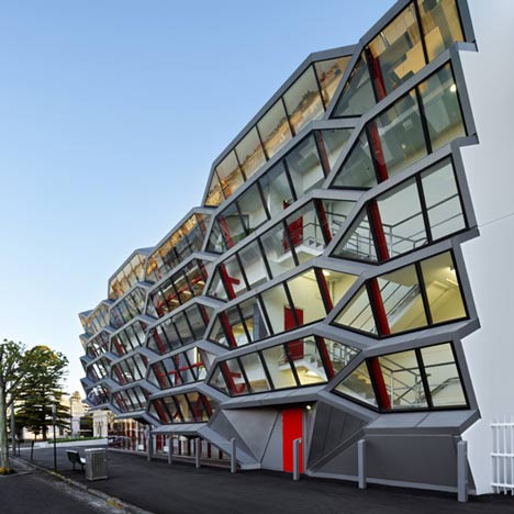
Australian firm Lyons’ new campus building for a college in Warrnambool, Australia, has a glazed façade made up of hexagonal apertures tilted down towards the street.

The new building acts as a threshold between the town and private campus, and will house accommodation, offices, lecture theatres and meeting rooms.

The glazed apertures have a steel structure finished with zinc, and provide solar shading and natural ventilation.

The main entrance is through a glazed wall underneath the apertures.

To the rear of building is an enclosed courtyard.

The college, near Victoria, is one of five across Australia that form South West TAFE, a further education institution.

Here's some more from the architect:
This project is the third stage in the redevelopment of South West TAFE’s Warrnambool Campus, and meditates between the civic space of the town, and the private interior space of the campus.

The building is approximately 2,870sqm of floor space, over three levels, and accommodates a diverse brief including; campus student services on the ground level, the campus administration and directorate on the first floor, and a conference centre and other general learning spaces on the third or upper level.

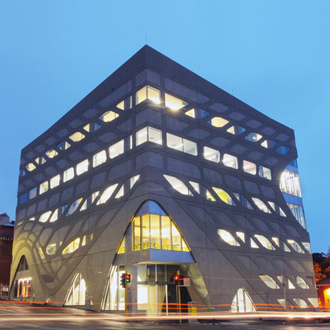
The project required a permit from the Heritage Council of Victoria, due to its adjacency to the heritage listed Warrnambool Court House.

The principal entry façade to Timor Street faces due north, and its context and orientation suggested a couple of key design strategies.

Firstly the primary circulation of the building is located on the street, as an extension of the civic space – like the footpath repeated across three levels. This is combined with the concept of the self shading wall, accommodating the parameters for environmental performance of both shading and natural ventilation; and allows the street façade to be both shaded and transparent, making the circulation visible onto the street.

To achieve these objectives materials were sourced for the shading geometries. The profile of expanded metal was expanded to a gigantic scale – one that works with the street. The finished profile is clad in zinc, in order to negotiate the valleys and peaks of the geometry.

At an urban design scale, the rhythm of the geometry can be seen to stitch up the street and the two adjacent heritage buildings.

At the scale of the building, the internal circulation stairs are co-ordinated to the geometry of the façade, further amplifying the sensation of connecting the circulation with the street.

Click above for larger image
The building is entered via a glazed wall formed underneath the major circulation stair, and leads to the student service centre, and then continues through to the rear campus courtyard space.

Click above for larger image
From the foyer, the stairs rise up through the street wall to a series of student spaces, where students self organize into informally learning activities.

Click above for larger image
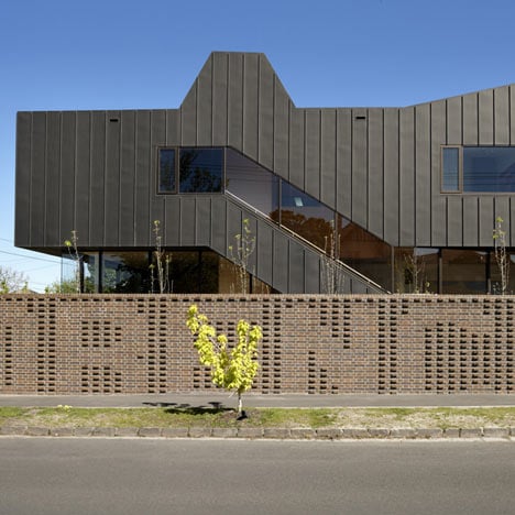
The interior courtyard space, to which this project provides half the boundary, (previous redevelopments provide the other half), is designed as a quiet space, with primarily solid walls in metal cladding, contains figurative windows which echo the generating geometry to the north.

Click above for larger image
The building contains core sustainability practices. These include the design concept of the northern façade, the use of natural ventilation and mixed mode for the circulation spaces and storm water harvested off the roof and landscape works for use in irrigation across the campus.
See also:
.
 |
 |
 |
| Menzies Research Building by Lyons |
Lyon Housemuseum by Lyons Architects |
Mornington nursing home by Lyons Architects |