SBF Tower by Hans Hollein
Architect Hans Hollein of Vienna has designed this high-rise office tower for Shenzhen, China.

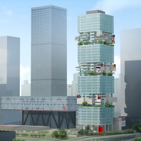
Called SBF Tower, the 200 meter-tall building will have 42 storeys.

These will be divided into alternating zones, with six glazed storeys that have identical floor plates followed by five plates with irregular plans forming terraces.

This pattern will be repeated up the building.

A building around the tower's base will house the entrance, a business centre and restaurant.

More Dezeen stories about Shenzhen:
Vanke Center Shenzhen by Steven Holl Architects
Shenzhen International Energy Mansion by BIG
Shenzhen Crystal Island by OMA and Urbanus
Shenzhen 4 Tower in 1 by Steven Holl Architects
China Insurance Group headquarters by Coop Himmelb(l)au
Museum of Contemporary Art & Planning Exhibition in Shenzhen by Coop Himmelb[l]au
Shenzhen Stock Exchange by OMA
Shenzhen International Airport Terminal 3 by Massimiliano and Doriana Fuksas

Here's some more information from Hollein's office:
Shenzhen / China
SBF Tower
The office tower has a strategic position within the texture of the city.

Click above for larger image
Adjacent to the Town Hall and its main North-South axis, and located on East-West oriented Shen Nan Avenue, it has the pole position in the central quarter in Shenzhen, where in midst the stock exchange building dominates.

Click above for larger image
The SFB Tower building contrasts to the stock exchange building. In actual fact it contrasts to any highrise in the vicinity because it is different. With its memorable design in an exposed corner position of the cluster, it becomes a dominant statement within the highrises.

Click above for larger image
The tower building in plan is a simple square of 45 m x 45 m, with 42 floors and an overall height of 200 m and it features a total floor area of 80.500 m² above ground. A skirt building partially frames the tower in the base zone, where the entrance area, the public business hall and a high class restaurant are located.

Click above for larger image
The tower building itself rises on top as a highly sculptured building with vertical gardens integrated in the architecture such giving the tower a very distinct appearance talking of alternative workstyle and sustainability.

Click above for larger image
Vertically the tower is a layered structure featuring two different zones of 5 to 6 floors each which repeat alternating 3 and 4 times. One such zone has 6 identical floors with a square outer perimeter.

Click above for larger image
But the other zone of 5 floors is highly complex in its outer appearance. Each individual floor is seemingly different; deep setbacks and far outreaching cantilevers interchange along the imaginary façade line and are overgrown with plants.

Click above for larger image
These sky garden-levels also have the advantage that their purposely versatile outer appearance is very flexible and can easily answer individual situations. The main entrance lies in the north with a covered drive up. A ramp leads to the underground parking in the northwest of the access street in the west.

East two way exit ramp from the underground parking also connects up with the road system. A symbolic feng-shui door is positioned at the south eastern corner. The entrance lobby with the adjoining business hall has luxurious dimensions with tall spaces and interesting volumetric situations. The materials used are elegant surfaces of stone and wood, glass and metals.
See also:
.
 |
 |
 |
| Shenzhen Crystal Island by OMA and Urbanus |
Vanke Center Shenzhen by Steven Holl Architects |
Beirut Terraces by Herzog & de Meuron |