Hermès Rive Gauche by RDAI
French architects RDAI have completed this new Paris boutique for fashion brand Hermès inside a 1930s swimming pool building.

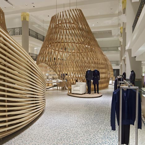
Hermès Rive Gauche features three nine-metre high wooden pavilions made of ash laths, each housing the Hermès collections.

A fourth wooden structure lines the staircase leading visitors from the entrance into the former pool.

The floor of the pool area is covered with mosaic tiles.

More about Hermès on Dezeen »
More retail on Dezeen »

Photographs are by Michel Denancé unless otherwise stated.

Here are some more details from Hèrmes:
Hermès has entrusted the RDAI agency, which is reponsible for designing all the Hermès stores worldwide, with the design of a new space, singular and unexpected in Paris. Hermès is setting up shop in a swimming pool... An immense volume, empty. An impression more of space than of surface area. And now, at the end of a project that added but did not take away, the Lutétia swimming pool, in the heart of the Saint-Germain- des-Prés quarter of Paris, has metamorphosed into the first Hermès boutique on the Left Bank.

The architectural project led by Denis Montel and the teams at RDAI mixes contrasts and complementarities. It was imagined more in terms of volume than surface area, in m3 more than in m2. In the end, it is an intervention both radical and astonishingly gentle.

Listed as a Historic Monument since 2005, the swimming pool built in 1935 has a strong architectonic character and a compelling identity, that of Art Deco – it is in the spirit of its age. After its closure, the swimming pool underwent varied and diverse uses and was transformed. The challenge was to translate some of the values intrinsic to Hermès into space: heritage and modernity, savoir-faire and creation.

The project has a double aim. First of all to respect, conserve and reinterpret the architecture of the swimming pool.The only important modification was the covering of the pool by means of concrete composite floor slab supported by a light structure. Underneath, the pool has been integrally preserved. The facade, giving onto the rue de Sèvres, has kept its original appearance.

Then, to tell another story, one that is resolutely contemporary.This takes form through the appearance of three monumental ash huts which both disrupt the existing volumes and converse with them.The invasion of what was once the pool by these huts, flexible, light and nomadic, suggests the creation of houses within the house.

A change of scale, an invitation to wander, to drift, which produces a powerful magic... Everywhere the movements seem natural, they are fluid, rippling.The shimmering of the water that was once here is evoked in a subtle way in the tones of the mosaics, in the effects of the lights... What existed and what has been added converse in a strange harmony. They are whole, they are complementary.

The Entrance
At the foot of an elegant apartment building from the mid 1930s, the facade of the Hermès store is discreet.An entrance portico in the centre between two windows, nothing to hint at the surprise awaiting once through the doors...

The entrance is like a lightwell overturned, horizontal, which attracts one irrevocably towards the light at the back, towards what was the Lutétia swimming pool.The entrance to the store must function like a delicious trap into which the visitor lets himself slide, from crossing the threshold of the doors on the street until he reaches the swimming pool and its strange inhabitants, the huts.

To guide him, the perspectives are accentuated and modified by an imperceptible contraction, rather like the sides of the Médicis fountain in the Luxembourg garden. The lightly inclined ceiling, the walls curved and leaning inwards, covered with oak laths that leave recesses open as if floating in matter. An introduction full of mysteries inciting one to plunge into this new Hermès house.

The Huts
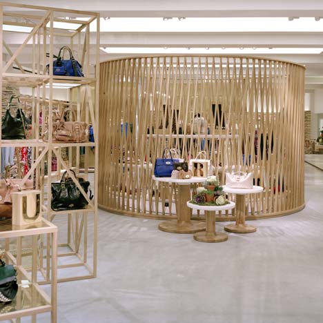
Four pavilions with an organic design, in which some will recognise familiar forms from the plant or animal world, or from childhood... Others will liken these huts, which occupy the volume of the swimming pool, to the nests of tisserin birds.These pavilions of different form and dimensions are constructed in ash wood. They are self-supporting structures that rest on a system of woven wooden laths (profile 6x4cm) with a double radius of curves. The documentation and three-dimensional drawing of the complex geometry of each hut was made possible by the computer script written for each one of them.

Rising to more than 9 m in height, they lean progressively, as if attracted by the skylights. The huts house the Hermès collections. They seem to have simply alighted on the ground, lending the project its nomadic dimension.

The fourth hut, which appears to be lying down, lines the staircase that naturally leads the visitor towards the pool and forms the link between the entrance and the open space of the swimming pool.

The Lighting
In such a volume, the lighting is crucial. The entire space is bathed in natural light that penetrates through the three large skylights above the atrium, softened only by a metal screen. At night the skylights are lit to avoid a “black hole” effect.

In order to avoid putting the spaces overlooking the pool that previously housed the changing rooms, in the shade, the effects had to be measured out, the contrasts that would otherwise have been too harsh attenuated. All the vertical panels are therefore also lightly illuminated.

Above photograph is by Bruno Clergue
The undulating walls in white plaster, running around the ground floor, are lit from above by LED tape with the light source hidden from view.

Above photograph is by Bruno Clergue
Lit from the interior, the huts appear as giant lanterns. A lighting device embedded in the floor, illuminates their vaults of latticed wood.

Each hut has a large chandelier composed of a double ring of suspended wood.The shelving is lit by integrated and invisible LED tape.

Above photograph is by Bruno Clergue
The Mosaics
The Lutétia swimming pool is a mineral world. The floors, the columns, the staircases are covered in mosaics, broken tiles or granito. The existing ornamental elements on the floor and the walls have been preserved and restored.

Through the play of this transformation, this world has discovered several new forms of expression...

Above photograph is by Bruno Clergue
In the entrance to the store, a mosaic carpet with a Greek motif (a nod to the flooring of the Hermès store at 24 Faubourg Saint-Honoré) welcomes visitors. Following this desire for coherence, the steps and risers of the large newly created staircase are in granito.

Adding to this refinement, the floors of rooms less visible to visitors (such as the fitting rooms, the bathrooms) have been worked in broken tiles. It is a means of writing these new spaces into the history of the swimming pool. The surface of the pool is adorned with a mosaic covering, whose texture and composition of ceramic and glass mosaic tiles evoke the movement of waves. Shiny and matt tesserae in different dimensions and in multiple colours and white gold seem to vibrate as one moves around. A random approach to the composition in graduated tones creates effects of depth and sparkle accentuated by the play of light.

Click for larger image

Click for larger image

Click for larger image

Click for larger image

Click for larger image
See also:
.
 |
 |
 |
| Mulberry store by Universal Design Studio |
Dezeen's top ten: shops |
Wood Pavillion by Wing Yi Hui & Lap Ming Wong |