
Photographer José Campos has sent us some images of a social centre in Brufa, Portugal, by Portuguese studio Imago.

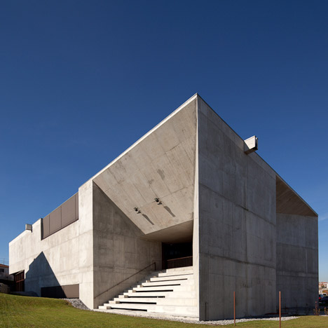
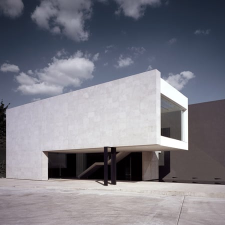
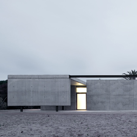
Apertures have been carved out of the rectangular concrete volume, creating little slits and openings all around the building.

Openings in the roof plan create little courtyard areas flooded with natural light.

In contrast to the exterior façade, the interior features glazed walls that wrap around the courtyards.

A day care facility, rest home, offices and service areas are housed within the building, all oraganised aroung a central patio.

Photographs are by José Campos.

More photography stories on Dezeen »


The following information is from the architects:
Social Centre – Brufe
Brufe, Vila Nova de Famalicão, Portugal
Inaugurated 2010
Based on a block form some openings are carved to illuminate the interior space or in most cases tearing and piercing the building to its inner courtyard.

The building is turned inside out: the exterior façades look opaque, dense, with just a few carves in the main points of the building like the stairs and the main entrance.

The interior façades appear as a translucid and continuous glass curtain wall that embrace the internal patio shaded by proposed trees.

In the top portion of the mass each carving provokes an event with its surroundings, covered parking spaces, main entrance, and a covered seating area for open air events.

The programs criteria includes day care, rest home, office and service areas and is organized in functional blocks surrounding a central court yard.

The physical communication within itself accentuates permanent visual relationship.

The interconnection or independence when necessary is distributed in a permanent manner.

Credits
Authors:
Architect André de Moura Leitão Cerejeira Fontes

Architect António Jorge de Moura Leitão Cerejeira Fontes

Co-Authors
Architect Nuno Cruz, Architect António Dias and Architect Bruno Marques

Collaborators
Architect José Forte, Architect Sónia Gonçalves, Architect José Pedro Fernandes

Architect José Miguel Bahia, Architect Pedro Negrões Soares

Engineer Eugénia Fontes, Dr. Tiago Fontes

Technical Projects
Structure – Engineer António Ramos – “R3R Gabinete de projectos Lda”

Electrical Instalation – Engineer Joaquim Filipe Leite de Abreu – “Apótema Gabinete de Projectos Eléctricos, Rita e Gás Lda”

HVAC project – Engineer António João Gomes da Costa Palmeira – “Gaprel”

Construction area - 1876,95 m2


Click for larger image
See also:
.
![]() |
![]() |
![]() |
| Office and warehouse by DCPP Arquitectos |
CRAM Foundation by Hidalgo Hartmann |
More photography stories on Dezeen |


these guys sure like corbusier!
Please, no more satanic architecture. Hopefully Le Cobusier is dead and his designs are no longer used until… NOW.
This kind of architecture is perfect for drug dealers and junkies.
satanic? well if I look around I can think on many better examples of satanic architecture, all very different from this example and very famous by the way. Zaha, foster, OMA, FOA etc.
This may be hash, but is powerful, as roman architecture was hash and powerful
Some hate it Some love it but…I agree. Very strong presence to this, a bit Hash but powerful nonetheless. Nicely put.
"all very different from this example and very famous by the way". It is just thought-provoking and, at the same time, alarming, that you tend to mix the concept of competence and the concept of being famous. Just because someone is famous doesn't mean he has any value whatsoever. Nowadays just because Zaha Hadid has always some editor that want to publish her work, even if it has no quality, many people, like you, tend to think that's because she is good. No, that's just how the system works, and you should be more aware and try to think for yourself…
One of the Contemporany Master of Photography!
Great building ! The concrete roof and wall structure are beatifull.
The exterior form/volume is quite nice. There’s a proportionality to it that makes me overlook my general aversion to brutal concrete structures.
I don’t think that the atrium is totally successful though. I like that the walls of the atrium are glass. It gives that overall sense that the concrete volume has been rift, but the ceiling doesn’t sit well with me. There’s more to it than just this one feeling, but the circular openings clash with everything else being rectilinear and angular. They’re like round holes in a cubic peg.
BAM! Brutalism LIIVES!
One note about the order of the photography. It really bugs me when there's no sort of chronological or thematic order to the way they are presented. I suggest you stick with exteriors first then interiors, or, present images of similar spaces photographed at different times of day adjacent to one another. In other words, avoid the photographic smorgasbord and encourage narrative.
I agree whole heartedly. Unfortunate for this project, it seems to be a smorgasbord of disjointed architectural operations. I am having a difficult time understanding it, perhaps because of the presentation and documentation provided, but mostly because I feel like there is simply too much going on.
That being said, there are some really nice moves, but on a personal level, I feel like the project would be more successful if the amount of ideas were restrained by half and explored more comprehensively. I feel like I am looking at a collage of late Le Corbusier projects rather than one really well thought out piece of work.
Good article and photos, I agree the latter could have been displayed in a more useful order, especially cause they are so well taken.
I think it the look of the building doesn't really suit for kids and as shown that interior is playing important role to adjust this building to be softer
Le corb LIVES!
if you cant beat him join him
well dont its still a very beautiful piece of architecture and shows that you cant go wrong aslong as you follow the rulebook!
really like this building!
uninteresting but the first two commenters are wrong in their comparisons and derision of the master Le Corbusier. this work is far from it, and they should look closer before they criticize so glibly with their young, trend-loving and untrained eyes.
I do not think that this elevation was suitable for building social housing. It looks like a prison.
what program did u use for the eleveations?
lol, id know that entrance anywhere, its Aldo Rossi's; Monument to the Resistance; Cuneo, Italy; 1962