
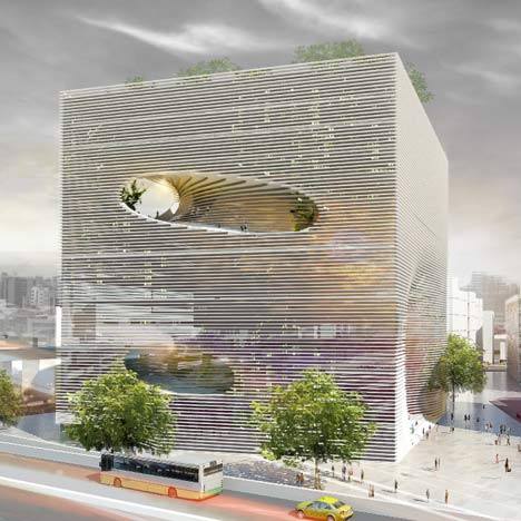
Danish firm Bjarke Ingels Group have designed a technology centre for Taipei, Taiwan, comprising a cube-shaped structure with round voids cut from its volume.

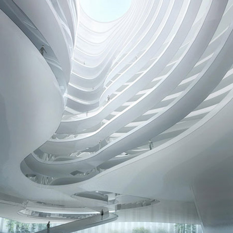
Called TEK (Technology, Entertainment & Knowledge Centre), holes in the structure will create a spiral within the volume, forming access routes from street level into the building and up to its roof.

The building will be made up of concrete lamellas, an arrangement of stacked thin plates, that will recede in the centre and function as a staircase where the holes have been cut into the structure.

These stepped areas can also provide informal seating areas for visitors.

The centre will comprise exhibition spaces, showrooms, an auditorium, restaurants and galleries, which will be organised around the central spiral.

Retail spaces, a hotel and offices will also be incorporated.

All our stories on Bjarke Ingels Group »

More cultural buildings on Dezeen »


Here’s some more information from the architects:
TEK – Technology, Entertainment & Knowledge Center Taipei
The Technology Entertainment & Knowledge Center – aka TEK Taipei – is a dense urban block of all kinds of activities related to contemporary technology and media.

The cube = TEK3
The spiraling street of media programs is consolidated in to a 57x57x57 m3 cube of program permeated by a public trajectory of people life.

The cube is finished in concrete lamellas serving as solar shading as well as public access.

The lamellas recede inwards forming a generous public staircase allowing the public to walk into the façade and all the way to the roof.
Click for larger image
TEK Taipei will consolidate exhibition spaces, showrooms, retail space, a market place and hotel, offices and conference rooms all related to media in a single superfunctional entity.
Click for larger image
At the heart of the institution, a big public auditorium will host product presentations, program launches, movie previews and gaming tournaments as well as the biannual TEK Taipei as the reoccurring anchor event for the whole complex.
Click for larger image
TEK3 contains an almost urban mix of programs with no obvious hierarchy.
Click for larger image
We propose to organize the shops and showrooms, offices and hotel rooms, conference rooms and exhibition spaces, restaurants and galleries along an internal extension of the pedestrian street to the south.
Click for larger image
ProJect TEK – Technology, Entertainment & Knowledge Center Taipei
Click for larger image
client Taiwan Land Development Corporation
Click for larger image
consultants Realities United, Arup
Click for larger image
size 53.000m2
Click for larger image
location Taipei, Taiwan
Click for larger image
m = distance I m2 = area I m3 = space

Technology + Entertainment + Knowledge = TEK

TEK3 = Space for Technology, Entertainment & Knowledge
Click for larger image
Partner in Charge: Bjarke Ingels, Jakob Lange

Project Leader: Cat Huang
Click for larger image
Team: Alysen Hiller, Xi Chen, Espen Vik, Johan Cool, Xu Li, Gaetan Brunet
Click for larger image
See also:
.
![]() |
![]() |
![]() |
| Taichung Convention Center by MAD | The World Village of Women Sports by BIG | Urban Forest by MAD |


boo.
really no landings?
i love they they condense all of their architectural moves into these swift statements, but im not buying this. Their "danish steps" project was similar but much better. but also unbuilt and therefore fair game for idea recycling.
i very much like this, very inviting…
Go BIG!!!
At least, they have a strong concept! (unlike OMA…)
http://www.eikongraphia.com/?p=2460
Holy Contour Command!
Still, beautiful.
the big project is a nice update to
a concept oma made for their unrealized coolsingel project.
http://www.oma.eu/index.php?option=com_projects&a…
dammit but i wish i could think of things this cool!
Fantastic! Reminds me of our Liwan Bayrut from 2008, only in a different, non-typological version: http://www.khourylevitfong.com/
As an American, my first thought was "That's a lawsuit waiting to happen." The fact that I thought that is mildly depressing.
I'm not a supporter of creating dangerous architecture for the sake of awesomeness, but I appreciate a design that can emerge without such a timid deference to planning bureaucrats that would constantly try to find risks in designs like these without showing much interest in grasping the bigger idea of architecture's social purpose.
This design, whether you like it or not, is purely made with the focus of creating a fun and exciting space that people can enjoy. I normally dislike most of the that BIG designs because of I think they often have a tone-deafness towards context in their brutally large scale , but this project is more about the grandiosity of architecture's potential to create excitement and pride.
A very good and innovative work. The concept of the stair/ public space inside might be a step ahead of the fish tank experiment of the MAD architects.
But its very well done..
nice work! now I jst wonder how they gonna handle the handrail :)
a little to much like OMA Coolsingel and Danish Steps.
A great design, just not original.
if you had bothered to check the plans, you would realize that there ARE landings.
Ordinarily I find this kind of continually stepped design a cop out. However, I quite like this one – conceptually.
I do have to agree with "student" (above) – I doubt it will ever be built.
And he/she raises a really good point about the lack of landings. This would be the worst nightmare of any parent with young children (not to mention against code in the USA).
The unrolled section is excellent! You can understand the clarity of the project with it.
reminds me a lot of a design from OMA made for a shoppingcentre in Rotterdam Netherlands.. http://www.architectenweb.nl/aweb/redactie/redact…
superb.
i would love to find myself inside the tube
:)) not so spectacular if you are unable to climb all those stairs …. discriminating architecture when all the fun revolves around inaccessible stairs!
student,
there are landings, if you look closely at the plans you can see landings every few steps.
i'll believe it when i see it actually built.
interestingly enough, BIG produced the same images and nearly same project for a competition in Beirut… http://darbayrut.org/ProjectDetails.aspx?pID=253&page=3” rel=”nofollow”>.http://darbayrut.org/ProjectDetails.aspx?pID=253&page=3
this somehow reminds me of 'the opus' by zaha hadid. regardless of which, its interesting how the vortex/ fluid form punctuating through the solid geometry of a cube synthesizes the urban setting and somehow creates a geometrical man-made landscape
http://www.dezeen.com/2007/05/22/the-opus-by-zaha…
As usual BIG is emulating OMA; the formal concept is very similar to Dubai Deathstar.
it's beside the point whether there're landings or not.. It's not going to work because the main circulation routes are steps.. can you imagine walking from street level all the way up? There must be hundreds of steps..
kaas koolhaas rotterdam. google it
Hypno-Cheese!
can't remeber ewactly in wich project, but they have done this exactly the same two years ago or something….
Please check OMA website (Coolsingel project) for more details.
very beautiful but where are the landings?
hey guys originality for this pojects is n neither of KOOLHAAS nor of HADID…
Watch the last page of the book 'MOVES' by un studio…
A sign in front of this building might read:
"Sorry all Disabled, Elderly and Unift. This ones not for you"
Youve just knocked off 80% of the population.
Nice idea, but not workable.
It's one of OMA's concept, used to design the dutch embassy.
http://www.google.fr/imgres?imgurl=http://www.cla…
I would hate to be in a wheel chair