House in Ise by Takashi Yamaguchi & Associates
Japanese architecture firm Takashi Yamaguchi & Associates have completed this house in Ise, Mie Prefecture, Japan.

The project comprises two adjacent volumes with inclined roofs, connected by a central atrium.

Large glazed walls inside the house frame views of the surrounding landscape.

Living spaces are arranges round the atrium, while a bedroom and family room on the second floor lead out onto a roof terrace.

More Japanese houses on Dezeen »

More residential architecture on Dezeen »

Here's some more information from the architects:
House in Ise
The building is located on high ground with lush greenery and a bluff that overlooks the beautiful Miyagawa-River flowing north-south through Ise City.

The Intention was to create a rich relationship between the house and these surroundings.

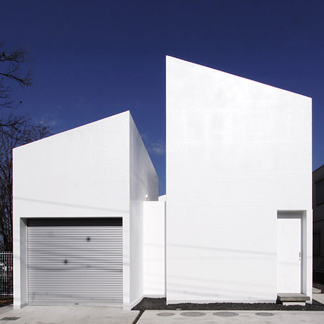
The building is composed of two volumes arranged in parallel.

A vertical void links the rooftop terrace and the light court on the first floor, drawing nature into the interior.

On the first floor, a horizontal void connected directly to the vertical one opens up a view of Miyagawa River.

The interaction of these external voids - the way they intersect and connect with interior spaces - generates richer, more complex scenery throughout the building as a whole.

Rooms are arranged around the light court, which extends into the entrance such that Miyagawa River bursts into view when the door is opened.

Click for larger image
The eastern volume's first floor contains the living, dining and kitchen areas central to everyday life.

Click for larger image
The large opening dug from its northern end offers dramatic views of Ise and Miyagawa.

Click for larger image
The aluminum flooring's dull sheen gently amplifies the illumination from the light court and reflects a variety of natural transitions onto the white interior.

Click for larger image
The second floor contains family space and a bedroom in an enclosed area with a sloped ceiling.

Click for larger image
Milky-white natural light entering through slits in the roof wraps the interior in a soft, subdued atmosphere.

Click for larger image
The western volume's first floor contains the garage and a study.

Click for larger image
The long, relatively low opening in the study enables eyes weary from reading to rest with a view of the abundant greenery outside.

Click for larger image
The rooftop terrace and light court are open to Miyagawa area's natural scenery and afford excellent vantage points for the summer fireworks festival.

Click for larger image
The building's white exterior walls both reflect the fresh green of spring and catch the shadows cast by bare branches under the setting sun of late autumn.

Click for larger image
Such changing scenery is sure to create precious memories for the family that calls this house home.

Click for larger image
See also:
.
 |
 |
 |
| 63.02° house by Schemata Architecture Office | Usuki House by Tonoma |
Double House by Tsuyoshi Kawata |