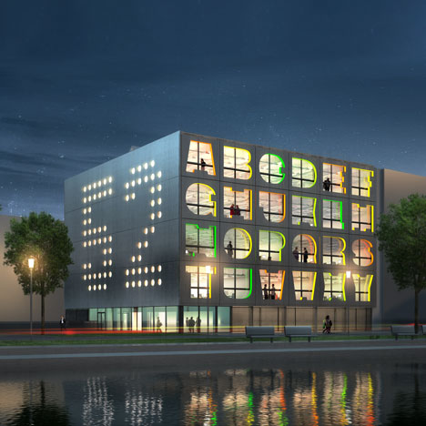
Alphabet Building by MVRDV
Dutch architects MVRDV have designed this creative industries office block in Amsterdam that has letters of the alphabet cut out of the facade.

Each cut-out is the window to an office unit and each letter signifies the address extension for the occupying business.

On the east facade of the Alphabet Building a series of dotted windows spell out the number 52, relating to the address.

All letters of the alphabet have been used apart from I and Q. The original design included Q (as shown in top image) but was later replaced by Z .

The project is scheduled for completion in 2012.

More projects by MVRDV on Dezeen »
The following details are from MVRDV:
Alphabet Building Amsterdam
MVRDV designs creative industry hub
Amsterdam based project development corporation NIC started sale of the MVRDV designed Alphabet building. In Amsterdam small and mid-size creative companies have trouble finding suitable office space. The Alphabet building communicates through a clear exterior design which reveals on the East façade the house number and at the main façade its extension for each company, a letter of the alphabet. The interior is highly flexible and completed with a rough and pure finishing. The 3200m2 creative industry building will be completed in 2012 according to high energy efficiency standards.

- On the East facade the house number, on the front facade its extension.
The creative industry has seemingly unrealistic demands when it comes to office locations: a incubator of creative ideas which is spacious and inspiring with a differentiating design at a great location with car access. The Alphabet building in the Amsterdam port refurbishment Minervahaven unites all these qualities. The former port is currently refurbished to become a creative hub.

- Behind each letter is a flexible office unit
The building is on a relatively small site of 30 x 30 meters and consists of a transparent plinth with a compact office block on top. Behind each letter of the façade the building offers a flexible unit of 128m2, the units can be sold independently or as a series of letters. Design studio Thonik will occupy the top floor or the letters A to F. As it was impossible to put the entire alphabet on the façade the letters I and Q are missing: the IQ is inside the building.

- Interior finishings are concrete, aluminium and steel
The interior finishing follows the demand of creative companies, large loft like spaces with a rough finishing: no double ceilings, exposed materials such as concrete, aluminium and steel. A number of sustainable technologies give the building an excellent energy profile. Parking is located inside the plinth, circulation and spacious outside areas at the back of the building.