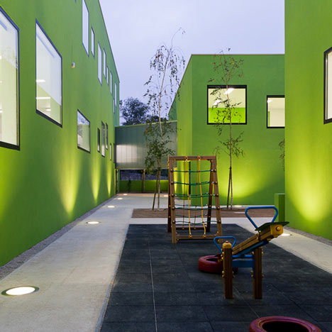
This school in Porto by Portuguese studio AVA Architects has lime green walls inside and out, and is filled with green furniture.

Named the Antas Education Centre, the five school buildings are arranged around a series of courtyards and playgrounds.

Black-framed windows of different shapes and sizes are scattered across the facades of each two-storey block.

A canteen is located on the ground floor, while classrooms can be found on both levels.

A lot of the schools we publish have brightly coloured facades - check out one clad in a yellow, green and white patchwork, and another with a bright red courtyard ceiling.

Photography is by José Campos, apart from where otherwise stated.

Here's some more text from AVA Architects:
School Center Antas, Porto, Portugal
Location and Context
The site of action is part of an urban context through the recently redesigned Detailed Plan of Antas. The nearby is not defined by buildings, with only the north to the existence of a huge slope and south of the proposed construction site.

The land is entirely surrounded by streets. The area of the school is approximately 2 967.00 m2.

Idea
The spatial and architectural design of the building of the new Education Center Antas were formalized in several bodies each containing part of the program in accordance with principles of internal organization, functionality, form and image, given the type of building and its specificity.

This conception took into account the morphology of the terrain, solar orientation, access and links to surrounding bodies.

It always took account to the relationship established between spaces, between exterior and interior and between interior spaces.
Click above for larger image
The intension is to formalize and realize the program provided through a drawing of building capable of being fragmented into several bodies interconnected with exterior spaces creating diverse environments.
Click above for larger image
It’s a building consisting of several bodies expressed by a "simple architecture" that will build a close relationship with the exterior spaces.
Click above for larger image
It was intended to create in the spaces between the various bodies the visual relationship between interior and exterior reducing relations with the urban surroundings.

There was an intention to turn into how the building relates to the exterior. However there are some links to the outside also.

The settlement found answers to a matrix that structuralize a functional organization of the school as a function of the planned program and constraint imposed by various land levels.


it isn’t proper
This random window architecture disgusts me. It's the panic of the blind wall or of the regularity. This is not fun as some people would say it is. And architecture should not be fun. If you want to have fun, buy a lego kit and play with it. Once you're enough destroy what you did, see the difference? It happens that in architecture, once you make something ugly, it will be ugly for the rest of your life.
…sorry to break the news to you, cranky-pants, but architecture is fun.
http://www.youtube.com/watch?v=O42K4EwVssQ
So how do you really feel about it?
:) children don't know that architecture is supposed to be serious business .. (yet)
hahaha, are you trolling? this is hilarious. asymmetry in window placement is one of the few things i love about modern architecture
Who said that architecture can not be fun?
Although I understand the project, the windows have to do with the kids, or with the height difference between them. In addition to transmitting a type of lighting in the space of the classroom …
The architecture can not only be seen by the details, but the color, the spaces created by stringing visual relationship between the ways ….. I do not think that is an ugly building, but rather is a building that conveys tranquility and this is reflected by the joy of children playing in the yard.
@samuel 'should not be fun'?! WTF. I'm not saying I like the random windows from inside either but come on man, think!
very smart , clean, crisp and contemporary – Looks great in the pictures. But is this an environment that will encourage children to be creative and explore – can you see them pinning pictures and posters all over the walls or letting kids lose with paints….
Architecture = Architorture for some.
They have to deal with redtape from corrupt authorities, client/ site politics or clients from hell, haggling (of professional fees) and poor wages, long hours, dealing with death on const. site, some even end up as CAD monkeys after 5 yrs of school!
And the truth is, no one is going to thank you for a good piece of kick-ass architecture. Coz no body cares except for the phony-architects themselves.
That's why architecture is seriously not so fun anymore…
It works for me…the colour, the random window arrangements and Samuel – my daughter always says "okay daddy you work and I'll play for you and a little for me too".
I just love the black window frames – real classy detail
Reminds me of one of her illustrations – and besides, this is for the little ones to have fun.
I think it's fun and could encourage a lot of creativity for the kids. I also like the random placed and sized windows.
Well, at least i opened a discuss section here. We'll talk in a few years, when you can't stand to see this spectacular architecture… I didn't mean to say that architecture should not be fun like when you look at a clown and laugh, i'm talking about the rhetoric of these projects. If you don't understand it, it's okay, you'll just like 90% of the population.
Samuel, if you lived in some of these barrios or concrete jungles full of apartments are far as the eye could see, you'd welcome a little colour and possibly any added stimuli that your eyes could afford. Personally, I would find all the grafitti that you find in these neighbourhoods far more disturbing. So if I want to have a laugh, I go look at those. Lighten up bro, you sounding like a fascist now. NO fun, no laughing in class, no dancing next, lets all be serious about things and debate all matters, AND NO COLOR!!!! Just lego for everyone. Seriously bro!!
And don't be a snob. Architecture is not just for architects.
I love the contrast between the green wall and the red circulation space, very toffee apple-esque and playful. i think the windows would be really fun and interactive for the kids, as they can have a different experience looking through each one, stretching up and crouching down to see out/in.
However, i find the interior very clinical and un-stimulating for a child…probably the most stimulating space within is the view through the windows against the striking green walls, and (considering its an education centre), the teachers probably dont want the kids staring out the window all day!