Imaginary restaurant designed like a prison by Karina Wiciak
The penultimate project in Polish designer Karina Wiciak's series of fantasy restaurants depicts tables locked up in prison cells.
Karina Wiciak, of Poland studio Wamhouse, created the renderings of a restaurant to emulate a prison and called the design Poczekalnia, which means "waiting room" in Polish.
"Not only the interior but also the name of the restaurant itself is a kind of metaphor, because the prison itself can be euphemistically described as a kind of waiting room," said the designer.
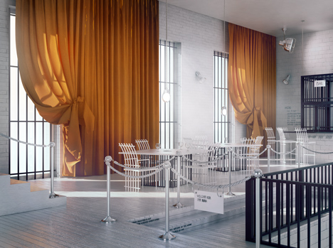
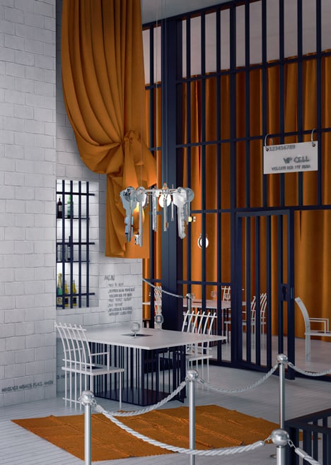
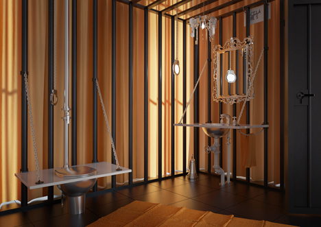
Orange fabric used for curtains and rugs references the bright uniforms worn by prisoners. The otherwise monochrome interior features whitewashed bricks walls and wooden floors, with black bars forming partitions and covering the windows.
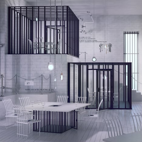
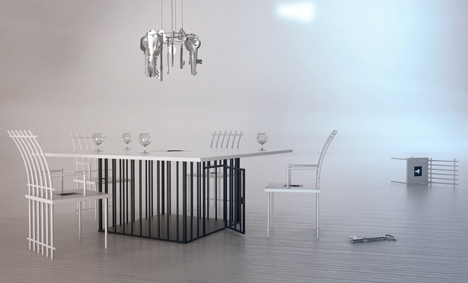
These vertical bars are also used for the backs of chairs and the bases of tables. VIP tables are caged-in on all sides, accessed by doors with giant locks.
Lights are fixed into handcuffs and suspended from the ceiling on long chains, while chandeliers are formed from sets of keys.
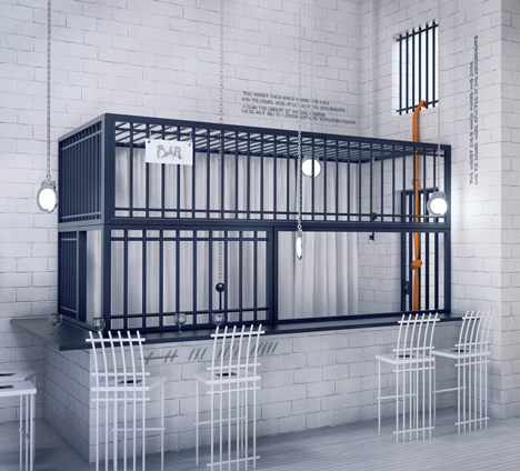
The restaurant's serving counter is also surrounded by bars, where a knotted length of orange material leads out of a barred window like an escape route.
This project is the eleventh of twelve conceptual restaurant designs by Wiciak. Previous interiors in the series are modelled on an artist's paint palette, a sewing machine and a slaughterhouse.
Here's some more information from the designer:
Poczekalnia
Poczekalnia is the eleventh project of the collection "XII", designed entirely by Karina Wiciak.
Poczekalnia (which in Polish means "waiting room") is a restaurant inspired by the prison.
Not only the interior but also the name of the restaurant itself is a kind of metaphor, because the prison itself can be euphemistically described as a kind of waiting room.
The entire interior was done in white and black Pop Art colours, with the addition of orange fabric - as a characteristic element of clothing of convicts in prison.
Prison bars, and even the cells in which paradoxically the VIP rooms are located, are the main element of the design. The bar is also behind the prison bars, and the toilets are designed in the form of iron cages, enclosed with orange curtains and glass wall (outside).
Hanging lamps in the shape of handcuffs and a chandelier in the form of a key chain are another prison motives. Interiors are complemented by tables and chairs with motive of bars and a big key lock.
The project of "Poczekalnia" also includes:
» Table "kraty" (which in Polish means "prison bars")
» Chair "kraty" (which in Polish means "prison bars")
» Hooker chair "kraty" (which in Polish means "prison bars")
» Hanging lamp "kajdanki" (which in Polish means "handcuffs")
» Chandelier "klucze" (which in Polish means "keys")
About the collection XII - entirely designed by Karina Wiciak
The collection "XII" will consist of 12 thematic interior designs, together with furniture and fittings, which in each part will be interconnected, not only in terms of style, but also by name. Each subsequent design will be created within one month, and the entire collection will take one year to create.
Here, visualisation is to constitute more than a design, which is thrown away after implementation of the interior design, but mainly an image, which has a deeper meaning and can function individually.
These will not be interiors made to a specific order, but designs based on the author's fantasy and his fascinations of various sorts. It will be possible to order a specific interior design in the form of adaptation of the selected part of the collection, on the basis of exclusivity.
The author's assumption was not to create trite, fashionable interiors, but non-standard places, full of symbols and metaphors, at the borderline between architecture and scenography.
Due to their nature, these are mostly commercial interiors, intended for use and reception by a larger group of people. Yet, it was not supposed to be an art gallery, in which art is merely watched, but places in which it could be put into use and to do virtually everything – depending on the purpose and function of the premises.
The author of the collection did not strive to artificially ascribe ideology to random ideas, but rather to make the entire design readable and coherent, and at the same time to design every item specifically for the given interior.