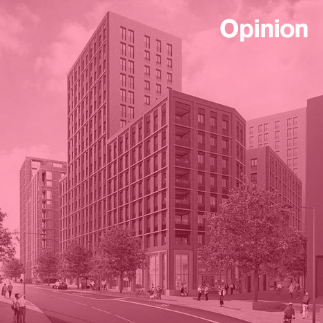
"London's new typology: the tasteful modernist non-dom investment"
Opinion: sober, well-mannered and increasingly well made – London's new housing developments are hiding their yuppie-dom behind a polite facade of brickwork that wouldn't look out of place in the 1960s, says Owen Hatherley.
The journeys I regularly take from south-east to central London, by train, by DLR or by bus, have always been a good place to watch "regeneration" at work. Entire districts that didn't exist previously – Greenwich Central on Creek Road in Deptford and other such geographical improbabilities – arise without fanfare.
Creeks, canals and streets previously defined by strung-out light industry or Greater London Council estates would be replaced with first concrete frames, then massive (but "broken-up" and demonstratively irregular) blocks of flats, covered in all manner of generalised stuff – trespa panels, aluminium balconies, swooping roofs, slatted wood. Anyone who has been to any British city in the last decade will be familiar with the genre.
Lately, the same frames have gone up, in much the same ex-industrial places, and with more or less the same cram-as-many-units as possible approach to massing. But that chaos of jollily clashing materials is gone, replace by a new coating of traditional London stock brick. London has a new typology – the austere yuppie flat, the tasteful 1950s-style Modernist non-dom investment.
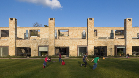
The first real test for the style that has quietly swept the capital before it was Accordia, a housing scheme in Cambridge designed mostly by Feilden Clegg Bradley and Alison Brooks, on former Ministry of Defence land. A dense series of low-rise blocks of flats and houses, it was conspicuous for not being conspicuous – for favouring regularity of profile, repetition in silhouette, and the later to be ubiquitous rough, crumbly yellow stock brick.
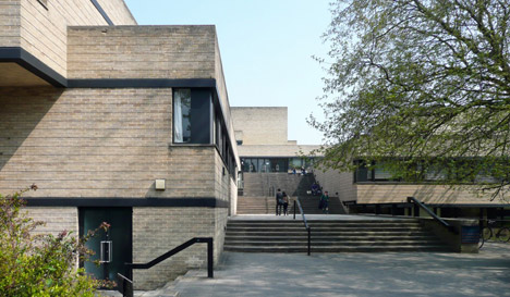
Although it would win the Stirling Prize in 2008, Accordia would not reveal itself as the new orthodoxy until a few years later. In fact, it appeared at the time more as a late survival of an older Oxbridge orthodoxy, the mild vernacular Modernism favoured in the work of architects like Hugh Casson and Neville Conder, Colin StJohn Wilson and Leslie Martin, whose Harvey Court in Cambridge and the Bodeleian Law Library in Oxford were particularly notable for their stock brick and strongly modelled, blocky shapes.
The fact that this sort of mild, self-effacing, modest, ostentatiously humane if slightly hairshirt-wearing architecture was favoured in one of the most privileged and pampered parts of the country didn't escape the notice of critics – the polychrome, baroque "blitzcrete" forms of John Outram's Judge Institute in Cambridge were explicitly aimed at the legacy of Leslie Martin and his followers.
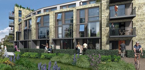
Accordia, though, was merely Maccreanor Lavington's John the Baptist. This firm have quietly become one of the defining architects of contemporary London, leading huge projects at King's Cross and the Royal Docks in the east of the city, where schemes that would once have been gussied up with attention-grabbing tat have emerged instead as unbroken expanses of brick.
Like most regeneration schemes, a lot depends on where the money's going – so at the large luxury housing estate in King's Cross, the quality of materials is extremely high. To anyone used to the way that contemporary London architecture feels intangible, tinny, tacky, afraid of physicality or permanence, it is bracing to visit their cluster of towers on the Regent's Canal. Suddenly, various qualities long missing from the city's housing – rhythm, moulding, a sense of weight and depth – are deployed on a grand scale.
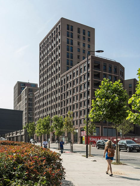
At first, the result is intense and impressive. What is perhaps more impressive, though, is the fact that the reason for this concern with physical surface may be much the same as that motivating the previous use of wood-effect trespa and multicoloured panels – that is, the breaking up by the architect of the mass dictated by the needs of the developer.
Maccreanor Lavington's towers are as ultra-dense as any scheme by MAKE or their ilk, and similarly attempt to mask that through various kinds of display and contortion, pulling themselves into craggy shapes and skylines so as to humanise the dogged filling of every inch of the site. This is more obvious at the lesser scheme in the Royal Docks, where the budget hasn't stretched to the expressionistic modelling used so interestingly at King's Cross, and you have instead just unusually well-clad yuppie flats.
These are merely the most complete. Go elsewhere, and you can find the style neighbouring earlier, more obviously crass conceptions of how to sell luxury – as at Canada Water, where Glenn Howells' new housing uses its brick panels as if as a screen against the fibreglass domes and gold griddles used in the nearby work of CZWG.
The scheme that really made the change obvious to me was a small infill development on Blackwall Lane in Greenwich, where the site of a shabby sign shop and a billboard is becoming a piece of stern, neat stock brick street architecture to the designs of Dunnett Craven architects, directly opposite a gigantic and hideous scheme by MAKE, going up at the same time but designed as long ago as 2005. That, and finding in the Evening Standard an advert for a new stunning development somewhere in Clapham where the old imagery of white pyjamas, glasses of wine and magnificent views coexisted surprisingly with the early 1960s Cambridge look John Outram once claimed was "more suitable to the pedagogy of milking cows".
The new London brick is ultimately the result of Design for London guidelines, and it shows that while local government seems to have no ability or interest in influencing what developers build, it is able to influence how they clad it; and in a city with so captive a market as this, buyers and investors are presumably not too put off by the replacement of the barcode facade with the brick panel.
However, it is taking critics some time to notice that the aesthetic of London today, at the nadir of its housing crisis, at the moment where the gap between rich and poor is wider than at any time since the 1930s, is no longer the screaming plutocratic cacophony of St George's Wharf or Stratford High Street. It's sober, well mannered, increasingly well made. It is as if the response to the housing crisis was to make housing less conspicuous, less of an aggressive imposition on the eyes of the unfavoured. It says "look, we live in normal brick houses, just like you".
Owen Hatherley is a critic and author, focussing on architecture, politics and culture. His books include Militant Modernism (2009), A Guide to the New Ruins of Great Britain (2010), and A New Kind of Bleak: Journeys Through urban Britain (2012).