Dan Britton's typeface recreates the frustration of reading with dyslexia
London designer Dan Britton has created a typeface that's intentionally difficult to read to simulate the problems faced by people with dyslexia.
Design graduate Britton – who was diagnosed with dyslexia in his third year of university – wanted to create a typeface that would demonstrate the effects of the disorder, which impairs reading ability. Dyslexia is estimated to affect 10 per cent of the world's population, according to UK charity Dyslexia Action.
"What I wanted to do was recreate or simulate the emotions of reading with dyslexia to try and put across how frustrating it is to try and read something simple," Britton told Dezeen.
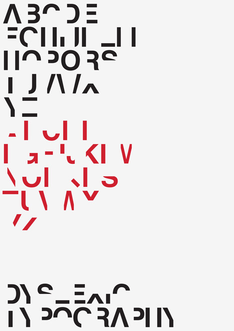
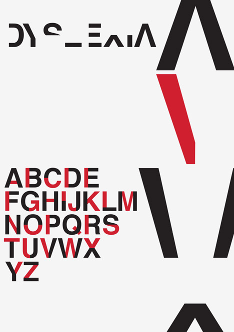
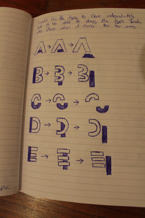
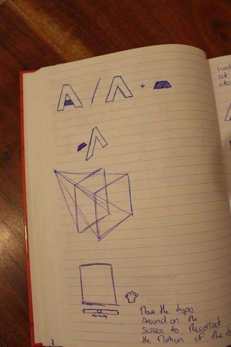
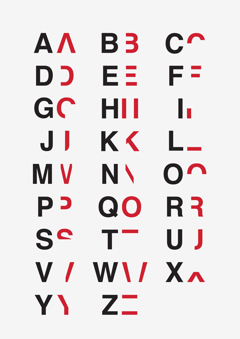
He sliced up the commonly used Helvetica typeface – created in 1957 by Swiss designer Max Miedinger – to delete 40 per cent of each letter and number, removing their key characteristics but leaving enough to make them just about legible.
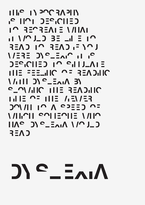
The intention is that a reader has to take their time to decipher which letters are used in words and sentences, slowing them down to the speed of someone with dyslexia.
"You can't skim through, you have to pick out and read each individual letter, then piece together the words, then sentences and paragraphs," Britton said. "The whole process of reading is 10 times slower, similar to that of a dyslexic reader, to recreate the embarrassment of reading with everyday type."
The project began as a self-initiated graphic design assignment during Britton's studies at the London College of Communication, for which he decided to apply his experiences of dyslexia to help others understand some of the symptoms.
"I felt it was a very misunderstood condition, there isn't really an understanding about it and I wanted to try and tackle that in a way that hasn't been done before," he said.
Britton contacted the British Dyslexia Association and other similar organisations to review the promotional material they use to help build awareness of the condition.
"It's some of the worst design I've ever seen," he said. "More importantly, it didn't convey a message and it didn't tell anyone anything."
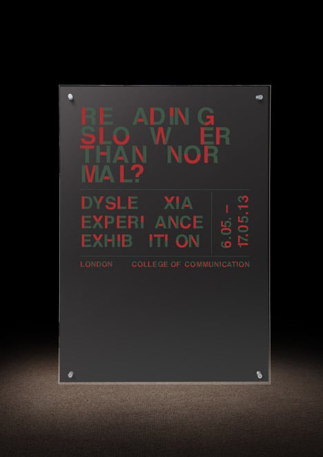
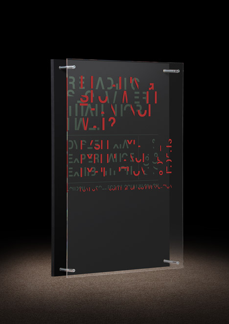
He used his typeface to create a series of 3D posters, layering text written with his sliced characters behind a perspex sheet that carried the parts needed to fill the gaps in a different colour.
Promoting an exhibition about dyslexia that took place last month, the message on the poster read "Reading slower than normal?" and included the information about the dates and venue.
"What I've found all through my life – and I'm sure many others are the same – when you tell someone you're dyslexic they say 'yeah, whatever'," said Britton. "They just can't comprehend it because they haven't experienced it and there's nothing to translate that over."
He explained that serif fonts are the most difficult for him to process, so he avoids reading newspapers entirely. However larger type and letters with curved elements, like the much-loathed Comic Sans typeface, are easier.
"When I was younger, I remember Comic Sans being friendlier to read even though its a crap typeface," Britton said. "Anything with a nice curve is better."
His tutor showed the project to a member of the UK parliament, and the designer hopes that the government will use it for various applications to raise awareness about dyslexia. "I'd love to get it developed some time soon because I think it can help," Britton said.
Another designer whose work was influenced by the disorder is Henry Franks, who created a collection of "dyslexic" everyday objects. Designer Christian Boer presented a typeface specifically for dyslexic people at last year's Istanbul Design Biennial.