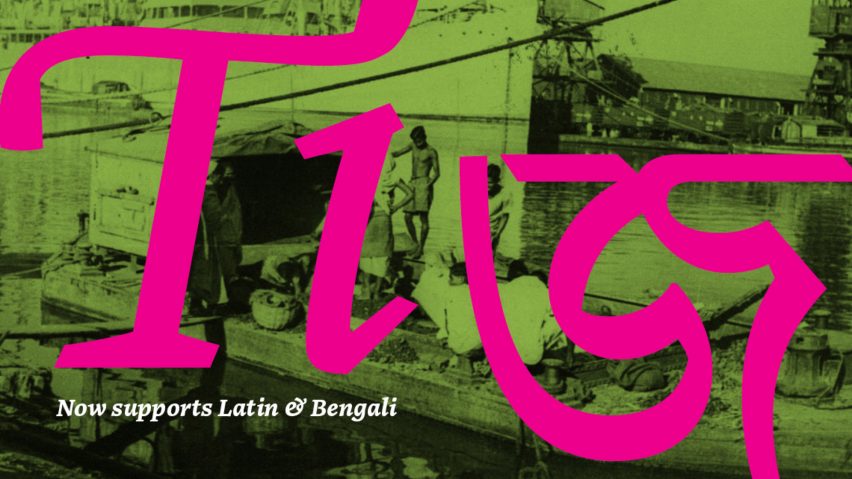
Noort is a bilingual type family that "respects cultural differences"
Chilean designer Juan Bruce has developed an expressive typographic family that supports both the Latin and the Bengali alphabet.
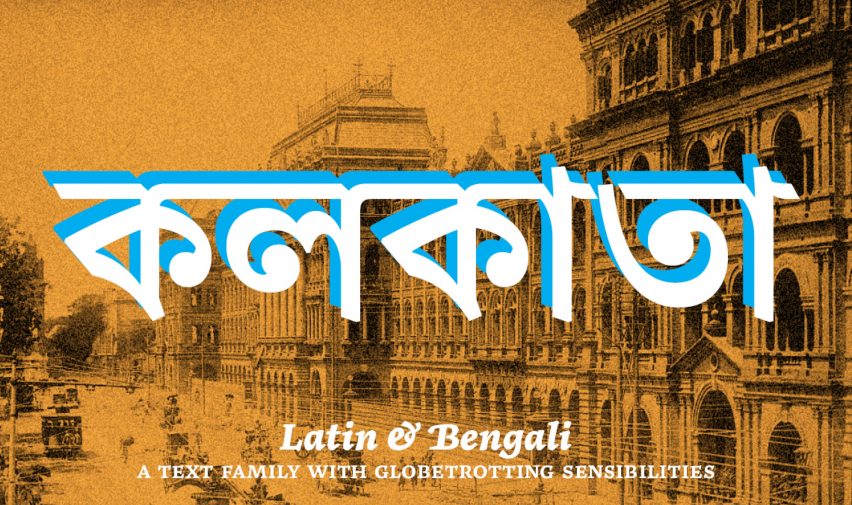
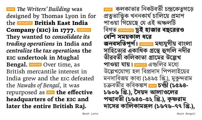
It includes the Noort Latin typeface – originally developed by Bruce in 2017 – and its evolution Noort Bengali, with both sharing key characteristics so they can be used together as a family while also retaining Bengali's unique character.
The aim was to create "a bilingual family that respects cultural differences", according to the designer, who was inspired by research showing that computer software is often developed with only Western writing systems in mind.
Up until recently that meant Bengali speakers, who hail from Bangladesh and parts of north-eastern India, could only send text messages using the Latin alphabet.
"The globalised world demands the coexistence of multiple cultures and languages, but globalisation shouldn't mean minorities adapting to majority ideas to be recognised and respected," Bruce said.
"Noort Bengali is a fresh proposal that brings together two cultures and prioritises them equally."
Published by font foundry TypeTogether, the original Noort typeface is a serif font family influenced by 17th-century Dutch maps.
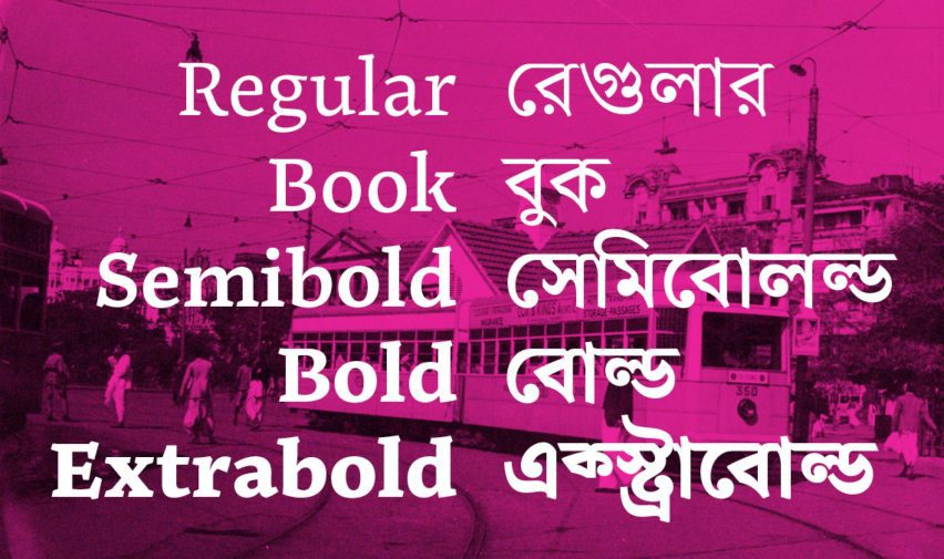
Noort Bengali features the same five weights, stoke style and low contrast as its forebearer but is distinguished by an interrupted headline and distinctive diagonal linework reminiscent of calligraphy.
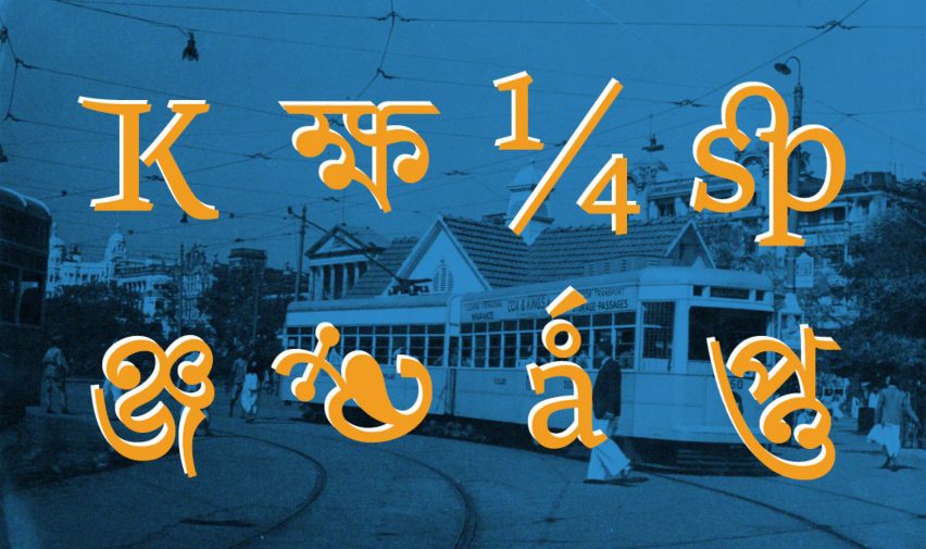
In this way, the typeface aims to retain the dynamism of traditional Bengali handwriting while meeting modern standards of character sets, glyph reordering and vowel attachments so it can be used as a scalable digital font.
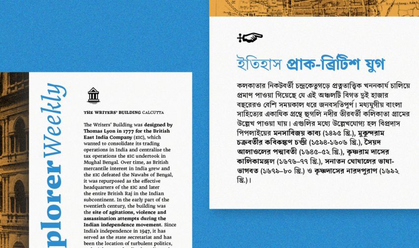
The Noort font family is geared towards Bengali and bilingual books and editorials. It also comes with a suite of cartographic and way-finding icons so it can be used for information design.
Bruce told Dezeen that his main motivation for the project was "just the plain fun of exploring new shapes, languages and cultures".
"The idea was never to be all high and mighty about how Bengali designs should be," he said. "It's about understanding new things."
"I also find it very challenging to harmonise two different scripts that follow very different rules. The coexistence of such diverse writings in the same line of text or paragraph is, in my opinion, pleasing to the eye."
By creating a multi-script typeface that treats both Latin and Bengali equally, he also wanted to provide a tool that might help to protect the future of this widely used yet vulnerable language.
"Typography is in a way the simplification of shapes for mechanised writing," Bruce said. "But some scripts compromise too much of their nature."
"I think since we have the technologies to do so, we should enable more of these native traits to enter into typography."
Noort Bengali has been shortlisted in the graphic design category of the 2023 Dezeen Awards alongside a rebrand for boxed wine and an interactive calculator that projects damage to coastal cities from rising seas.