Help Remedies by Pearlfisher
If pharmacy packaging leaves you feeling perplexed about what you're taking, then these medicine packets named after symptoms rather than ingredients will be right up your street.

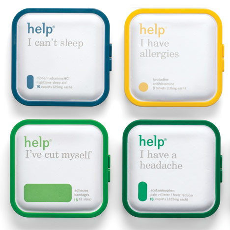
Graphic designers Pearlfisher refreshed the minimalist packaging for pharmaceutical brand Help Remedies, adding colour-coded graphics that illustrate the sizes and shapes of pills or plasters inside.

Other designers promoting stripped-back packaging include Antrepo, who created conceptual labels for well-known supermarket products - see that story here and more stories about packaging here.

The following information is from Pearlfisher:
Pearlfisher refreshes the packaging for Help Remedies as part of the national Take Less campaign.
Pearlfisher has refreshed the packaging for Help Remedies – the New York City-based boutique pharma company and creator of minimalist medicine – as part of Help’s national Take Less campaign.
Founded in 2008, Help Remedies disrupted the staid and samey look of the existing pharma category with a bold but simple range of products titled after the symptom it is meant to solve (e.g) Help I have a headache.
Help is taking the pharma world by storm again with its new Take Less campaign. In a category that traditionally pushes more, extra, bigger, faster, the new Help Remedies campaign is pushing forward with a bold and unique message that less is sometimes more – less drugs, less dyes, less coatings.
As part of the rollout of the Take Less campaign, Pearlfisher was tasked with refreshing the packaging for the existing product range and for the addition of new variants to the portfolio – including Help I have a stuffy nose.
Jonathan Ford, Pearlfisher Creative Partner, says, “We have refined the identity and colorcoded the embossed pill shape to make the overall brand architecture more visually strong and to give the brand better stand-out and immediacy of recognition. The design evolution dials up Help’s equities, creating an ownable secondary language through the pill iconography, that will be used across further brand touchpoints and communications.”
Nathan Frank, Founder, Help Remedies, comments, “As a small company rolling out nationally, our packaging is our most important piece of communication. That being said, to litter it with bullet points would go against everything we stand for. Pearlfisher has done a great job in enhancing our identity so that it communicates everything we have to say without having to spell it out, literally.”
The Help Remedies product assortment featuring the new-look packaging will debut this Fall in Walgreens nationwide and select Target stores to complement existing distribution in nationwide retail outlets.