El Portillo by Stone Designs
Spanish studio Stone Designs have converted a log cabin into a cafe at a ski station near Teruel, Spain, using climbing ropes and felt.
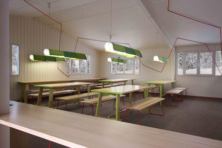
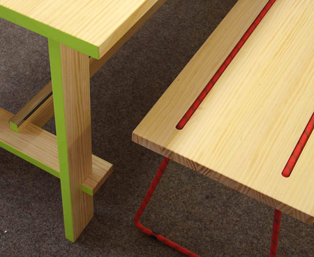
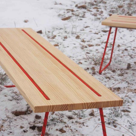
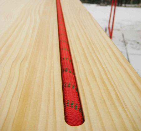
Called El Portillo, the cafe features pine benches with steel legs covered in the same red ropes that zig-zag across the space.
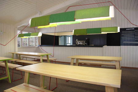
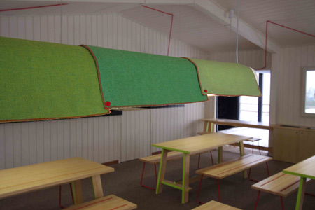
The lighting consists of polycarbonate cylinders that have green felt panels draped over them, secured together with red buttons.
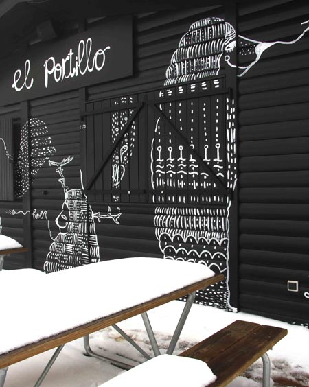
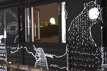
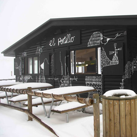
The black-painted exterior has been decorated with illustrations of mythical creatures by graphic designer Pepa Prieto.
Here is some more information from the designers:
--
El Portillo is a cabin located at Javalambre ski station in Teruel.
It is a typical Canadian wood cabin, made of tree trunks with a pitched roof. The project consisted of reconverting the space, which up until now had been uncared for both in terms of design and operation, into a hamburger cafe to cater for a specific zone of the station.
As you can imagine, when the Aramón Group offered the project to Stone Designs, the latter did not think twice about saying yes; it seemed the perfect project for them. It was a ski station, in the midst of nature, in a completely snow filled landscape; a wooden cabin, made to measure.
The initial idea was to create an interior and exterior that would co-exist harmoniously and mutually complement each other, and in this way take as much advantage as possible of the cabin. Given that it would only operate in the winter, taking into account the constant presence of snow, the first idea was that the cabin should form part of the landscape.
In winter, with the snow on the mountain, everything becomes a contrast of black and white, that is, snow covers everything and anything not covered is dark in colour. This is why it was decided to paint the whole of the outside of the cabin black, so that it would contrast with the snowy landscape and, at the same time, form part of this landscape.
Once this idea was clear it was decided that, to obtain the desired effect, it had to be brought to life, which immediately brought to mind the idea of collaboration with the graphic artist Pepa Prieto who, as on other occasions, was pleased to collaborate with them.
She was finally responsible for giving life to all the creatures that since then have inhabited the walls of the cabin. The only colour used to create these creatures was white, because in this way, they appear to emerge out of the snowy ground.
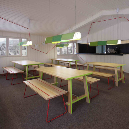
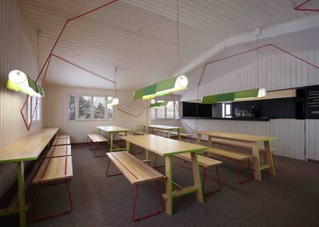
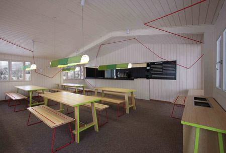
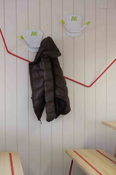
The inside has been approached in a completely different way and, whilst the outside is black, the interior has been painted white, seeking to take advantage of the scarce light on cloudy days and creating a cosy space in which to take refuge during the harshest days of winter. It has been endeavoured to use the fewest number of elements possible so that, in the end, the furniture becomes the means used to create the topography and unique dialogue of the establishment. As the space had a very marked shape, it was decided to use a red climbing rope as an element of distortion that would soften its lines, creating a vision of the area that is less static, filling it with movement and life.
Under this red line, there are a series of Nordic style tables made of natural pine with the edges in the corporate green of the group which is thus presented to users, but is not overpowering. For seating, benches were designed that form a link between the space and the rest of the furniture, as, not only are they made from natural pinewood, but the rails on which they are supported are steel rods covered with the same rope that softens the space's shape, thus achieving the feeling that all the elements form part of one same ensemble.
To create individual lighting, lamps have been hung over the tables. These were created specifically for the project and consist in a polycarbonate cylinder covered with textile tiles that give the space great warmth. The bar zone has been decorated with a black band that remits to the outside of the cabin and creates contrast that gives the space depth. The most uninhibited character comes from the menus; a true reflection of the sassiness of their creators, they are written directly on pieces of masking tape, which means that they can be changed when necessary without having to resort to professionals.
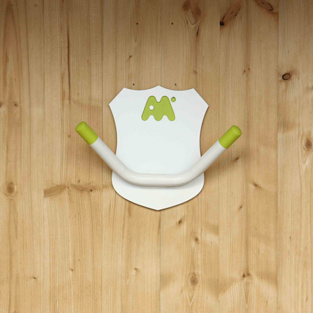
To accentuate the mountain character of the cabin, a series of "trophies" have been designed for the Aramón Group, which represent deer horns, but carried out in such a way that they almost seem a joke of their source of inspiration. Indeed, the first impression one gets upon entering is one of surprise, as it is does not present the typical topography of an establishment in these types of surroundings where dark colours usually prevail, with overloaded spaces seeking warmth, which in this case is achieved in a much simpler manner, providing solutions that are much more effective for this purpose