Dezeen's top 10 Aesop store designs
Australian skincare brand Aesop prides itself in commissioning a different design for each of its stores. To mark the opening of its 100th boutique this week, we've collected together ten of our favourites from the Dezeen archive – including a kiosk made from newspapers and a shop made from a demolished house (+ slideshow).
In an interview with Dezeen, Aesop founder Dennis Paphitis said he worked with different designers to avoid "the kind of assault on the streetscape that retailers inflict through the ordinary course of mindless business."
"I was horrified at the thought of Aesop evolving into a soulless chain," he said. "I’ve always imagined what we do as the equivalent of a weighty, gold charm bracelet on the tanned wrist of a glamorous, well-read European woman who has travelled and collected interesting experiences."
The brand has now opened its 100th store – designed by architecture firm Snøhetta – and has worked with a diverse range of collaborators including British designer Ilse Crawford, Japanese firm Torafu Architects, French architecture studio Ciguë and Melbourne-based March Studio.
Aesop at I.T Hysan One by Cheungvogl
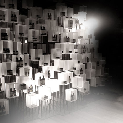
A forest of steel rods supported 800 resin boxes in a temporary installation inside Aesop's outlet at I.T Hysan One, a major department store in Hong Kong.
The monochrome display was created by local architects Cheungvogl, who were inspired by a black and white photograph of floating lanterns.
The different heights of the boxes was designed to make them appear as if each one "is being drawn upward by an invisible thread," explained the architects. "Some boxes hold Aesop formulations while others are designed to reward visitors' curiosity through unexpected sound, scent and touch." Find out more about this design »
Aesop Singapore by March Studio
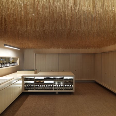
30 kilometres of string formed from coconut husk was hung from the ceiling of this Aesop store in Singapore – one of the first designed for the brand by Melbourne architects March Studio.
"When combined en mass, the seemingly insignificant threads mesmerise and remind one of airline magazine flight maps," said a statement from Aesop. "The entire store is framed with meticulously detailed grids that suspend twine from the ceiling. The idea is to work with a sombre material palette in an unexpected way."
Cupboards made from marine plywood and a carpet of coir matting create complementary toned surfaces, and products sold in the store are packaged with a matching twine. Find out more about this design »
Aesop Grand Central Kiosk by Tacklebox
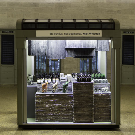
This Aesop kiosk in New York at Grand Central station was made from over 1,000 copies of the New York Times.
Brooklyn architect Jeremy Barbour of Tacklebox tore and stacked the newspapers before binding them in a wooden frame and topping them with sheets of powder-coated aluminium.
"The kiosk was intended as a place for information, as well as a place of familiarity, hence the use of the NY Times which is part of the commuters’ daily routine," he explained. Find out more about this design »

Instead of shelves, French designers Ciguë hammered row of perfectly aligned nails into the walls of this shop in one of Paris' oldest neighbourhoods. The idea was derived from workshops and garages, where tools are often hung on the walls using nails.
"The main idea with Aesop is to find different ways of displaying their products," said architect Hugo Haas. "The bottles are so classical they have their own existence. They just need a good background to help them levitate." Find out more about this design »
Aesop Westfield by Tolila+Gilliland
Felt lines the walls of this store interior inside one of London's biggest shopping centres, by Parisian studio Tolila+Gilliland.
The firm collaborated with lighting designers PSLAB on the renovation of a former jewellery shop in Westfield, to develop a design where the transition from mall to boutique would create "a separate interior world".
"The felt has this amazing tactile quality of course, but it was also important for the store's acoustic nature," explained architect Nicholas Gilliland. Find out more about this design »
Aesop's first London store, and the first to be featured on Dezeen, was created by Ilse Crawford of Studioilse.
Occupying a protected Victorian shop building in Mayfair, the space was filled with a combination of new and antique furniture. Original parquet floors were left in their raw state, and the fireplaces were reinstated.
"At its heart sits one grand gesture, a large ceramic circular basin to emphasize the ritual of cleansing," said Crawford. "A celebration time, place and quiet beauty." Find out more about this design »
Aesop Aoyama by Schemata Architecture Office
Japanese architect Jo Nagasaka of Schemata Architecture Office has completed a number of stores for Aesop in his home country, including this one in Tokyo's Aoyama neighbourhood made from a demolished house.
Rather than hide the remnants of the interior's previous incarnation as a vegetable shop, the architect highlighted the old pies and drain covers by coating them in resin.
New additions are made from salvaged timber, handles and furniture from an abandoned house the architect came across in Nakano-ku. Find out more about this design »
Aesop Kawaramachi by Torafu Architects
Torafu Architects reused metal pipes and lightbulbs previously used by fishing boats to attract squid as the focal point for this Aesop store in Kyoto.
"By utilising the height of the vaulted ceiling, we hung squid fishing boat pendant lights like a mobile and filled the space with light," said the Japanese architects.
The space features exposed concrete walls, roughly covered with white paint along the top and bottom of the ground floor. Find out more about this design »
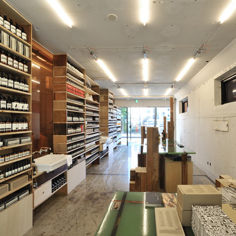
Aesop Fillmore Street by NADAAA
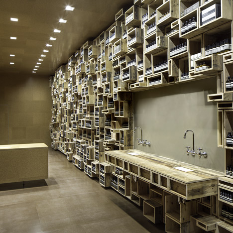
Reused materials are a common feature of Aesop store designs – this one in San Francisco by Boston architects NADAAA has a wall lined with a "tapestry" of wooden boxes made from reclaimed wood.
The designers said the idea had been inspired by "a fascination with pre-twentieth century apothecaries and twenty-first century skin care".
The rest of the walls are covered in cork, offering another texture as well as dampening sound inside the space. Find out more about this design »
Aesop Ginza by Schemata Architecture Office
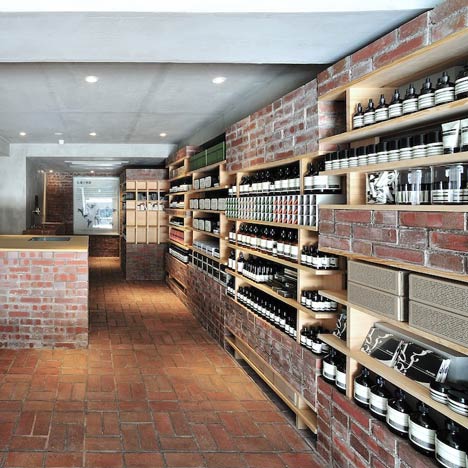
This Schemata Architecture Office design in Tokyo's Ginza district occupies an old shoe shops and was fitted out with new redbrick fixtures and a matching floor as a nod to the building's original brick-tiled facade.
"The owner of MIlano Shoes put the brick tiles on the facade of the shop to create a "high-quality mood." When other tenants of upstairs moved into the space they hated the bricks and painted them," explained the architect.
The shop is fronted by a pair of large glazed doors, so passerby can see the redbrick interior. Find out more about this design »