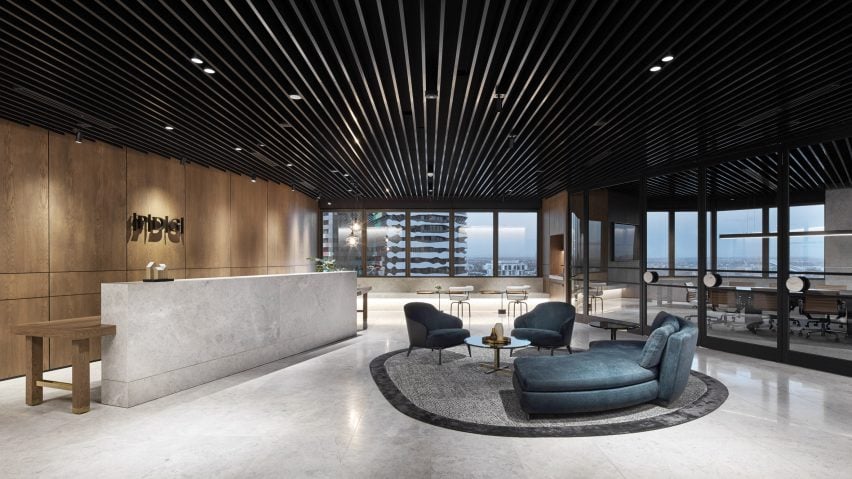
Luxury materials bring hotel feel to headquarters of PDG property developers
Studio Tate has revamped the 17th floor of an unusual hexagonal building to create lavish offices for PDG, a property development firm based in Melbourne.
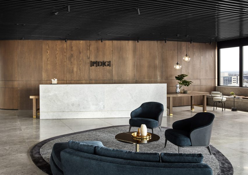
The studio was given the task of turning the six-sided space – which was previously occupied by the Australian airline Ansett – into an inviting headquarters that would encourage communication and productivity among PDG staff.
"We were presented with the challenge of debunking the perception that a hexagonal shape was difficult to plan," explained Alex Hopkins, principal interior designer at Studio Tate. "It really called on intelligent design to successfully marry sophisticated spacial planning with luxurious materials and employee comforts."
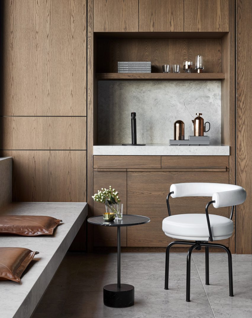
Hopkins and her team chose to place curved walnut corridors throughout the office as a contrast to the angular floor layout, forming clear paths of circulation for PDG staff.
They also set all desks away from the edge of the building, allowing employees to move around easily and have equal access to outdoor views.
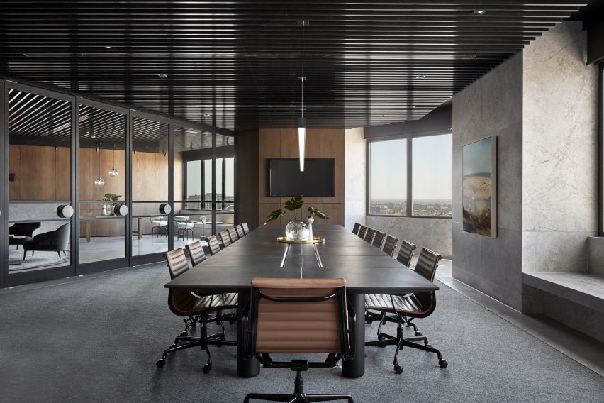
To make the 950-square-metre workspace appear more open, Studio Tate incorporated full-length glass doors in the reception area. A transparent glazed wall has also been placed between the CEO's office and the main work floor in an attempt to "integrate rather than segregate, and offer visibility and access to the director at all times".
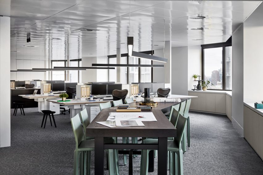
Stools have been added to the end of workstations to give the option of hot-desking and provoke more casual, inclusive meetings.
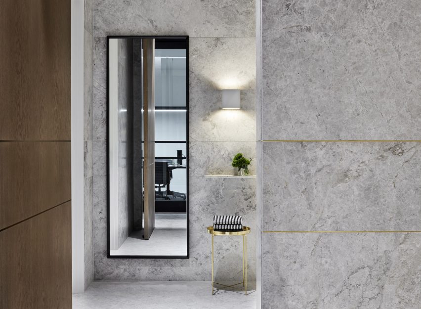
For the decor, Studio Tate used luxurious materials in order to meet PDG's request of having a workspace that "didn't feel like an office at all". As well as walnut veneer joinery, the headquarters also feature marble-clad bathrooms and stone surfaces that have been inlaid with brass, evoking a similar feel to a hotel or high-end private residence.
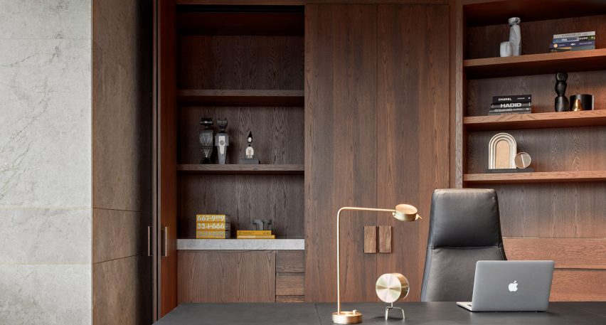
"These materials really allowed us to deliver on the brief," Hopkins told Dezeen. "They are the subtle layers that contribute to feelings of warmth and homeliness that will inspire employee wellbeing and thus productivity."
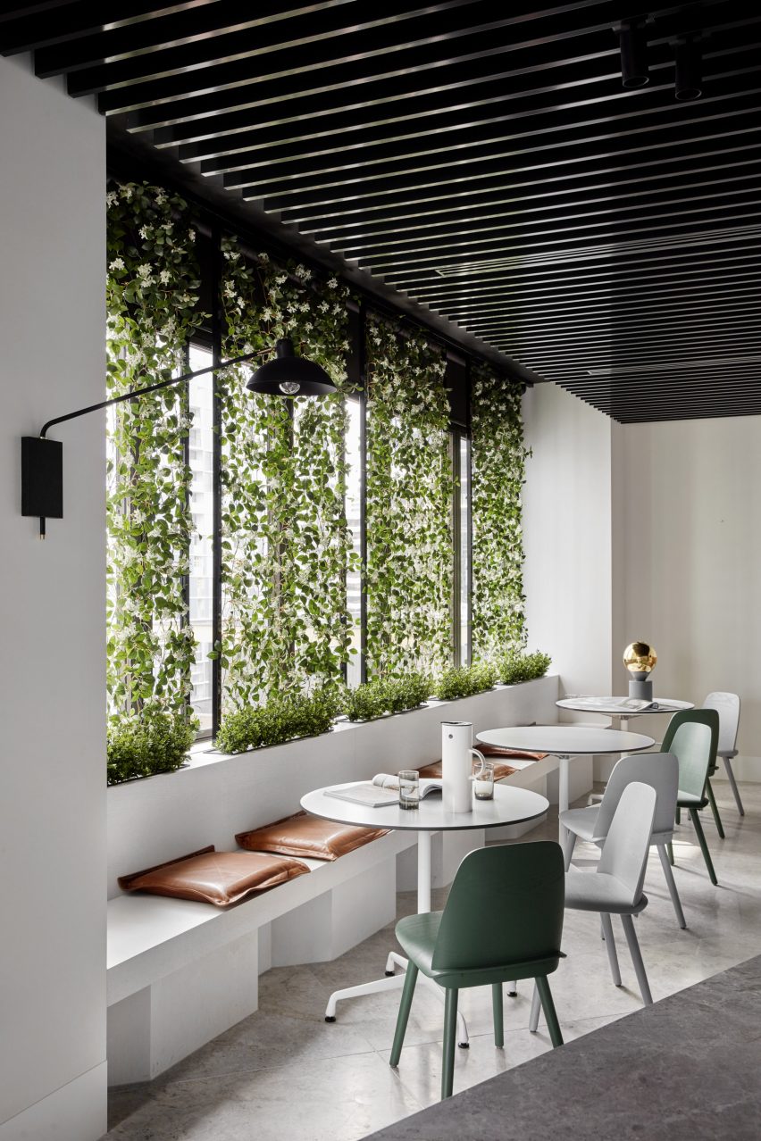
The office's open-plan kitchen also includes a moveable wall of greenery, which Hopkins explains "adds a lightness and humane quality, bringing the outside in, particularly 17 floors up".
Other studios and designers have chosen decadent materials to transform offices, including Yves Behar whose boutique co-working space in San Francisco has a black marble feature wall.
Photography is by Peter Clarke.