"London streets don't need to look like a 1940s that never happened"
The sanitisation of shop signs in Walthamstow, northeast London, is a mistake that mustn't be repeated anywhere else in the capital, argues Owen Hatherley.
One of London's great secret virtues is an ability to make a street that, in many other cities in Britain, would be a grim parade of chain stores and empty units, into an endlessly interesting global microcosm. One such place is Walthamstow High Street.
If you're looking for interesting architecture, don't bother. Aside from a decent municipal library and the rather piquant Festival of Britain-style clocktower on the junction of Hoe Street, this is a parade of Victorian, Edwardian and modern buildings of mostly zero aesthetic value. They could probably be demolished from end to end without offending all but the most zealous Victorian preservationists.
But that's not the point of this place. What is the point is the assemblage of Lithuanian and West African grocers, Bulgarian restaurants alongside eel and pie shops, a plethora of charity stores, a busy street market mostly full of tat with the odd bit of gold. It is an exhilarating, warm and convivial fragment of a world where borders are irrelevant and nationalism a joke, laid out on what is, in terms of its actual buildings, a normal boring street that could just as easily be in Southampton, Kidderminster or Barrow-in-Furness. It's no exaggeration to say that it is places like this – as much as the better employment opportunities and the underfunding of the north – that make people move to London.
But something strange is happening here. All the street signs at the corner of St James's Street and the High Street have been suddenly replaced with neat, upper-case sans-serifs on muted colours. Suddenly, it looks like Harrogate or Bath – except the old shops are still there. It's a surreal experience.
It is places like this that make people move to London
This is part of a £3 million makeover by Waltham Forest Council, a process which is intended to begin at the St James's Street "gateway" and then creep up the High Street. It also includes new signs for directions, new paving, and new street furniture. Most of this is uncontroversial and welcome. The Victorian buildings have been given a sprucing up, so their collection of plaster griffins and gables are a little more apparent to the eye, and the new stone facings look hard-wearing and elegant. That's all to the good.
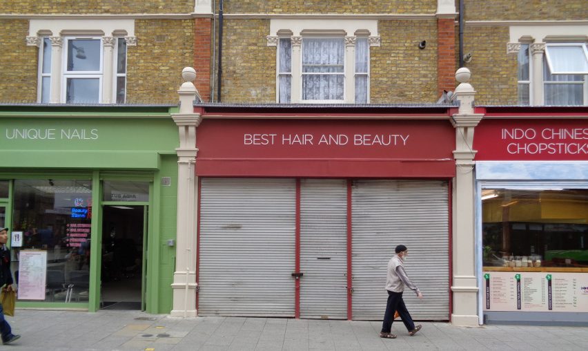
The problem is the notion that the best thing to do with a street like this – with its audacious combination of Vilnius, Accra, Nicosia, Varna and the old East End – is make everything look the same, with all those messy and strange shops all having exactly the same typeface. Some have taken the opportunity to slightly rename themselves. The handmade bubble lettering of Beste – French Crop Undercut Colouring Highlights Hot has become the sans-serifs of Best Hair and Beauty. Costa and Lituanica now have the same look, at least on the outside. It was of course optional, but only one hairdresser has kept its old cheap-glam sign of the Mona Lisa.
Where has all this come from? Although the impulse to tidy up in this manner often comes from Victorianists and conservationists, the early 20th-century High Street looked absolutely nothing like this. In fact, in terms of signage, it would have been messier than the street is now, with signs upon signs, devoid of even the slightest input of a design education – something that didn't come to London until well after 1945.
Many of the old signs were and are naff, some of them very enjoyably so
A little taster of the Edwardian horror of empty space is given by the painted advertisements that still exist on the sides of some of Walthamstow's buildings, which are now delightfully nostalgic, but would at the time have been among many shouty voices imploring you to buy potted meats, jellied eels, penny farthings and suchlike. So what exactly is it Waltham Forest and its design team think they're doing here?
In a post on his blog Fantastic Journal a few years ago, Charles Holland called this process Farrow and Ballification, after the good-taste paint and wallpaper company. This particular approach to conservation is, in his words, a "sanitised version of the urban streetscape, with its heritage paint shades and expensive bread shops" which is "as historically suspect as any other era's vision of the past". Holland argues that "for all its assumed sensitivity, it is ultimately more about a certain kind of pervasive middle class aspiration than it is about conserving the past".
It's certainly hard to talk about what is happening here without using the term gentrification, although perhaps here it a misnomer – none of these shops are being forced out, yet. Instead, what is happening is that ordinary nail bars and kebab shops are being made to look like branches of Labour & Wait, like someone said: "If you can't remove them, redesign them". It's not hard to imagine that they'll be followed soon enough by the sourdough bakeries and artisanal stovemakers.
Urban coherence is a good thing. But the remodelling of the shop signs of Walthamstow is an anally retentive mistake, driven by a total misunderstanding of what makes London interesting
Many of the old signs were and are naff, some of them very enjoyably so (the black-painted BAD Warehouse, perennially having a BAD SALE). Of those that survive, there are a few that are very fine, like the gorgeous embossed frontage of Saeed's Fabrics, or the pink 50s-80s retromania extravaganza of Jesse's Cafe (whose owner is perturbed by the programme, more because she's only recently paid for the current sign). But neither conform to the current nouveau Eric Gill canon. What they do instead is display to the pedestrian that they're in a place where people from every continent live without discord. Today, that means a lot.
Urban coherence is a good thing. Nobody in Walthamstow will complain about better paving, cleaner buildings and nicer benches. The standardisation of road signs, tube stations and maps, street information and suchlike are all progressive measures that only the kookiest Ayn Rand fan could object to. But the remodelling of the shop signs of Walthamstow is an anally retentive mistake, driven by a total misunderstanding of what makes London interesting.
London streets don't need to look like a historically illiterate retcon of a 1940s that never happened – they're fine looking like what they are, hugely successful experiments in multiculturalism, whether in Deptford, Peckham, Haringey, Wembley or Walthamstow. Let's hope the sans-serif "gateway" stops here.