"What an ungainly neighbour for the elegant Mies building"
In this week's comments update, readers are convinced that Herzog & de Meuron has designed its Museum of the 20th Century badly on purpose, to emphasise the beauty of the neighbouring Neue Nationalgalerie.
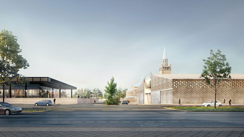
Neighbour from hell: Herzog & de Meuron revealed updated plans for the Berlin museum, and readers agree it's no match for the Mies van der Rohe-designed Neue Nationalgalerie it will adjoin.
"What an ungainly neighbour for the elegant Mies building," said a reader going by the name Alfred Hitchcock.
Chejo added: "If the idea was to make Mies' building look prettier, then they achieved it".
"Mies masterpiece will shine brighter in front of this incomprehensible hanger," commented Manuel Baena.
JMFM simply concluded: "Underwhelming".
For this reader, the winning architecture studio is clear:
What do you think of the updated plans? Join the discussion ›

Eye opener: readers are disgusted to learn that Panasonic's Future Life Factory is developing wearable blinkers, to keep people distraction-free when working in busy spaces.
"Human workers are literally livestock as far as corporations are concerned. This is a bizarre age we live in. What next?" asked King of Bob.
Nielsr went further: "Funny definition of 'personal space.' Presumably this is cheaper and less embarrassing than admitting open-plan is often unproductive."
"Walls are now a disruptive technology. Walls," added a flabbergasted Michael Hazz.
Jg has a better idea: "Why buy this when you can just write 'f-off' on your cheeks?"
One reader could see potential in the design, but for different reasons:
Would you wear the blinkers? Join the discussion ›
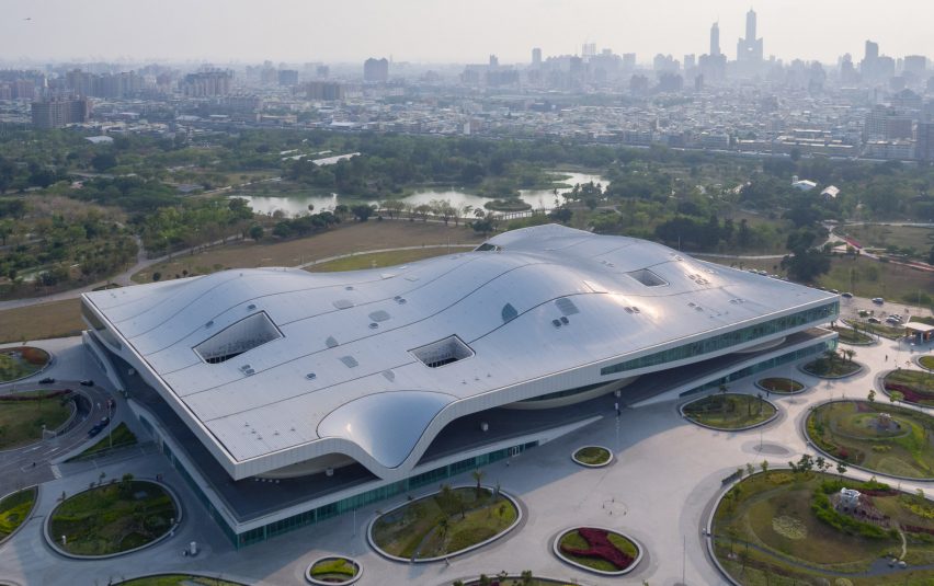
Centre stage: the "world's largest performing arts centre under one roof" is now open in Taiwan, designed by Mecanoo, and commenters are torn over whether it deserves a standing ovation.
"The plaza space looks uninspiring and venue fit-out lacks refinement. Overall looks cheap," argued Justas Studio.
Heywood Floyd shared the sentiment: "The whole project looks value-engineered and too big for the designers to manage properly or conceptualise as a whole. Not good."
"Can't believe they built this, looks like a surreal and fantastic rendering," said Clouddy in the building's defence.
"This project is incredible from idea to execution. It is a statement project that would have warranted the Pritzker Prize 10 years ago," countered Archi.
This reader made their feelings clear:
Architectural genius or mess? Join the discussion ›
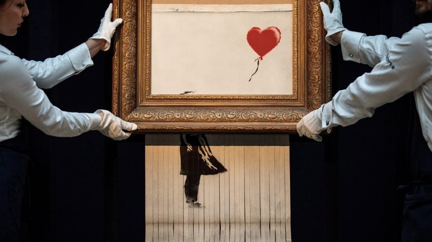
Bid farewell: news that a painting sent through a shredder at the moment of its auction sale has been officially confirmed as a work by street artist Banksy has left readers amused.
"This is simply so fantastic. Whether it was staged, the look of surprise and shock from onlookers was priceless – certainly worth the £1 million," applauded Arc.
Steve Hassler agreed: "I think the real story is that someone paid that much in the first place. Good for him on all accounts."
"The goal was to expose the superficiality of selling his work, while selling the work. That's why Banksy at his best is so great, he can have it both ways," added Heywood Floyd.
Le Cochon Bleu commented: "It brings to mind quite a funny, and at the same time sad, meaning of the aphorism 'art will eat itself'."
This reader was less impressed:
Self-indulgent PR stunt or clever conversation starter? Join the discussion ›