"Looks like a bad 1960s tower block dressed in a gaudy Hawaiian shirt"
In this week's comments update, readers are finding it hard to see the beauty in a red, white and blue tower block designed by architect Jean Nouvel.
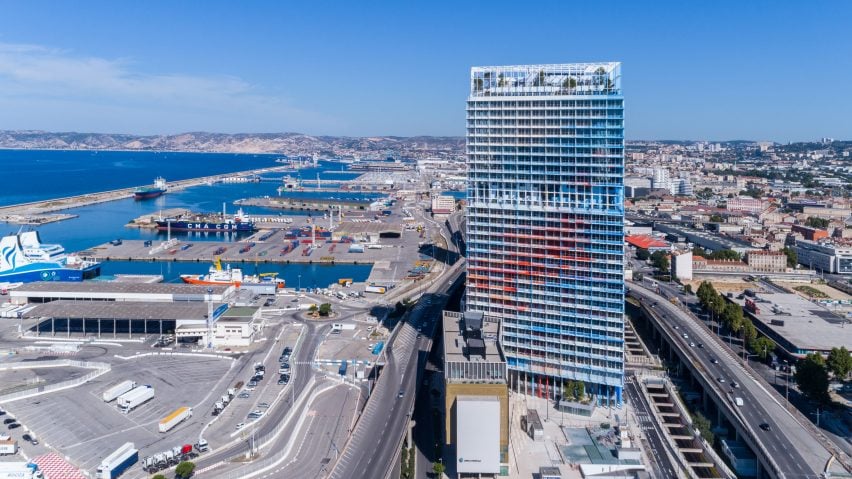
Seeing red: readers have given the thumbs down to La Marseillaise, a Marseille tower decorated in 27 different shades of colour.
"Awful," said Hikoo.
Alfredhitchcock agreed: "It looks like a bad 1960s tower block that's been re-clad in bright colours to try and make it more aesthetically pleasing, but it still looks like a bad 1960s tower block, dressed in a gaudy Hawaiian shirt."
"What a mess," added Threefloatingorbs.
Chris Becket made a more practical point: "I wonder how this building is meant to age. With 27 shades of red, white and blue, long-term maintenance could be a nightmare as the effects of the sea air and sun play on the structure."
However one reader felt the building already look weathered:
What do you think of the patriotic design? Join the discussion ›
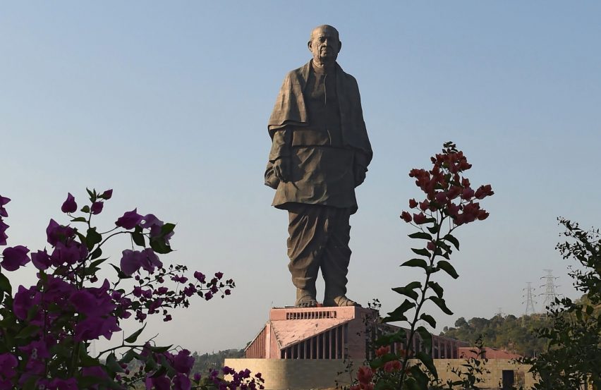
A tall order: the Statue of Unity has been has been officially inaugurated in Gujarat state, India, much to the dismay of commenters. The 182-metre-high monument was created by Michael Graves Architecture and Design, to pay tribute to the founding father of the Republic of India, Sardar Vallabhbhai Patel.
"A colossal waste. The time has passed for such monumental monstrosities. What it does represent is the vanity of man," said Arc.
Clichy was equally frustrated, asking: "Just why? This is a horrendous project, truly a blot on the landscape that serves no purpose."
"Massive statues, that's what India most needs? Great men are harder to produce than great statues," added Duckusucker.
"I wish the money that was spent on this was used for something better, something that actually made a difference. We need to get our priorities straight. As an Indian I am not proud of this," commented Divya Kapuria.
This reader made a particularly thought-provoking point:
Is the statue a huge waste? Join the discussion ›
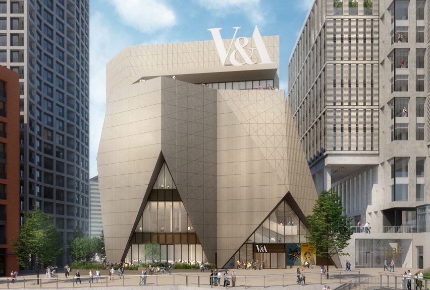
Off the mark: readers are not sold on plans for V&A East, the museum's proposed new outpost at the London Olympic Park featuring a five-storey museum designed by O'Donnell + Tuomey.
"That's one big heap of ugly," concluded Vuillard.
"Is it just me or does it look like a shopping mall on the inside?" ask Jea.
Threefloatingorbs may have found the reason why, adding sarcastically: "It's absolutely stunning how the designers put so much vaseline on their rendering lenses."
Jam was equally ironic: "Oh good, London doesn't have very many museums."
This commenter thought the design looked like something else:
Are you just as disappointed in the plans? Join the discussion ›
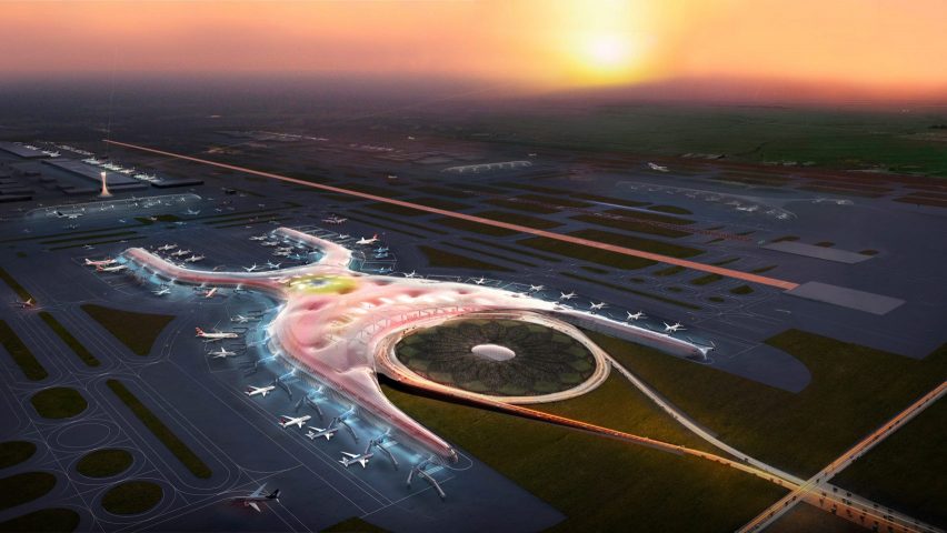
Outcry: a public referendum has resulted in a majority vote against Foster + Partners' new airport for Mexico City, meaning it has been cancelled midway through construction. Readers think costs should have been considered more carefully by all.
"To make this project without asking the population has that risk. Now the bill to stop the project will be higher than the project itself," observed Mario Guzman.
Alfredhitchcock added: "A bit like the Brexit referendum – asking people to vote one something without knowing the consequences first."
"Anti-democracy at its best," stated Hugo Castaneda Chavez.
Fva had a different view though: "The problem is being sold as a political or corruption issue but the most important thing is the water. It would have eaten up a large area of land which serves to filter rain water."
This reader was unimpressed by other features of the project:
Should the build have gone ahead? Join the discussion ›