"A nightmarish blight on a beautiful landscape"
In this week's comments update, readers are uncomplimentary about an abandoned housing development in central Turkey that features hundreds of identical chateaux.
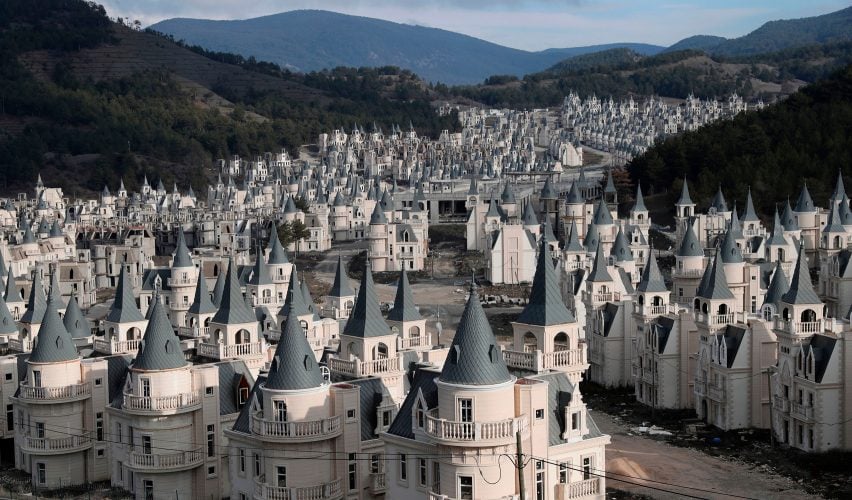
Abandonment issues: drone footage showing 732 identical mini chateaux that have been abandoned at the Burj Al Babas luxury housing development in central Turkey, after its developer filed for bankruptcy, has riled up readers.
"A nightmarish blight on a beautiful landscape," commented Joan.
Wyndham Williams agreed: "That just looks awful, and no space around each Barbie house? Hardly luxury".
"Looks like a wide white river of regret," added Hilton Purvis.
KLNR replied:"Looks like some dystopian Disneyland."
This reader had a very specific concern:
What do you think of the housing development? Join the discussion ›
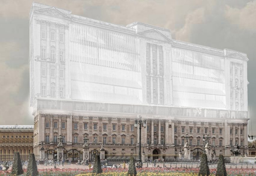
People's palace: commenters aren't impressed with Opposite Office after it revealed a proposed redesign of Buckingham Palace. The Affordable Palace would enable 50,000 people to co-habit with the queen.
"Ridiculous and insulting. How does circulation and means of escape in case of fire work with this design, or is it okay for 50,000 people to be trapped because this is better than being homeless?" asked AlfredHitchCock.
Heywoodfloyd went on: "I don't see the need to politicise the palace, this proposal is primarily immature rather than far left."
"Desperate attempt to gain attention, the design is laughable, and the rendering even more so," concluded Josh.
Pappeppuppippop replied, sarcastically: "I redesigned Opposite Office's HQ to boot out the architects and make room for the needy. Aren't I wonderful and deserving of fashionable praise?"
This reader simple said:
What do you think of the redesign? Join the discussion ›
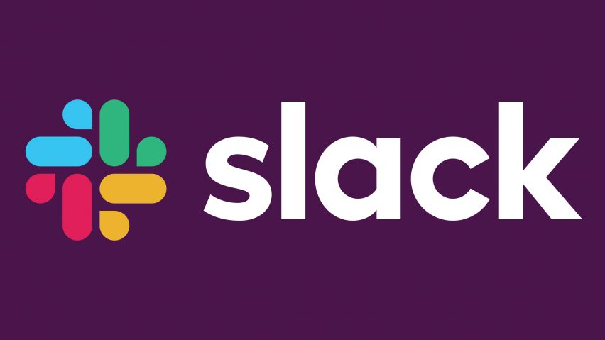
Cut us some slack: Pentagram has adapted the logo of workplace messaging system Slack as part of a rebranding effort, and the results have divided reader opinion.
"This is one of Pentagram’s best rebrands. They have found a way to convey the benefits of Slack using simple shapes that magically evolve from the original logo. Bravo," praised Michael Wigle.
Leo was a little less enthusiastic: "I like it, but I don't see how this can be considered a more simple version of the octothorpe symbol."
"Nobody see the swastika?" asked Adrian.
Frank had similar thoughts: "Twitter is already having a field day with the unfortunate symbolism. Once you see the swastika, you can't un-see it."
As did this commenter:
Successful rebrand or unsuccessful? Join the discussion ›
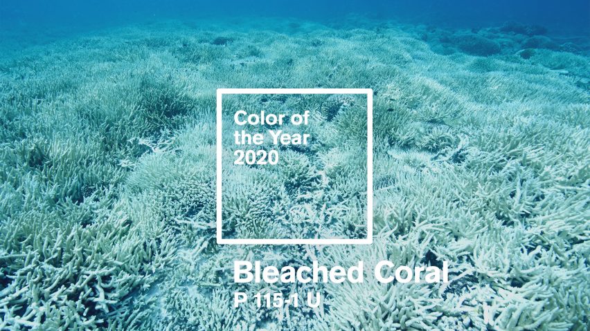
Dead sea: Pantone's shade for this year, Living Coral, fails to highlight the ongoing destruction of coral reefs, according to Australian design studio Jack and Hue. In response, the studio has proposed Bleached Coral as the colour of the year for 2020, reigniting debate.
"Huge, influential companies like Pantone have a responsibility to, at the very least, be aware of the issues facing our planet, and their choice of Living Coral seems to indicate otherwise," said Jack.
Victoria disagreed: "Don't see what's wrong with Pantone's colour choice. It showcased the beauty of coral, a beauty that we must preserve."
"Very naive, wishing to stop global warming through "colour of the year", commented Dan, in contrast to both.
Thomas intervened to say: "Ugh, just stop. Pantone is not an activist group and is under no obligation to act like one."
This commenter also felt the conversation had gone on too long:
Which readers do you agree with? Join the discussion ›