Aesop's creative director selects significant moments from the brand's first book
Aesop's inaugural book offers a snapshot of its three-decade-long history. Creative director, Marsha Meredith, talks through some of her favourite moments from the skincare brand's past.
Spanning more than 336 pages, Aesop's self-titled publication offers an "intimate and reflective" glimpse into the Australian skincare brand's history.
This is the first book that the brand has released since its launch in 1987, but founder Dennis Paphitis thinks it's arrived at just the right time.
"We wanted to tell something of our story in our thirty-third year – it matters to pause and reflect," explained Paphitis, who co-authored the book with Aesop's in-house writer Jennifer Down.
"The book is not intended as a detailed overview, but a selection of some of the stories and people who have contributed to Aesop."
Across 11 thematic chapters, the title explores everything from the concoction of the brand's products, to the development of its signature brown-bottle packaging and the interiors of its most memorable retail spaces – including its humble first store in Melbourne.
Some pages also offer an insight into Aesop's long-standing relationship with architects like Frida Escobedo, who to-date has designed six branches for the brand.
"It's been a true pleasure to work with this dedicated editorial team to blow the dust off our archives and to present the founding gestures that have guided the company to its current position," said Marsha Meredith, Aesop's creative director.
Read below for Meredith's selection of stand-out moments from the book:
Aesop Brera
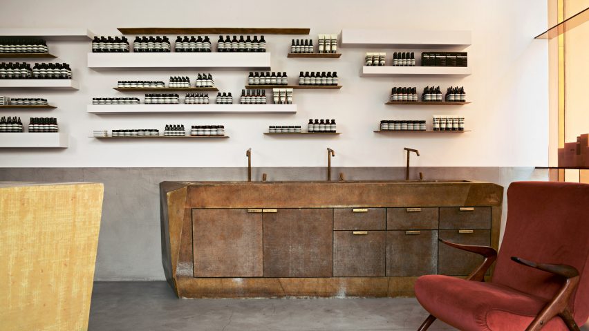
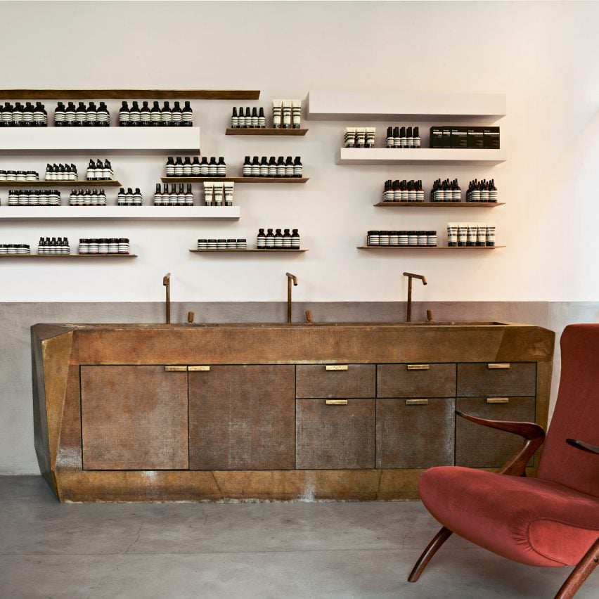
"Aesop Brera was our first store in Italy when it opened in 2015. We took over the lease from a salumeria that had occupied the site for decades, but which was moving to other premises. The business was something of a neighbourhood institution – it had been frequented by locals for their cuts of meat for decades.
"For the design of Aesop Brera, we collaborated with architect Vincenzo de Cotiis, who suggested we preserve the salumeria's original signage. That proposal was small but significant: it translated to respecting the history of the site and its previous occupants, which is an important part of how we approach the design of all our stores."
Aesop Tokyo
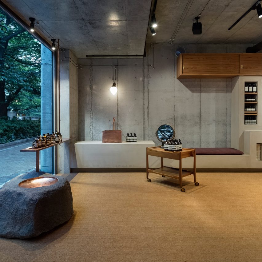
"The storefront of Aesop Tokyo faces the Meguro river, which provided one of the main sources of inspiration in the design of the space.
"This store is one of our many collaborations with Shinichiro Ogata of Simplicity and is an example of the way Ogata's approach to design is strongly informed by the geographical and historical context of a site.
"On one hand, the natural elements are evoked through the rawness of concrete, copper and stone; on the other, the teak cabinetry and salvaged furniture give the impression of a mid-century family home – warm and inviting."
Brass oil burner
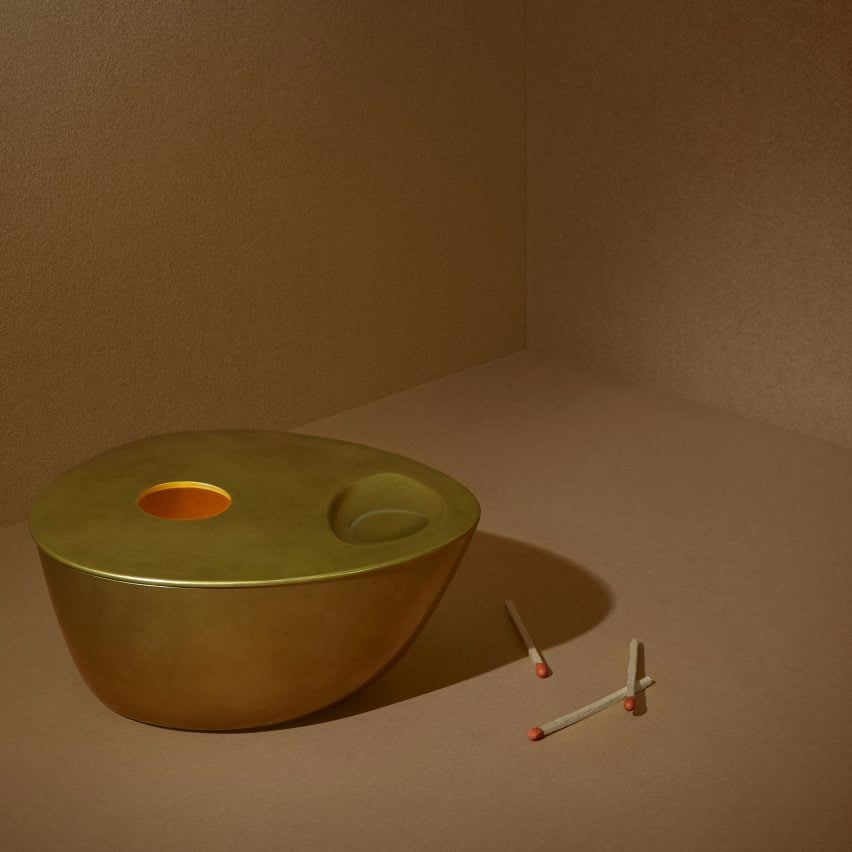
"We worked with Studio Henry Wilson to produce the brass oil-burner, which launched in 2018 after years of trial and error. We had worked with Henry on a few occasions previously in the creation of our Balmain and Crows Nest stores in Sydney, but the oil burner holds particular significance as our first design object for the home.
"Each is crafted from solid brass using a wax-casting process, which means that every piece is unique, and will evolve over time as its individual patina changes.
"We've always honoured individuality and idiosyncrasy, and so the design and casting process feels very apt."
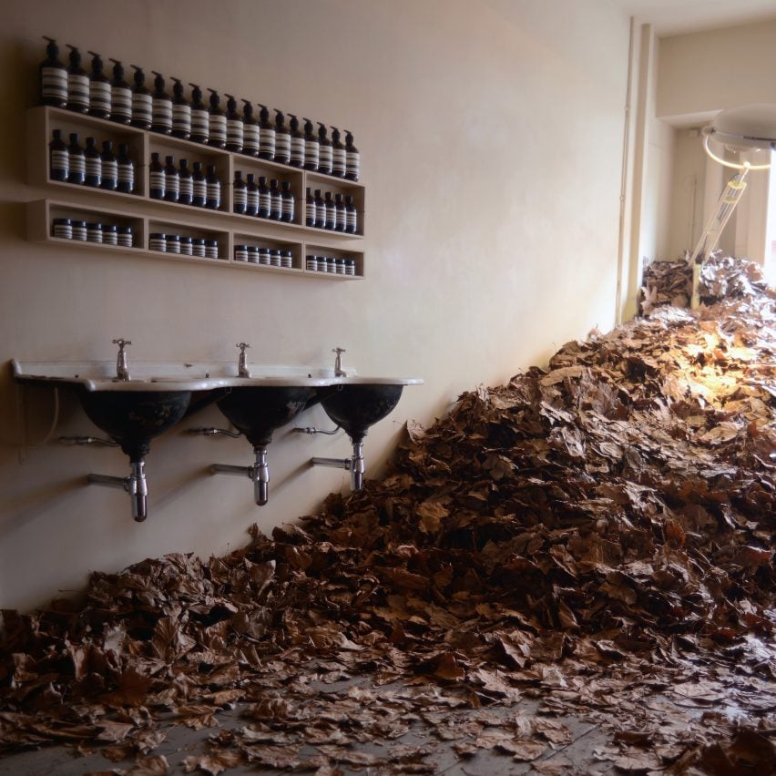
Autumn leaves installation
"Seasonal displays have been a part of Aesop since its earliest days. The first thigh-high flood of autumn leaves happened in a Melbourne store.
"Customers were taken aback, people were drawn in from the street. It was a sort of blurring of boundaries; not just between interior and exterior, but of personalities, too.
"Something about the superabundance of leaves makes people childlike. Although it wasn't a totally spontaneous idea—the leaves had to be collected, bagged, and loosed on the shop floor, then carefully raked each night – it was born from a very simple desire to bring joy to people."
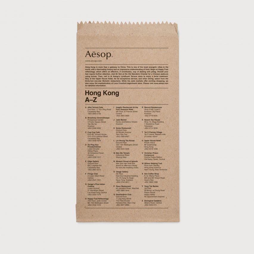
Aesop City Guides
"The City Guides started out as a way of passing on recommendations to like-minded friends and customers – not necessarily the best-known or most illustrious spots, but cafes, bookstores, restaurants, galleries, museums. The sorts of places that might not be in a travel guidebook, but which were authentic and welcoming nonetheless.
"Printing the guides on brown paper bags allowed us to share these suggestions with customers, and to extend the conversation beyond the initial in-store interaction."
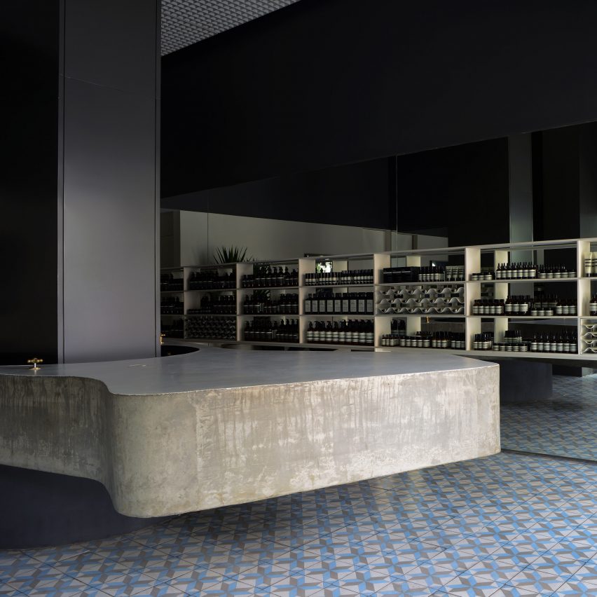
Aesop Oscar Freire
"Aesop Oscar Freire in São Paulo was our first store in Brazil, and is the result of a collaboration with esteemed architect and urbanist Paulo Mendes de la Rocha who is known for his contributions to the Paulista School – an informal grouping of Brazilian architects in the 1950s who were interested in brutalism.
"He worked with the renowned Paulo Mendes of Metro Arquitetos, and the resulting store is a light-filled space that feels in complete harmony with the city's climate and culture, which bears an impression of the designers' thinking in both material and form.
There's an extensive use of concrete, for example, which has utilitarian visual connotations; but it's configured in curving, fluid shapes that choreograph a leisurely pace of movement around the space.
"I'm also fond of the cement tiling underfoot, which is the same as that traditionally used in many local houses."
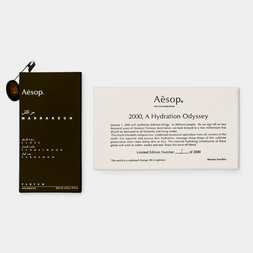
Aesop packaging
"Over time, the scale of our packaging has changed, but its aesthetic codes – the typefaces, the colours, the way in which information is organised – have remained consistent. In the beginning, the modest scale of our production allowed us to experiment with less conventional packaging.
"The early iteration of the packaging for the Marrakech fragrance featured a button and a safety-pin as a concession to tamper-proof plastic wrapping; while the year 2000 saw the production of a limited-edition hydrating oil, sold in so many numbered vials – an ode to Stanley Kubrick and the new millennium."