From Green to Red installation by Beatie Wolfe makes atmospheric carbon "something that people can relate to"
Musician and artist Beatie Wolfe has created an interactive video installation depicting rising carbon levels in the atmosphere.
Called From Green to Red, the video acts as a soundtrack to a Beatie Wolfe song of the same name that is about climate change. The project aims to "take intangible data and make it something that people can relate to," Wolfe told Dezeen.
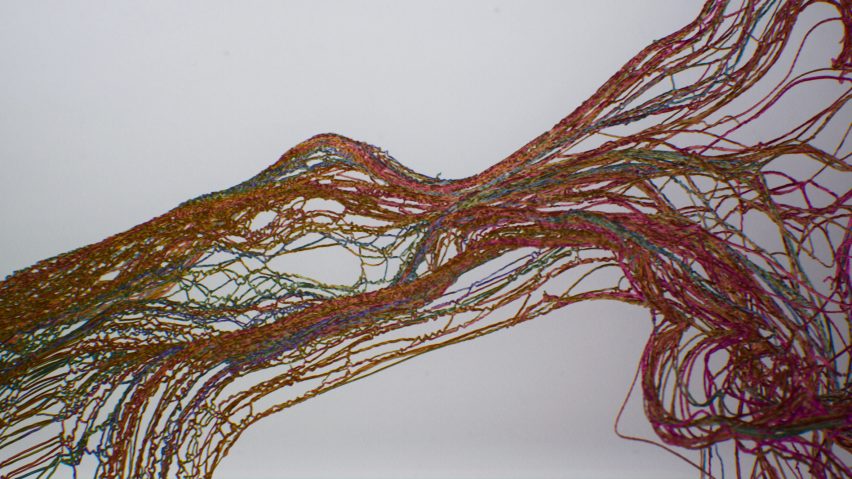
Viewers of the installation can interact with data tracking atmospheric carbon levels over the last 800,000 years. The data is displayed in a video projection showing a stream of digital threads representing a"woven timeline of our planet," according to Wolfe.
The threads gradually turn from green to red before suddenly unravelling, symbolising the way recent greenhouse-gas emissions are driving climate change.
The video was previewed exclusively on Dezeen last year as part of Virtual Design Festival. The interactive version allows visitors to reveal climate data along the timelines by moving their hands in front of the projection.
Wolfe wrote the song From Green To Red in 2006 immediately after watching An Inconvenient Truth, a documentary directed by Davis Guggenheim about former United States vice president Al Gore's climate-change campaign.
"I was just so horrified," said Wolfe, who was 17 at the time. "I just couldn't believe it. And so I went straight home and wrote the song From Green to Red. I just pressed record and the whole thing came out."
The song is about climate-change denial and the chorus ends: "As we sit at the crossroads the green turns to red. We don't want to know, don't want to know, don't want to know."
The song later appeared on Wolfe's 2015 album Montagu Square. A few years later, she met a NASA scientist who showed her data that showed rising levels of atmospheric CO2.
From Green to Red was previewed on Dezeen in 2020
The visualisation for From Green to Red was created in collaboration with production studio The Mill while the interactive installation was premiered at the London Design Biennale at Somerset House in London last month.
"One of the chief engineers for NASA was showing me these climate graphs, which were just so shocking in the same way as seeing An Inconvenient Truth," she said. "I was sort of shaken awake."
But she added: "I also realised how, for so many people, data is cold and impenetrable and sort of intangible." This gave her the idea to combine her song with an easy-to-understand visualisation of the data.
The From Green to Red installation is a way to "take that same data and essentially make it something that people can relate to and could absorb, and could really get a sense of where we are on the planet right now," she explained.
The amount of carbon in the atmosphere has risen 50 per cent due to the activities of mankind. Today there are around 420 carbon parts per million whereas in pre-industrial times there were around 280.
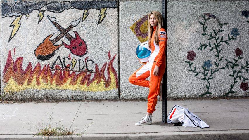
Beatie Wolfe was a guest artist at Dezeen's Virtual Design Festival last year. She provided the soundtrack to the festival's opening movie and recorded an exclusive performance.
The concentration of atmospheric carbon dioxide has been rising steadily since the industrial revolution and has accelerated over recent decades. Half of all emissions over the last 300 years have happened since 1980. A quarter has happened since 2000.
The Intergovernmental Panel on Climate Change (IPPC) estimates that between 100 and 1,000 gigatonnes of emissions will need to be removed from the atmosphere by the end of the century in order to keep global warming below the 1.5 degrees set out in the 2015 Paris Agreement.
UK studio Real World Visuals has also used visualisations to explain the impact of greenhouse-gas emissions. A short movie depicting New York's emissions as a mountain of blue balls went viral in 2012.
"Carbon emissions are invisible and that's a core part of the problem," Real World Visuals co-founder Antony Turner told Dezeen. "If carbon dioxide was purple, we would start taking notice."
Carbon revolution
This article is part of Dezeen's carbon revolution series, which explores how this miracle material could be removed from the atmosphere and put to use on earth. Read all the content at: www.dezeen.com/carbon.
The sky photograph used in the carbon revolution graphic is by Taylor van Riper via Unsplash.