Postmodern architecture celebrated in illustrations by Adam Nathaniel Furman
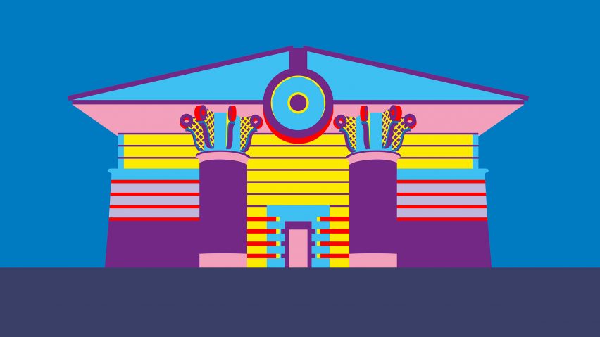
Designer Adam Nathaniel Furman has created a vividly coloured illustration series called Postmodern Icons, which celebrates buildings such as London's Isle of Dogs Pumping Station and Chicago's James R Thompson Center.
The series is a personal project that Furman started during the 2020 coronavirus lockdown, when he decided to revisit an old hobby of sketching buildings that he liked and creating 3D models of them.
After adapting one such model into an illustration and enjoying the process, he decided to make an ongoing series, focusing on postmodernism because there was "a gap" in its artistic representation.
"There's a lot of illustrations of modernist buildings and Victorian buildings and the great monuments of our cities from other periods," Furman told Dezeen. "There are not readily available ones much of postmodern architecture, which is something that I really like."
Often colourful and eclectic, postmodern architecture flourished in the 1980s and 1990s as a pushback against the functional ethos of modernism.
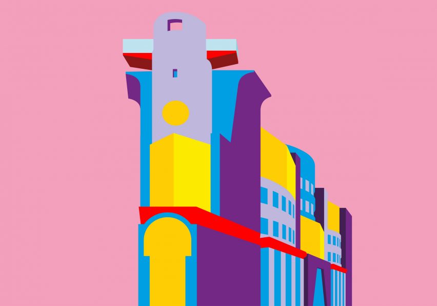
Furman tries to illustrate the buildings in a style that is as simple as possible, using just a few lines and blocks of bright colour to convey their essential character.
For some of the buildings, such as London's No 1 Poultry by James Stirling and Isle of Dogs Pumping Station by John Outram, the result is a highly simplified illustration that Furman describes as containing "just the right amount of information and no more".
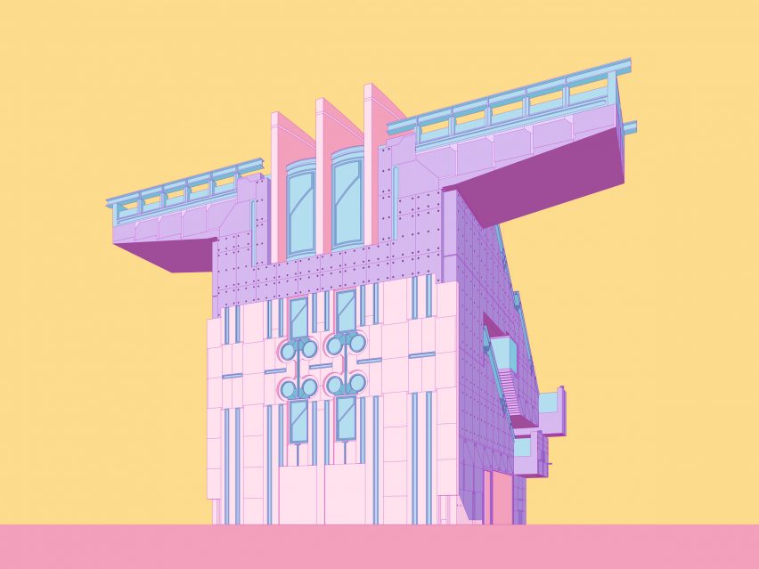
Others, such as Kyoto's now-demolished Syntax building by Shin Takamatsu, are rendered in more detail, which Furman considers necessary to communicate the brilliance in Takamatsu's work.
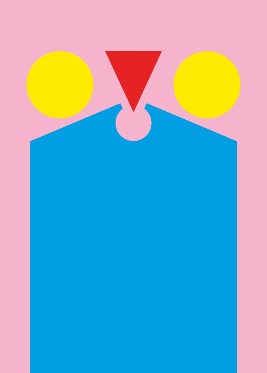
A couple of the illustrations, including ones of Kengo Kuma's M2 and Philip Johnson and John Burgee's AT&T building, appear as an abstract collections of shapes.
Furman chooses buildings that he loves for his illustrations, focusing largely but not exclusively on postmodernism, although not all his favourites have been suitable for the series.
The subjects have to be able to stand on their own, without their urban context.
"They are shown as sort of solitary objects floating – like souvenirs, effectively," said Furman. "And I've always been obsessed with souvenirs, just generally."
"If you look, a lot of my design work kind of revolves around the idea of the souvenir, this sort of encapsulation of something standing on its own representing something bigger."
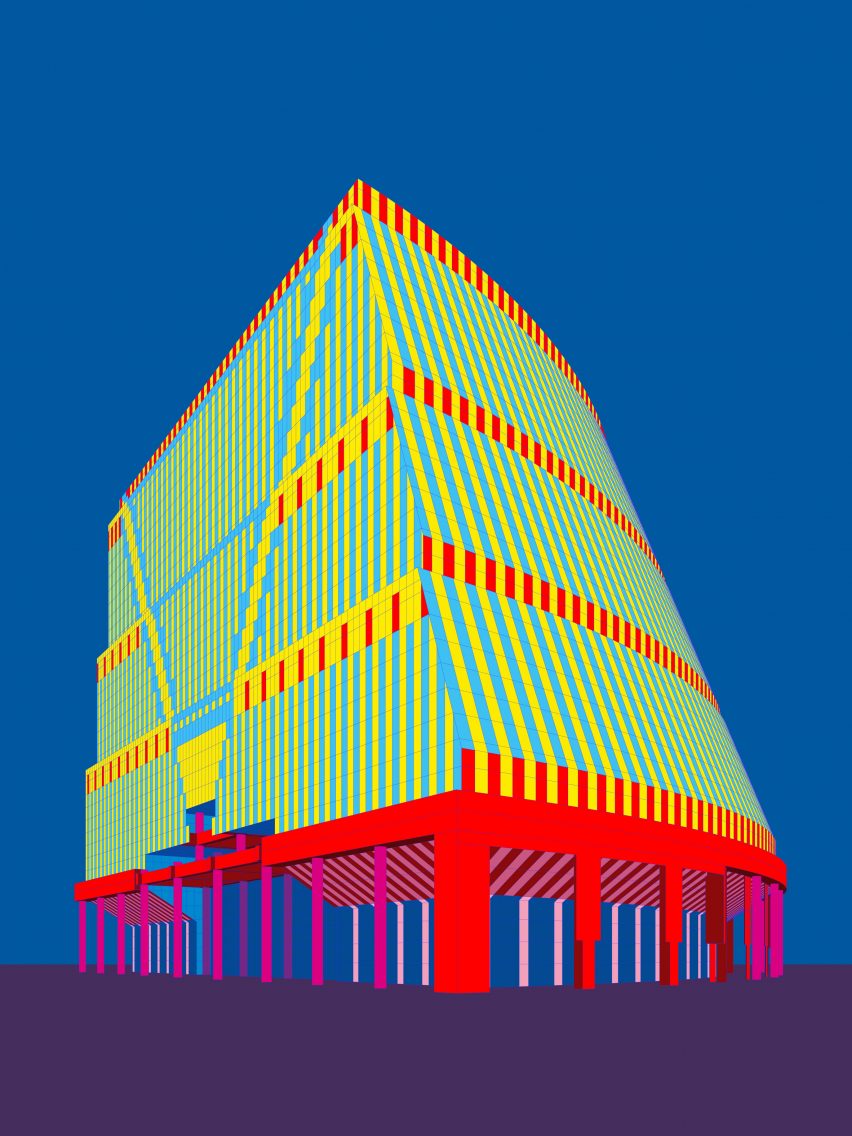
Furman posts the illustrations on Instagram, and sells them as prints and merchandise, such as mugs and tote bags, on his website. He also tries to use the work to call attention to architectural heritage causes.
The designer has illustrated Helmut Jahn's James R Thompson Center in Chicago, which was recently saved from demolition, as well as Wojciech Jarząbek's Solpol building in Wrocław, which earned Furman some ire from Polish commenters.
"I got loads of angry comments from Polish people like 'this disgusting building should be demolished!' – which is the reaction that very often happens to a style when it's not come back into fashion yet," he said.
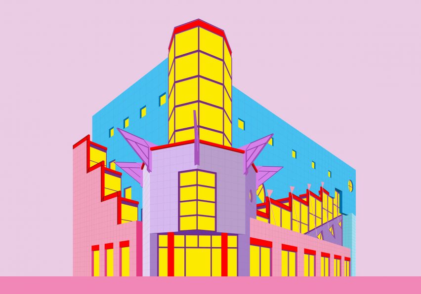
"The same thing happened with brutalism, and now it's everyone's favourite. Postmodernism is just going through the same thing," he continued.
Known for his colourful and playful designs, Furman considers himself part of a movement he has dubbed New London Fabulous.
His recent work has included the Proud Little Pyramid installation at King's Cross in London and pastel-coloured anatomically shaped chairs that explore cuteness and queerness.