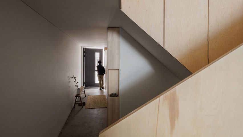
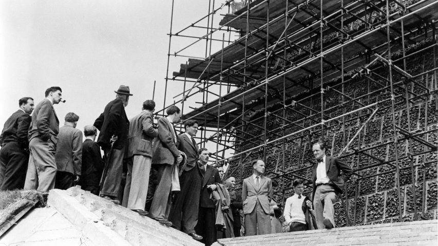
"What an architect is responsible for seems to have diminished" says commenter
In this week's comments update, readers discussed an opinion piece that argued "architecture is a hollowed-out profession with architects seemingly less vital than ever".
As architecture has evolved it has become detached from an understanding of construction and engineering that was once at the profession's core, wrote Eleanor Jolliffe in an opinion piece for Dezeen. Commenters joined the debate.
"What an architect is responsible for seems to have diminished"
"I agree with this diagnosis and would hazard that the fracturing of architectural knowledge has only contributed to the climate emergency," reflected Jbmoses.
"Even since my own registration in 1973, what an architect is responsible for seems to have diminished," lamented Colin MacGillivray.
Jonno55 thinks that "in the information age sophisticated engineering and large collaborative design and construction teams are here to stay".
Dan was scratching their head, commenting "eh? I don't know a single practising architect who isn't intimately familiar with construction techniques, material properties, structural design, building science and the plethora of other specialisms needed to make sound buildings."
What's your view on the status of the profession? Join the discussion ›
"I don't think they know what maximalism is"
On 1 April Dezeen ran a story revealing that minimalist British designer John Pawson has ditched his signature pared-back aesthetic in favour of maximalism. Readers were quick to react.
"Best April Fool's Day ever," exclaimed Aigoual. "Love it." Other readers agreed: Rd thought our prank was "excellent. 👌 And quite well done, doesn't look bad."
Kob was less enthusiastic, saying "TBF it's still minimalism. The inclusion of colour doesn't stop something from being minimal. The space is still devoid of clutter and unnecessary stuff."
"And yes, I know it's April," they were clear to add.
"I don't think they know what maximalism is," said Liam A. "This is just minimalism but with ugly colours."
April fool or English trifle? Join the discussion ›
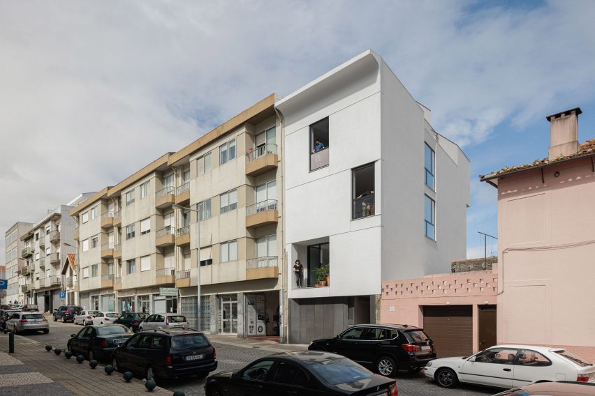
"Right up my aesthetic driveway"
The proportions of Casa Vertical's facade – belonging to a house in Porto designed by Tsou Arquitectos – echo those of its neighbours, but the building is finished in white plaster and topped by a gently curving section.
Commenters debated the project's merits (above and top).
Marius thought it was well-planned with a "tight footprint and lovely use and balance of materials and textures: white walls, wood, stone and exposed concrete/rock".
"This is right up my aesthetic driveway," concurred Puzzello.
But Walter Astor found it "very severe" and Mark Favermann called it "rather bland".
What do you think? Join the discussion ›
"Millions will keep drinking the stuff"
Drinks brand Pepsi has unveiled its fourth rebrand in 40 years with an updated logo that draws on its 1990s branding and uses black wording to draw attention to Pepsi Zero Sugar. Dezeen readers had feelings about the graphic design.
Ohoh! was confused, commenting "I don't understand how the brand font could change with every update".
"Nice idea; bad font," thought Embrita. "The diagonal move of the P kills it."
A Sound Bite thought that the "new Pepsi logo is both unattractive and unappealing but millions will keep drinking the stuff."
Upvoted more than half a dozen times, Gisstur had balanced praise for the change, calling it a "big improvement. Very clean strong. Looks great huge or small."
"The idiosyncratic custom type might not age well, but Pepsi seems content to do logo redesigns every decade or so. For now it looks fresh and interesting," they continued.
Pepsi or Coke? Join the discussion ›
Comments update
Dezeen is the world's most commented architecture and design magazine, receiving thousands of comments each month from readers. Keep up to date on the latest discussions on our comments page and subscribe to our weekly Debate newsletter, where we feature the best reader comments from stories in the last seven days.