"People living with disabilities are done waiting for accessible designs"
Designers and brands must get thinking now about the simple, immediate changes that can make their products more accessible to people living with disabilities, writes Luc Speisser of Landor & Fitch.
We cannot continue to unintentionally exclude the one-billion people living on this planet who are experiencing some form of disability.
This gigantic minority is so often let down by design. It's not enough to conceive truly inclusive products from the start, a process that normally takes two to five years, if not more. All of us – businesses, brands, designers – need to find solutions today. Because people living with disabilities are done waiting for accessible designs.
All of us – businesses, brands, designers – need to find solutions today
There is a lot that can be done to make brands and products more accessible right now.
Small shifts make a huge difference, and every element contributes to the accessibility of a product or a brand. From how it looks, to how it talks, feels, sounds, speaks and reads, every sensory element is an opportunity.
If you don't know where to start, a good first question is: can colour improve someone's experience? British bank Barclays, for example, changed the colour of its digital touchpoints to cyan from light blue, greatly improving its visibility.
Or perhaps it can be the incorporation of additional colours into a palette to aid legibility while also enhancing the overall visual impact of the brand. Accessibility upgrades like these are easy thanks to a number of online resources like Color Safe, Colorable, and Contrast Grid, and are a great starting point for any accessible design journey.
This leads nicely to another question: how accessible is your verbal brand? Typographic treatment can be on-brand while also improving legibility. This could be adjustments to scale, kerning and capitalisation. Again, there are plenty of resources are out there to support design choices, such as OpenDyslexic and Focus Ex.
Readability can also be improved beyond typographic style. Proctor & Gamble's Herbal Essences hair-care brand is a great illustration of smart design thinking. By embedding tactile indentations into the packaging, the brand is immediately more accessible to people with partial sight.
Of course, these solutions might already be on the radar of plenty in the design community, but repetition and democratisation can't hurt. What's more, we can go much further.
It is critical to recruit a representative group of the people you want to design for
To avoid bad design in general, and even more so when it comes to people living with disabilities, it is critical to recruit a representative group of the people you want to design for. And, in fact, not design for them but design with them. This is the best and fastest way to check if you are on the right track.
Adopt a one-size-fits-one approach. It takes a two-minute discussion with even a small group of people living with accessibility needs to understand that one-size-fits-all does not work. There are too many different and complex conditions and challenges to cover.
Investing massively to find the perfect product that works for everyone and then mass-producing it could take an eternity and might never work. So why not embrace the ever-improving possibilities offered by online customisation, 3D printing or other emerging technologies?
Forget about launching the perfect solution. Launch and wholeheartedly engage into an iterative process with continuous opportunities to improve and refine. Use your digital platform to consistently collect stats and data to see what people opt for. The one-size-fits-one model makes change super easy, as you are not restrained by a production line that has already been built.
Also, accept the idea that nobody can do it alone and that embracing partnership is not a weakness, but a strength.
Strive for no compromise. Very often when it comes to people living with disabilities, industries have come up with functional products with no regard to aesthetics. Why should accessible design just be functional but not desirable and affordable?
Some brands already understand this and have been leading the charge on accessibility for years, whether that be tackling language barriers, dexterity challenges, or accessible healthcare. This year's Cannes Lions Festival saw great examples of brands realising the importance of accessible design, with nominees shining through in the innovation category.
For designers, it has to become a natural reflex
Giants like Google are using augmented reality to break down communication barriers, bringing technologies like transcription and translation to our line of sight, making connections easier. Meanwhile, the Cannes Lions-winning Ecoclic box from laundry brand Ariel combines innovation and sustainability. The box is fully recyclable, FSC-certified and made from recycled fibres. It is inclusive and intuitive for adults thanks to its two-button ergonomic opening system. Combined with the clear opening instructions, the box is comfortable to open for all adults – including those with dexterity, visual and cognitive impairments.
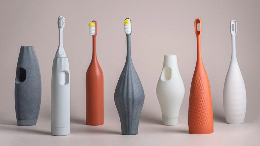
Then there was our shortlisted Accessories project – a first-of-its-kind accessible oral-care product, comprising bespoke 3D-printed toothbrush add-ons for people with dexterity challenges. The Accessories digital platform allows users to personalise their toothbrush handles, providing an efficient but also equally desirable and affordable solution to a daily but often-unseen barrier.
Making the world a more accessible place, right now, is possible. For businesses and brands, it is an absolute imperative but also a substantial source of additional revenue. For designers, it has to become a natural reflex; the very foundation of our approach. Let us end with Verna Myers' great words: "Diversity is being invited to the party; inclusion is being asked to dance." So, let's all dance together.
Luc Speisser is global chief innovation officer at Landor & Fitch.
The photo, showing Accessories, is by Si Cox.
Dezeen In Depth
If you enjoy reading Dezeen's interviews, opinions and features, subscribe to Dezeen In Depth. Sent on the last Friday of each month, this newsletter provides a single place to read about the design and architecture stories behind the headlines.