"True trends always answer a need"
As TikTok and other platforms become increasingly flooded with home-styling ideas, Michelle Ogundehin shares advice on how to navigate changing trends in the era of ubiquitous social media.
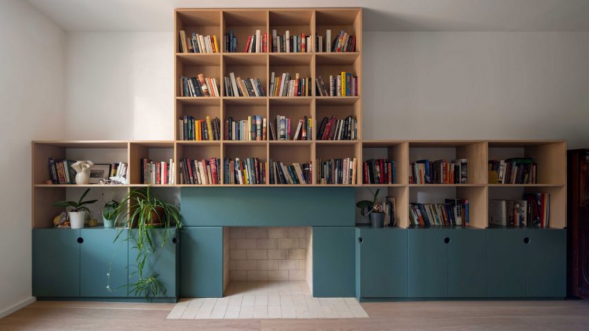
Newspaper journalists are often keen for a quote on "the latest trends". What do I think of polka dots? What about red paint: hot right now, non? It depends. Or recently, what could I say about the TikTok trend "bookshelf wealth"? Hmmm, interesting.
Obviously, just because images of a lot of spotty things have been cobbled together by someone on Instagram, or an influencer declares in breathless tones that poppy has surpassed magnolia in the paint stakes, does not make it universally true. But this is not to flagellate the notion of "trends" per se – the stylistic movements that visualise our cultural climate can be genuinely intriguing.
Here-today-over-tomorrow fads can be noxious
True trends always answer a need. Emerging from an alchemy of desire, available resources, and cultural resonance, they have the power to make visible unspoken truths. However, the here-today-over-tomorrow fads can be noxious. The thing is, true trends don't occur in a vacuum; you can always trace their roots. In short, no roots = no relevance = fad. And I'll come back to the bookshelves.
Alternatively, it's called marketing. Because someone, somewhere will make money from you feeling compelled to throw out your perfectly good cushion, frock, phone, or sofa to replace it with a newer, more "on-trend", faster, smaller, prettier, or any other adjective you care to insert here, model.
Social media platform-time is bought to advance the cause and propel the message. Whether it has staying power though, is entirely another matter. This is where the aforementioned relevance and roots come in.
Arguably there are moments when it seems as if one creative camp has agreed on a singular approach. The spring special April issues of the fashion magazines collectively trill that "it's all about pastels!" But is it? Or did the picture desks just pull together all the sugary-coloured images from across the collections of 20 different designers and call it a moment?
After all, it's habitual for colours to lighten in the spring and darken as we approach winter. More of note would be if everyone went grey for April. But that probably wouldn't make for an uplifting (ie sales-savvy) coverline.
It's the same in interiors. When I was editor-in-chief of ELLE Decoration, occasionally I'd receive a letter from a disgruntled reader bemoaning the season's hot new look. Why had it changed from last month's look, which they loved?
As consumers and designers, we must self-interrogate
My reply was always the same: my job is to show you what's out there, your job is to decide what you like, and then stick to it. Or change if you want to. But the key is that it's your choice. What I always wanted to add was: and don't devolve the responsibility for your taste!
It's also true that there used to be a bit of a journalistic mantra that went along the lines of: one's an oddity, two's a coincidence, but three's a trend! So, if three of a similar thing plopped into the inbox, then it was worth looking into.
However, the follow-up question is always: why? Why is this happening? Is there anything behind it? Just because something is new doesn't make it news. And, crucially, is it adding anything to the cultural conversation?
I think this latter point is ever more relevant today. It can no longer be justified to create for the sake of it (that is arguably the purpose of art). Instead, as consumers and designers, we must self-interrogate.
Has this product genuinely improved the models that precede it by using less resources, demanding less energy, eradicating plastic, and thus being less likely to end up as waste? If not, then why make it?
That aside, sometimes a "trend" reflects more of a mood than a whole "moment". Take the unexpected red "trend". We could post-rationalise this as being rooted simply in a feeling of dark times drawing us to colour. It makes us happier.
Engaging your own inner critic becomes ever more vital
On the other hand, red is a deeply emotive hue, one of the most visible of the spectrum, thus a colour that intrinsically demands our attention. This is why it's used for both stop and sale signs. We're literally hardwired to see it. So, is this a verifiable trend, or merely the power of colour theory? Maybe it doesn't matter?
However, when considering social-media trends, we generally only see more of what we think we already like. This is fine when we're talking pops of colour, a lot less so regarding deep fakes deliberately designed to thwart opinions.
Bottom line, engaging your own inner critic becomes ever more vital. The platforms will always deliver a constant stream of fodder, but to paraphrase the inimitable Coco Chanel: content is what's out there – but it's up to you to choose what to believe.
Now back to those bookshelves. The images themselves are irrelevant. If someone was to go out and buy books by the metre to "get the look" then they've missed the point entirely; let's not reduce the notion of home to a mere backdrop – it should be your personalised space from which to thrive.
Thus, to me, "bookshelf wealth" is the visual expression of the authenticity that we're currently craving in a world that appears to have gone right royally tits up. Homes with shelves bursting with well-read tomes, curiosities and the talismans of life, however quirky, are an antidote to the virtual.
It dwells firmly in the tactile and tangible world of the analogue as so beautifully depicted recently in Wim Wenders' latest film, Perfect Days, wherein the main protagonist lives contentedly in his chosen world of flip phones, cassette tapes and simple routine.
Stop the press! A trend that reflects the rejection of the maelstrom of modern life
It's about honouring yourself, your journey, your interests, and proudly displaying it all. It stands on the shoulders of the movements we've seen already towards fermenting, knitting, and baking sourdough. It's about truth-telling and slowing-down; renovating not relocating; ditching the work/spend cycle and stepping off the consumer conveyor belt.
It's not so much a look as a potent signifier of a shifting of priorities. It's back-to-basics and living on a human-needs-first scale, as an antidote to the prevalent norm of life being voraciously consumed at technological pace to maximise productivity for someone else.
Stop the press! A trend that reflects the rejection of the maelstrom of modern life, indicating long-term thinking and emotional evolution to be the way forward. That may not make for a super snappy soundbite, but it certainly bodes better for our future than crimson walls, or polka dots.
Michelle Ogundehin is a thought leader on interiors, trends, style and wellbeing. Originally trained as an architect and the former editor-in-chief of ELLE Decoration UK, she is the head judge on the BBC's Interior Design Masters, and the author of Happy Inside: How to Harness the Power of Home for Health and Happiness, a guide to living well. She is also a regular contributor to publications including Vogue Living, FT How to Spend It magazine and Dezeen.
The photo, showing House M by Studio Vaaro, is by Scott Norsworthy.
Dezeen In Depth
If you enjoy reading Dezeen's interviews, opinions and features, subscribe to Dezeen In Depth. Sent on the last Friday of each month, this newsletter provides a single place to read about the design and architecture stories behind the headlines.