"Peach is the right colour, but for all the wrong reasons"
By choosing Peach Fuzz as its Colour of the Year Pantone has celebrated passivity – when what the world really needs in 2024 is bravery and honesty, writes Michelle Ogundehin.
Pantone's Colour of the Year for 2024, Pantone 13-1023 Peach Fuzz, is a sweet, pleasant and friendly colour. It's nice. Which is a thoroughly loathsome word, often lumped together with kind. Even though (if you're an etymological pedant) there is a difference between being nice and being kind.
Kindness is often expressed through actions – doing something that is helpful to others – while niceness tends to involve more superficial words or agreeable, appeasing gestures. A nice person is sorry to hear you are unwell, a kind person may bring you soup. However, let's note up front that neither will prevent you from catching the cold that's going around in the first place.
The current cultural climate feels more brink-of-societal-collapse than fuzzy agreeableness
How does this relate to the colour? Well, according to the press release, Peach Fuzz "captures the global zeitgeist, serving as an expression of a mood and an attitude on the part of the consumer".
Except the current cultural climate feels more brink-of-societal-collapse than fuzzy agreeableness. Chronic disease is on the rise globally, mental health disorders too, both increasingly linked to a worldwide escalation in stress, pollution and environmental toxins.
Two brutal wars are playing out to no predicted peaceful resolution; one, the largest attack on a European country since world war two, has been raging for almost two years. Biodiversity loss is at catastrophic levels, and let's not even start on the ravages of climate change.
Despite this, the dominant homily of the times is #BeKind! A divisive sentiment at best – lovely in principle, but in reality often used to shut down dissent and quash opinion, especially for women.
But let us return to Pantone's peachy press release. "Peach Fuzz brings belonging, inspires recalibration, and an opportunity for nurturing, conjuring up an air of calm, offering us a space to be, feel, heal and to flourish."
Excuse me for interrupting the Kumbaya moment, but we will have zero chance to heal or flourish, whether ourselves or the planet, if we don't get up and start campaigning for urgent change. Right now we have many reasons to be angry, strident and to loudly protest. When the status quo needs to be challenged, being "kind" feels tantamount to being a pushover.
I see the colour of toilet roll, no longer stocked by anyone, anywhere
"I must be cruel, only to be kind," said Hamlet. This is perhaps a more appropriate positioning for now. We're surely overdue some uncomfortable truths?
Nonetheless, the "heartfelt" Peach Fuzz, promises to communicate a message of "caring and sharing, community and collaboration".
Really? I see only compromise. I see a colour widely used in the 1950s to paint the walls of swanky fashion salons because its flattering glow wrapped the privileged clientele in a permanently good light. I see the colour of toilet roll, no longer stocked by anyone, anywhere because it is a deeply unpopular, sickly shade. And I see the colour of pancake, the thick, sticky make-up used to obliterate any perceived facial imperfection.
Peach, I would therefore argue, is the colour of unrealistic optimism, of romantic hope over honesty. Lacking the passionate punch of red, it's a wishy-washy watered-down hue, stuck somewhere between the brash confidence of orange and vacuousness. It's deliberately muted. A colour that's been cancelled.
Which brings me to another potentially fascinating aspect of niceness. Remember that cold? Being nice can make you more susceptible to succumbing to infection.
According to Dr Gabor Maté, the renowned if somewhat controversial expert on the effect of stress, addiction and trauma on health, "There are certain inescapable patterns in people that get sick with chronic illness. The patterns include the repression of healthy anger. These are very nice people."
Peach is the colour of unrealistic optimism, of romantic hope over honesty
In brief (very), he's correlating the condition of being pathologically nice with an inability to express oneself authentically, whether due to social conditioning or external expectations of how you should act. "Once these beliefs are ingrained in your personality, they invite illness because of the stress they generate," he concludes.
Simplistic perhaps, but you can't help but admit there could be truth in this.
As such, avoiding the perils of excessive niceness, or a constant expectation to #BeKind, requires proactive acknowledgment of our genuine needs and wants, as well as setting boundaries. It's also about being heard in the expression of those needs. This latter bit often gets forgotten today.
Instead, we're living in an era where genuflection to wokeism is the norm and "sensitivity" censoring exists in every realm to avoid offending anyone, anywhere, about anything. Weaponised grievances masquerade as social concern, with people personally invested in one point of view harassing and de-platforming others for daring to hold a differing opinion. This is no way to go on.
Of course, launching a spectacle like Colour of the Year is very knowing. It's inevitably about making as much marketing noise as possible. As a result, it should never be taken as a definitive statement of anything of much importance.
However, in laying claim to epitomise the current state of the world, Pantone might just have inadvertently nailed a disturbingly true depiction of the pernicious impotence at the very heart of the current cultural malaise. It's the right colour, but for all the wrong reasons.
What we needed for 2024 was an assertive, empowering and honest colour. Not nice. Not kind. Merely truthful. A colour that says enough is enough. And that's 100 per cent not Peach Fuzz.
Michelle Ogundehin is a thought leader on interiors, trends, style and wellbeing. Originally trained as an architect and the former editor-in-chief of ELLE Decoration UK, she is the head judge on the BBC's Interior Design Masters, and the author of Happy Inside: How to Harness the Power of Home for Health and Happiness, a guide to living well. She is also a regular contributor to publications including Vogue Living, FT How to Spend It magazine and Dezeen.
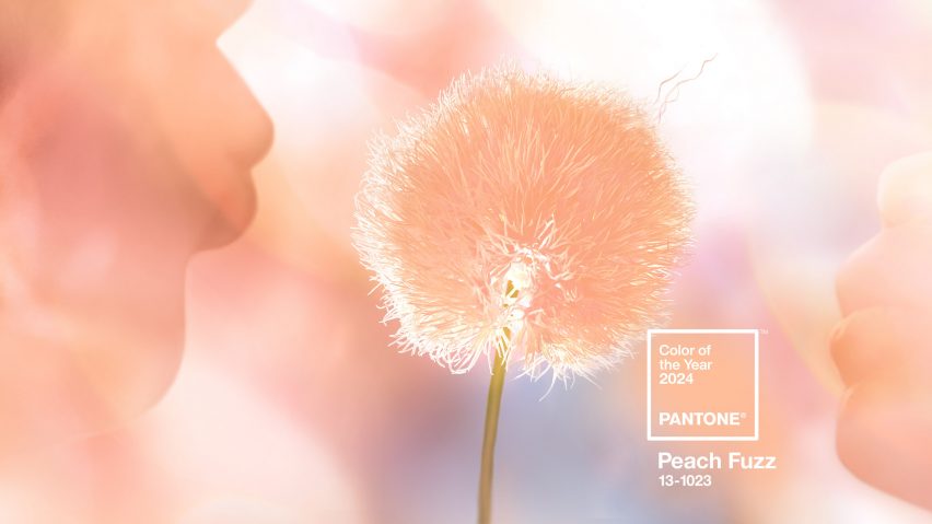
The image is courtesy of Pantone.
Dezeen In Depth
If you enjoy reading Dezeen's interviews, opinions and features, subscribe to Dezeen In Depth. Sent on the last Friday of each month, this newsletter provides a single place to read about the design and architecture stories behind the headlines.