


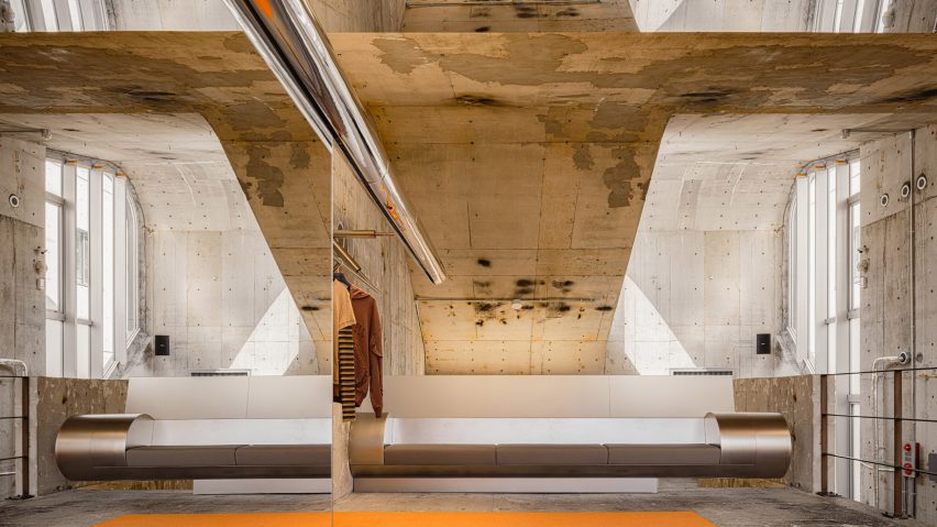
Local studio I IN drew on the existing architecture when creating fashion brand Andersson Bell's flagship store in Japan, which is filled with glossy, reflective surfaces and warm red and yellow hues.
Located in Tokyo's Aoyama neighbourhood, the original building from 1993 has an exposed concrete interior that heavily influenced I IN's design for the store.

"It is quite rare to find such a magnificent space in Tokyo, and we were fortunate to have the freedom to take a bold and radical approach to the design," I IN co-founder Yohei Terui told Dezeen.
"Especially, the building's strong composition of mass and void became a major source of inspiration and guided us throughout the spatial planning."

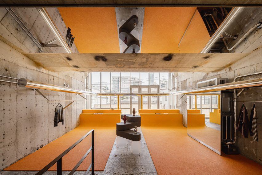
The studio aimed for the interior to be contrasting but not competing with the architecture.
"The idea was to translate the brand's identity of 'contrast' into space design," Terui continued.
"The existing architecture, built in Tokyo in the 90s, already had a very strong character and presence, so rather than competing with it, we wanted to introduce a strong modern layer that would create a beautiful contrast with the existing architecture."
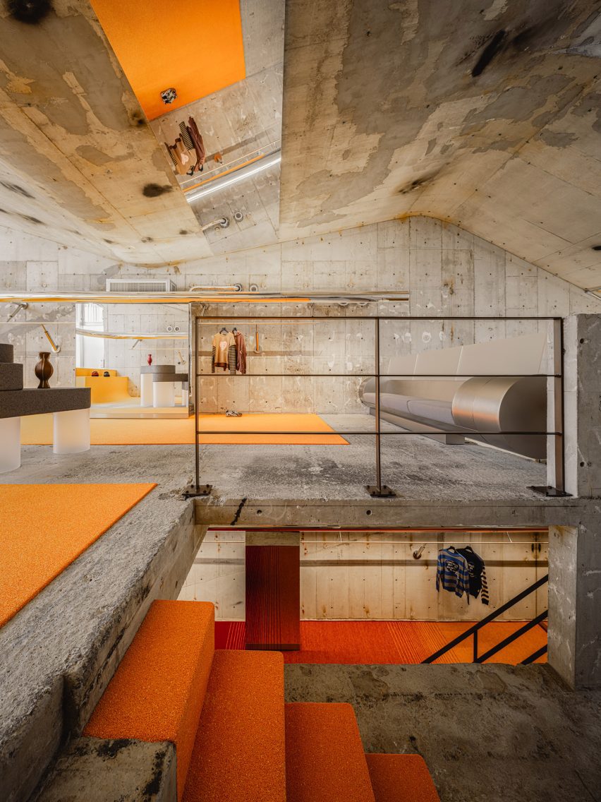
To do so, I IN, which Terui founded with Hiromu Yuyama, introduced warm, saturated colours across the building's three storeys.
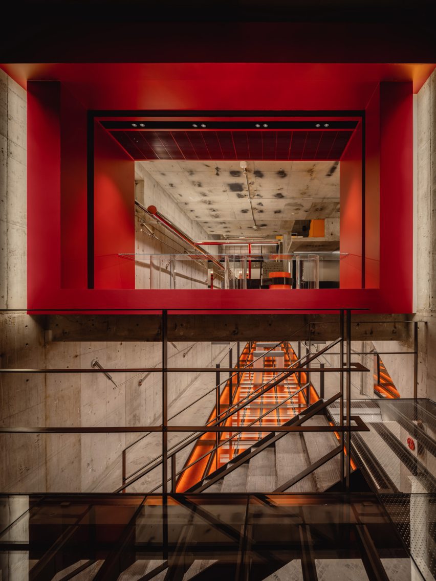
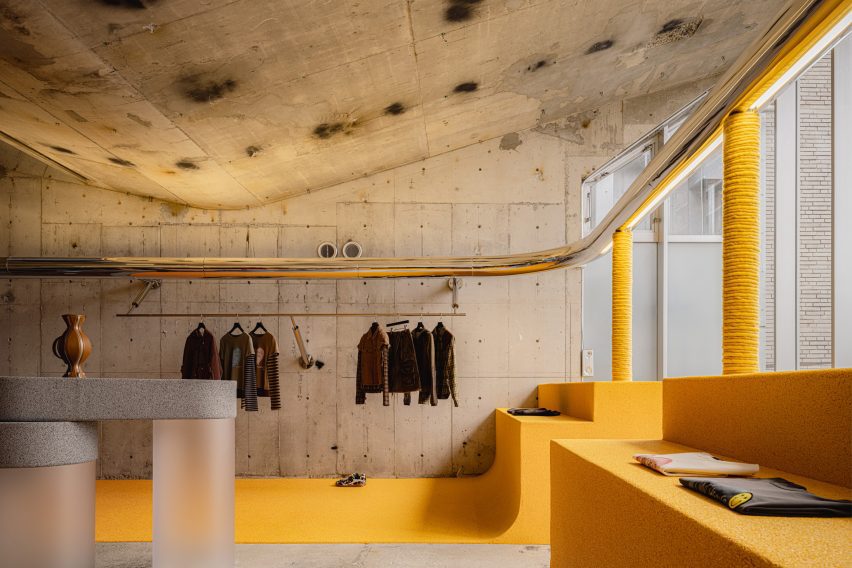
Bright red, orange and yellow hues contrast against the boardmarked concrete walls throughout the space, with the red section also visible through the store's large front window.
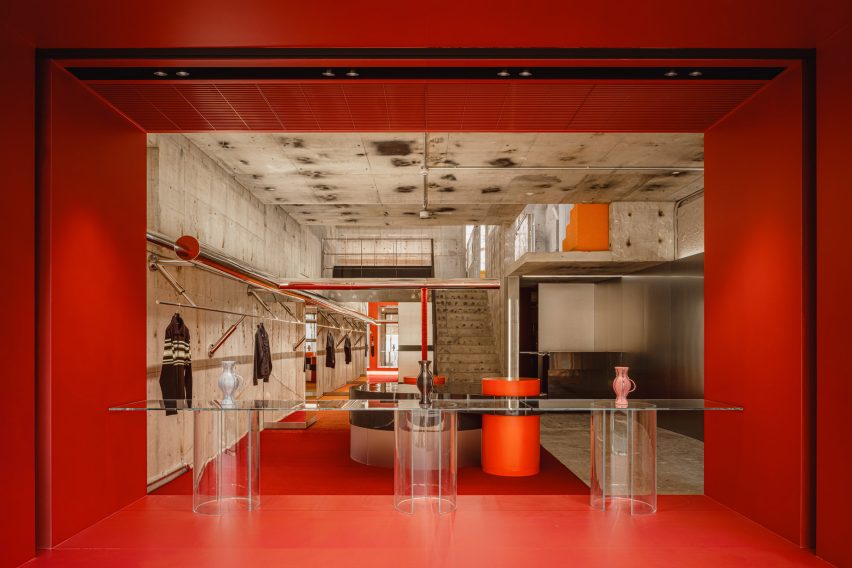
"The red comes from the brand's signature colour and became the introduction of the store," Terui said.
"As guests move through the space and step upstairs, they experience a gradual transition from red to orange and then to yellow," he continued.
"Rather than simply applying colour to each floor, we wanted this transition to become part of the spatial experience, giving each level a different atmosphere and creating a sense of progression as guests move through the building."
Terui and Yuyama also added pipes that "extend through the existing architecture as if piercing its structure", the studio said.
As well as contrasting the concrete's grey hue with more colourful details, I IN juxtaposed its raw tactility with plenty of glossy and mirrored details, including a glass floor, steel pipes and tables and display cases with shiny, lacquered surfaces.
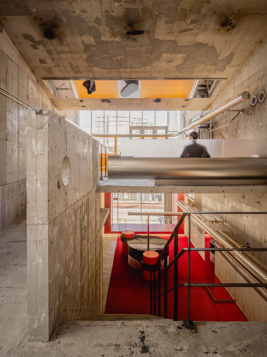
The furniture pieces used in the 309-square-metre store were tailor-made by the studio and designed to feel like a part of the existing architecture.
"All of the furniture was custom-made for the store," Terui said.
"We followed the same idea of creating a bold presence, taking inspiration from the powerful character and scale of the existing architecture," he continued.
"Rather than treating the furniture as separate elements placed within the space, we designed each piece as a part of the architecture, as if it had always been there, so that the furniture and the space ultimately merge into one."
I IN has previously also designed a tile-clad store for designer Nigo's Human Made brand and a glossy purple lounge for department store Matsuya Ginza.
The photography is by Tomooki Kengaku.