
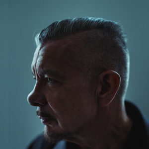
Neville Brody
English designer Neville Brody is the founder of Brody Associates.
His time as art director of magazines such as The Face and Arena in the 1980s won him international fame, including his investiture in 2011 as a Royal Designer for Industry, the UK’s highest design accolade, and a special commendation in the Prince Philip Designers Prize in 2010.
Brody has worked with major fashion brands like Supreme and Issey Miyake. He currently collaborates with companies including beauty brand Shiseido, technology giant Samsung, Japanese optics Nikon, fashion house Christian Dior, watch store Longines, and Japanese corporation Sony Music Masterworks.
Brody’s work is held in permanent collections worldwide in museums such as the Museum of Modern Art, V&A Museum, Design Museum, M+, and Museum für Gestaltung Zürich.
He was the Dean of the School of Communication at London’s Royal College of Art from 2011 to 2018, where he continues as a professor of communication.
Brody Associates specializes in identity, typography, and cross-platform visual-language systems and is responsible for The Coca-Cola Company’s global typeface, TCCC Unity as well as collaborations with art centre Somerset House, media brands The Times, BBC, and Channel 4, sports brand Nike, among others.
Typography by Brody featured on the England women’s national team football kit during last year's World Cup.
His new publication The Graphic Language of Neville Brody 3 (NB3) was launched in partnership with Thames and Hudson.

