
Red Stone has designed the visual rebrand for Parkinson's UK.
In response to the urgent need for improved services and support, Red Stone partnered with Parkinson's UK to create a new brand identity that better serves its diverse community.
Rooted in real experiences, the rebrand reflects the organisation's commitment to making a tangible difference today.
The guiding principle, "Pushing for better. Right here. Right now," unites the charity's work across research, healthcare and community support.
The new brand features a distinctive visual identity, a proprietary typeface, 'Parkinsans' and a refreshed personality of "relentless doers," enabling Parkinson's UK to drive greater visibility, engagement and action.
A key innovation was the creation of 'Parkinsans', a bespoke typeface inspired by the condition itself.
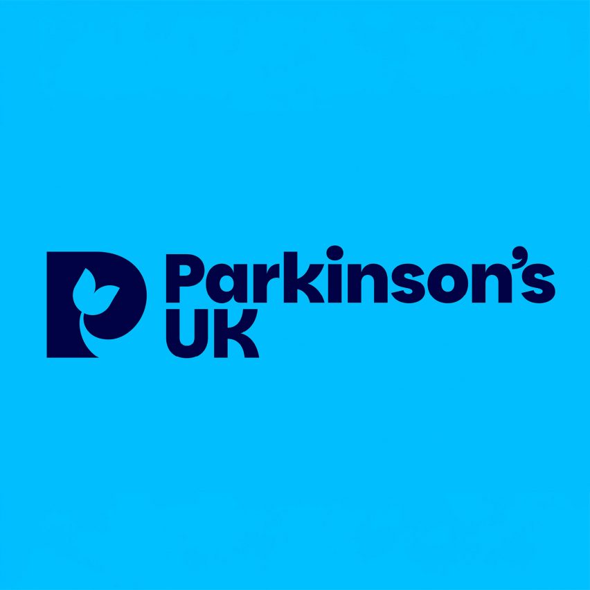
The new marque incorporates the Parkinson's tulip, an international symbol, creating a sense of belonging and unity.
Every design element was crafted to ensure inclusivity, from colour contrast to typographic clarity, making the brand accessible to patients, families, researchers and healthcare professionals.
This project has been longlisted in the graphic design category of Dezeen Awards 2025.
Studio: Red Stone
Project: Parkinson's UK Rebrand

