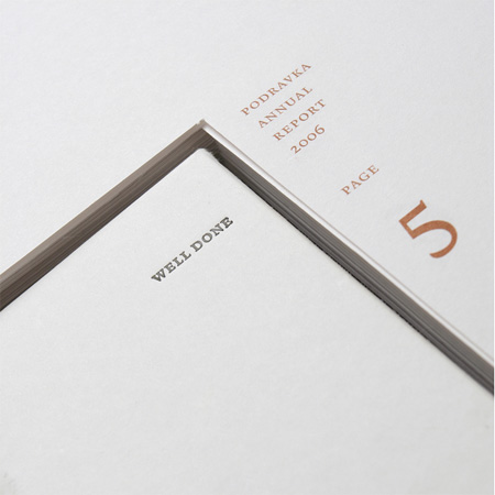
Well Done: a food company annual report that has to be cooked first
Croatian creative agency Bruketa & Zinić have designed an annual report for food company Podravka that has to be baked in an oven before it can be read.
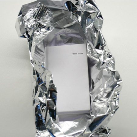
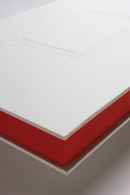
Called Well Done, the report features blank pages printed with thermo-reactive ink that, after being wrapped in foil and cooked for 25 minutes, reveal text and images.
Here are details from Bruketa & Zinić:
--
Well Done, the annual report for food company you have to bake before use
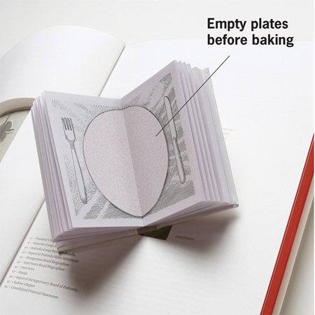
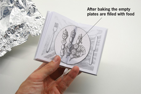
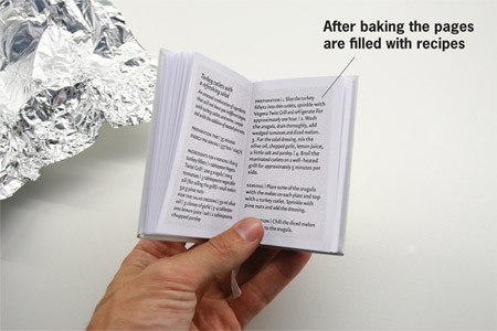
Empty pages become filled with content after being baked at 100°C for 25 minutes.
“Well done” created by Bruketa & Zinić is the new annual report for Podravka, the biggest food company in South-East Europe. It consists of two parts:
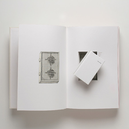
- a big book containing numbers and a report of an independent auditor
- a small booklet that is inserted inside the big one that contains the very heart of Podravka as a brand: great Podravka’s recipes.
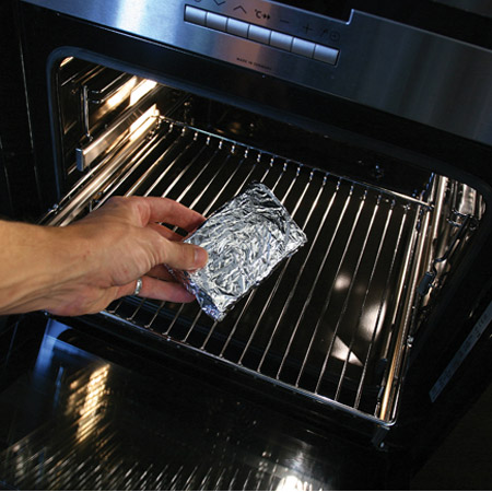
To be able to cook like Podravka you need to be a precise cook. That is why the small Podravka booklet is printed in invisible, thermo-reactive ink. To be able to reveal Podravka’s secrets you need to cover the small booklet in aluminium foil and bake it at 100 degrees Celsius for 25 minutes.
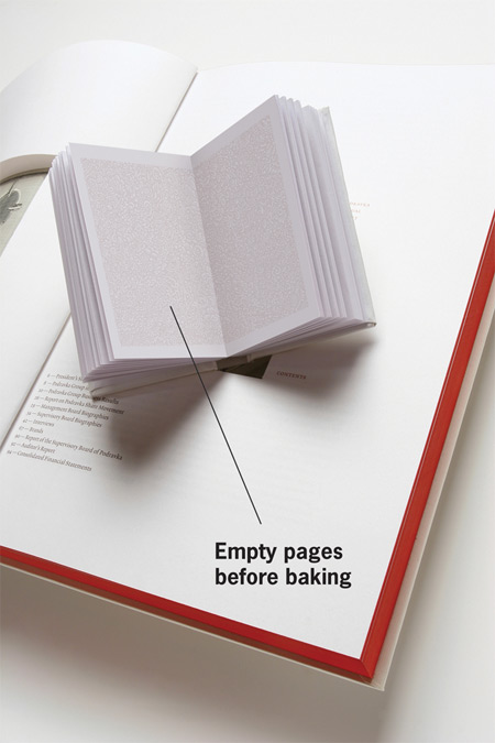
If you are not precise, the booklet will burn, just as any overcooked meal. If you have successfully baked your sample of the annual report, the empty pages will become filled with text, and the illustrations with empty plates filled with food.
The annual report is printed on paper Conqueror Laid Brilliant White 120 g/m2, Munken Polar 130 g/m2 and Soporset 90 g/m2 and written with typography Thema by Nikola Djurek and Lexicon by Bram De Does.
The creative team of the project consists of Creative Directors Davor Bruketa & Nikola Zinić; Art directors Davor Bruketa, Nikola Zinić, Imelda Ramovi, Mirel Hadžijusufović; Copywriters Davor Bruketa, Nikola Zinić, Lana Cavar, Teo Tarabarić, Project manager Mirna Grzelj; Prepress: Danko Đurašin and editor Drenislav Zekić.
This is the seventh annual report for Podravka designed by Bruketa & Zinić OM. Those seven books won numerous awards worldwide such as London International Awards (Gold), Art Directors Club New York (Silver), Red Dot (Best of the Best), Cresta (Winner of Category), I.D. Annual Design Review (Best of Category), Type Directors Club (Typographic Excellence), Graphis (Gold) , Creativity (Gold) , Good Design (Graphics Award), HOW International Design Awards (Best of Show), Moscow International Advertising Festival (Gold), International Forum Communication Design (Design Award) and ARC Awards (Gold).
Bruketa & Zinić OM is a 60-people independent agency based in Zagreb, Croatia. It was established 10 years ago. The agency has been awarded for their projects by many prestigious contests and their work has been presented in many publications, books and exhibitions worldwide.