January 27th, 2008

Here are some photographs of the Alan-Voo Family House in Los Angeles by Californian practice Neil M. Denari Architects.

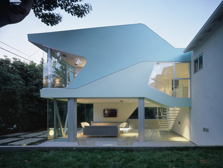
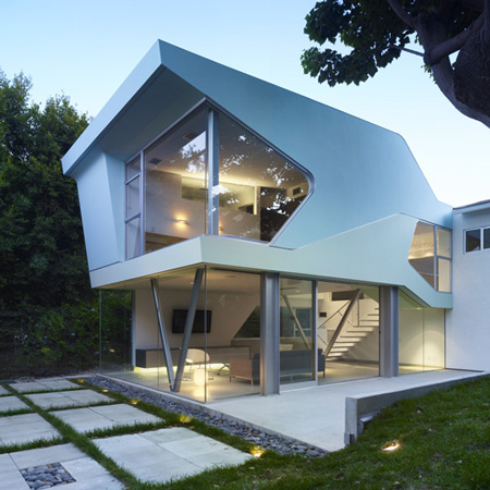
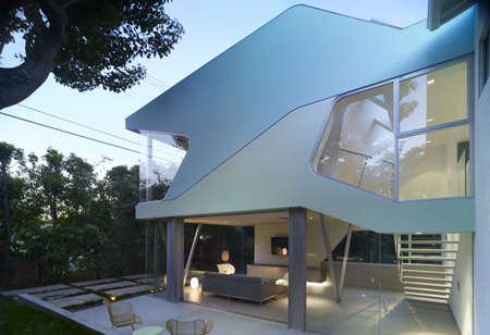
The project added a 1,000 square foot extension to the existing 1,000 square foot house.

The renovation was required to reflect the creativity of its inhabitants - a film trailer director, graphic designer and illustrator and their three daughters.

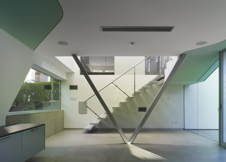
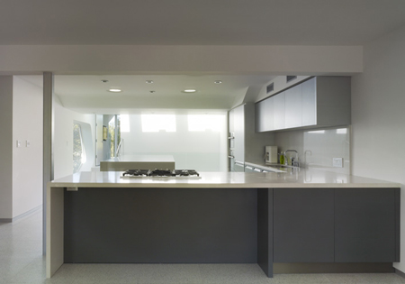
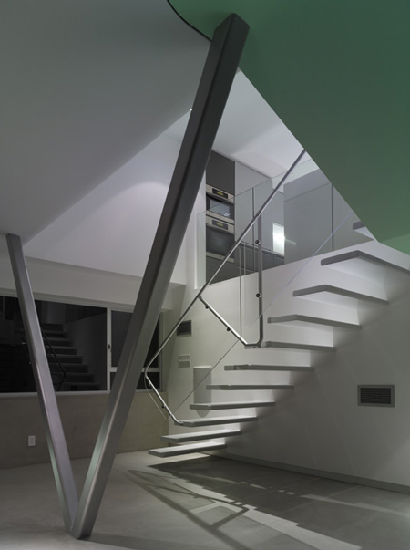
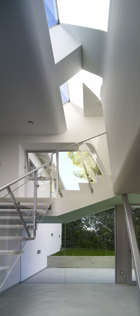
The extension comprises a glass-encased living area at ground level, and enclosed master bedroom on the first floor.

The house was completed in July 2007.

The following information is from Neil M. Denari Architects Inc:

Alan-Voo Family House

Project Description

The clients for this house renovation / extension, a couple with three daughters, are a creative, democratic unit. The father directs film trailers, the mother is a graphic designer and illustrator, while the high school / middle school / elementary school aged daughters are all immersed in their own versions of their parents’ visual cultures. The family have asked that 1,000 sf be added to the site in addition to the existing 1,000 sf house.

The scheme leaves half of the house for the daughter’s bedrooms and incorporates the other half plus new extensions in front and back into a public zone and a private bedroom for the parents.

This strategy amounts to a new 16 ft wide linear house being inserted into the existing house. Multi-toned, bright colors accentuate the new pieces which suggests a graphic expression representative of the family’s interests.


Posted by Rose Etherington

Subscribe to Dezeenmail

35 Responses to “Alan-Voo Family House by Neil M. Denari Architects”

  1. hasan Says:

    is so nice… i INDUCE to see its other architect`s projects

  2. carolina Says:

    this is beatiful… just perfect.

  3. Fischer Says:

    So nice….I love it!

  4. bala chand Says:

    Absolutely! fantastic!…..Good Work!…

  5. Tek Says:

    Luv this…very zen!

  6. luis miguel Says:

    es muy feo, y tiene un aspecto falso

  7. phone Says:

    Very Zen?!?!?!?!
    What the hell?!?
    Ughhhhhhhh!!!
    This house is horrible.
    It looks like a plastic toy.

  8. horst thorn Says:

    I love plastic toys, time are gone when we used to play with wooden bullshit…!!!

  9. Rebecca Says:

    I am a bit ambivalent. The interiors look really nice, but the exteriors look a bit toylike. If that’s good or bad I do not know..

  10. Tinsiders Says:

    Love the clean, pure look. Bravo!

  11. Dirty Says:

    Clean? There´s structural elements everywhere!

  12. M Says:

    nicely detailed

  13. lalala Says:

    Hey Phone,
    how bout you try to put ur stuff on this website?
    If you can. And we all can criticize on it. See how you
    you like it. Non of ur comments are constructive, you piece
    negative analysis.

  14. Leandro Says:

    The strong silhouette of the external form has no articulation with the internal space. A cake decor eh?

  15. Ramie Says:

    Hope to do something like that someday ..

  16. J Says:

    Can’t recall the title of his book from the 90s…was it ‘Gyroscopic Horizon’?
    This house Look straight out of that catalog!

  17. Jodi Says:

    i’ve looked at it…. looked at it again (don’t judge instantly take your time…. you are soooo quick to judge and have you ever designed a house? Nope) I did some work…… came back,looked again… okay okay, imagine with furniture, family, a dog.. maybe one like k-9 out of Doctor Who…

    Nope…. overall I don’t like it… I am not architect and would never pretend otherwise, but it is something about all of those diagonal lines, and an in-balance in the overall design, I particularly do not like the outside. but then I don’t have to live there - So perhaps I should keep schtum!

  18. david Says:

    i keep bumping into this house on various sites and blogs. i keep thinking that i should really, really like it, so i keep trying really, really hard to like it…but i don’t.

    i’m not usre if it’s the house itself or the way it’s photographed, or the cheesey way it’s always presented with the little back-story. it looks like it’s well put together and a lot of effort has gone it, but it just refuses to grab me.

    oh well, as long as the people iving in it love it, we can like or dislike as much as we want.

  19. Janesea Says:

    Well, if it was some of my friend’s house - I would frankly say “It’s a nice house”. But as for me I would never ever live in such house.

  20. Logicarch Says:

    As a whole I like the design of the addition; however I don’t think the addition/ renovation relates to the existing dwelling in any way. This is most likely why the photos don’t show the existing house.

  21. Azhar Says:

    Great to see Neil Denari building some of his fabulous drawings!
    Excellent!

  22. thorque Says:

    the verticle lines spoils it

  23. Nao Says:

    I liked the outside look, it caught my attention. It’s unique ^_^
    However, I do not like the “V” structure of the interior… I wouln’t feel comfortable.

  24. phone Says:

    I don’t like being banned.

  25. MOUSE Says:

    its great to see small projects like this. plenty of natural daylight, i enjoy the plasticity of the exterior, sure beats vinly siding. the diffuser panels near the stair do bug me, its too bad they could be lower and aligned.

    something about it reminds me of the 60’s. which i neither like or dis-like. wonder if anyone else got that same impression.

  26. THOMAS GATHMAN GALLERY Says:

    a fine example of post-cubistic architecture-picasso in 3-D

  27. Josip Roncevic Says:

    That is a great Idea and can be used for manufactured “town units “, too !

  28. eyeontheworld Says:

    At first glance, a stunning application of visual design simplicity. Pale in exterior and interior colour, soft and clean in finish. The structure seems as though it should flood with natural light, casting angular shadows and from its quirky windows offering reflections of equal variety.

    However look closer and with a keener eye and I feel that there are shades of 1970`s commercialism to the design. What I believe may have had beginnings in a typical, and somewhat un-original attempt at creating ultra modernism, has morphed, perhaps subconsciously, into a retro homage to the 70`s Californian office block.

  29. eric Says:

    Looks nice. But it has been done a million times before, not very creative.

  30. Elena Says:

    Bellissima…spero un giorno sia la mia casa!

  31. Rose Says:

    It is nice n perfect for my first inspiration, but the looks doesn’t last for long…

  32. modenza Says:

    Absolutely love the exterior, though I was disappointed with the interior. Particullarly the ground floor, whch didn`t work for me, too narrow and too dark (even with all that glass).

  33. andré Says:

    beautiful, this reminds me of the house of Mon Oncle!

  34. wad albabai Says:

    top ten

  35. y o u s i f Says:

    my dream home

Leave a Reply