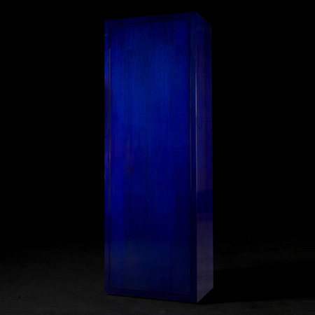
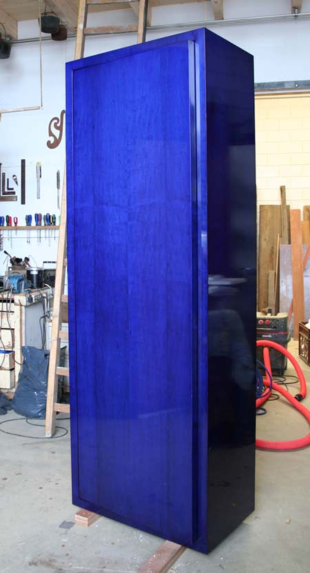
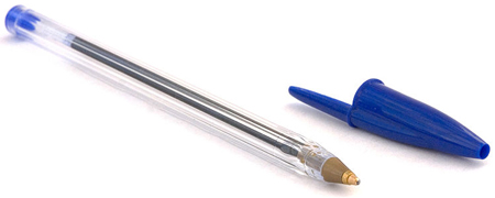
Designer Tomáš Gabzdil Libertiny of Studio Libertiny has created The Bic Blue Cabinet, which is coated with the ink used in disposable Bic Cristal ballpoint pens.

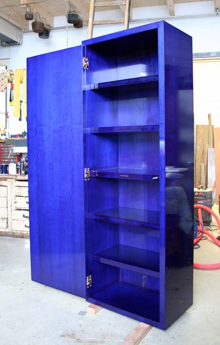
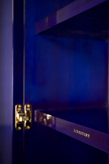
The cabinet is made from American maple wood and has gold-plated hinges, and a golden Libertiny logo inside. Several layers of French polish were applied on top of the ink to create a high-gloss finish.

The cabinet will be exhibited with Perimeter Editions at Design Miami/Basel in June this year,

Here's a description from the designer:
--
The BiC Blue Cabinet is mysterious and dominant; an object that tantalizes the surroundings. It reminds of Yves Klein's paintings and Kubrick's 2001: A space odyssey's mysterious monolith. It is a perfect alien.

The object (made of American maple) is painted with a special ink: the ink from the notorious disposable BiC Cristal ballpoint pen, which was generously provided directly from the BiC HQ office in France.
The ink has amazing iridescent characteristics. The final finish is French polish used on antique furniture and still nowadays on musical instruments. The process of application is very time consuming (dozens of layers of shellac). The surface becomes very hard with time. The interior contains sophisticated gold plated hinges and golden Libertiny logo. There is no handle but a push-to-open system.
More Dezeen stories about Studio Libertiny:
.


sorry, but the fact, that the cabinet is painted with BIG ink doesn´t make it better.
Yes! that would match perfectly with my golden taps and door handles.
aha
wow
why?
The qualities of the blue ink are very similar to that of natural indigo dye found in good quality jeans and also makes me think of the history of indigo, the use of the plant’s blue dye for adornment, religious ritual, and as a symbol of political and social status.
Lots to think about…
so?
Aha! (Phhhhh)
Why Vico? Why not? If not only for the extraordinary colour of the blue on the maple with the French polish…..that for me is enough in itself. Exquisite!
Beautiful work. Intense. Wonder how long it took for the ink to cure.
Remember seeing stain in other colors then wood decades ago.
Stunning.
That white P2O catch sticking out is really unfortunate.
the technique is nice, but the design is really nothing special. Is not even “normal”, like Fukasawa and Morrison.
Much Ado About Nothing…
Its a blue cabinet, looks nice enough, not the best use of time iv seen…
I have to say this seduces me. It could be any blue I guess, but the BIC blue is so familiar, then so unexpectedly rich over the wood, with the shellac glaze. (The gold hinges and logo are maybe a bit ostentatious.) But I would definitely put it in my house.
Great stuff for Dav Lynch movie. Ooo… I like it.
so after you by this for however many thousands, you explain that the color is regular blue bic ink. thats a little embarassing
where can you buy one of these bic blue cabinets? and how much are they for? anybody know?
Very Nice!
Would match great with an Jan Fabre "Bic-art" piece from the nineties.
interesting idea … turned out beautifully!