
Swedish architects Tham & Videgård Hansson have completed an apartment refurbishment in Stockholm with a colour scheme representing the changing seasonal colours in a nearby park.

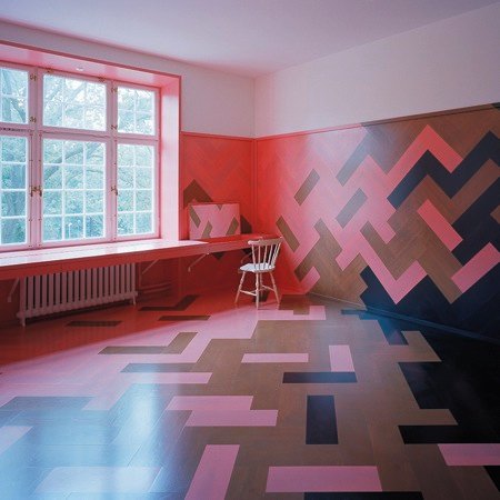
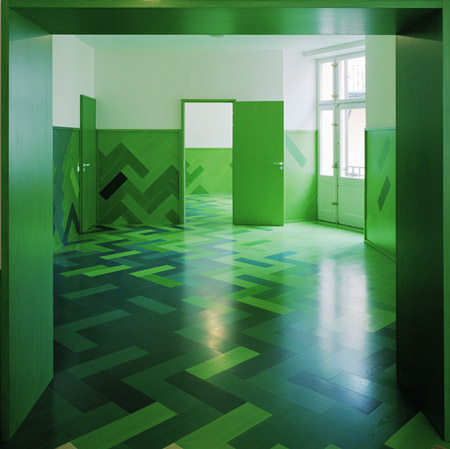
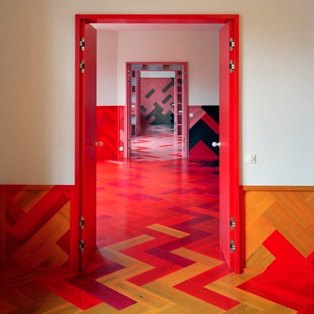
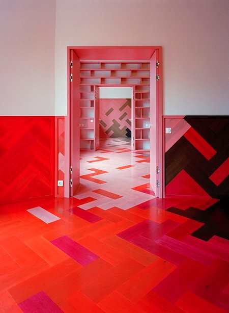
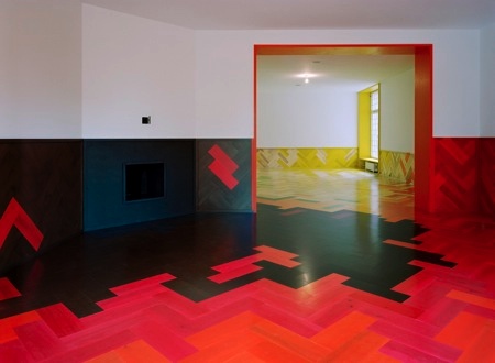
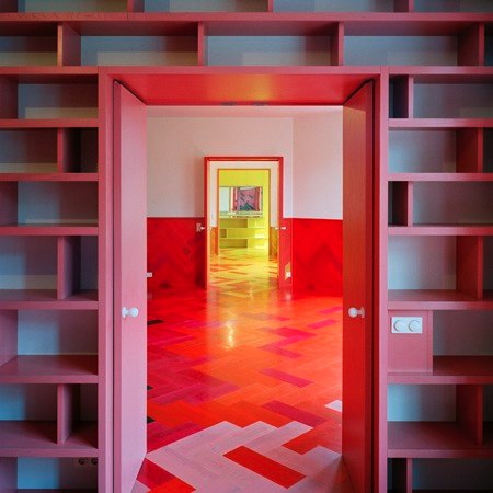
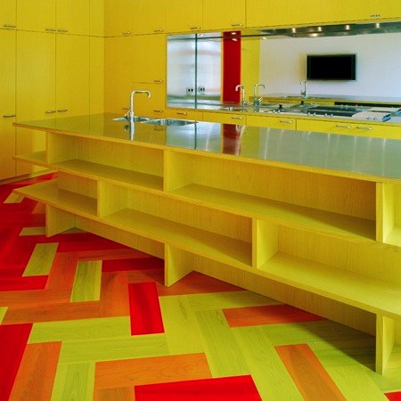
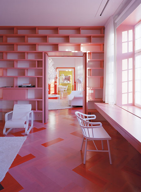
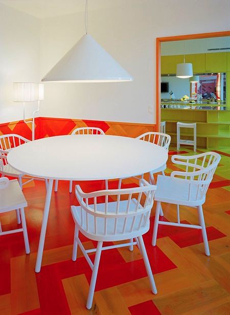
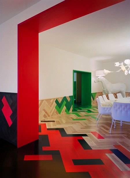
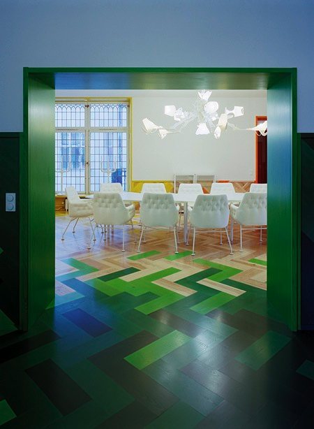
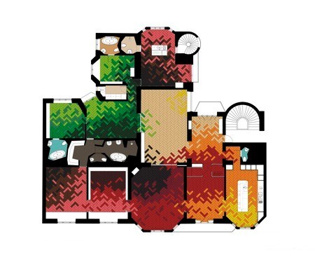
The apartment features oversized parquet floors and wall panels that merge through shades of green, yellow, orange, red and brown to winter grey and black.

The client called for a design that was not “the standard blond Scandinavian” interior.

Here’s some info from the architects:
–
Refurbishment of an apartment at Humlegården, Stockholm.
Oversized and multicoloured parquet floors and walls.
Stockholm (2008)

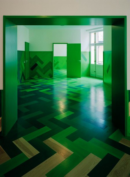
Departing from the traditional Swedish interior use of colour and patterns, developed by artists and architects like Carl Larsson and Josef Frank, this apartment also relates directly to the setting at the park Humlegården where the greenery outside changes with the season.

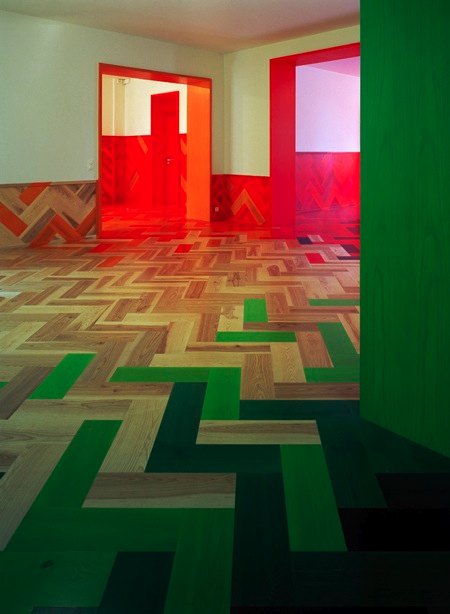
From winter grey and black, to summertime bright and deep green, to orange, red and yellow in autumn.

Our first starting point was to reestablish the well crafted quality of this once high-class turn of the century apartment (late Jugend / Art Nouveau (1800/1900) that had been totally altered, and even for some time transformed into a hotel, leaving very few traces of the original.

Inspiration was in part the location and the quality of a long row of rooms relating the greenery in the park outside, very present also in the interior spaces.

But equally important were the idea to address and experiment within the Swedish traditional use of colour and patterns in interiors developed by artists and architects like Carl Larsson and Josef Frank.

We had also used patterns and colour to order space in previous projects that this family had seen, which made us confident we could find a solution in that direction, something that would connect to both the physical and the cultural context.

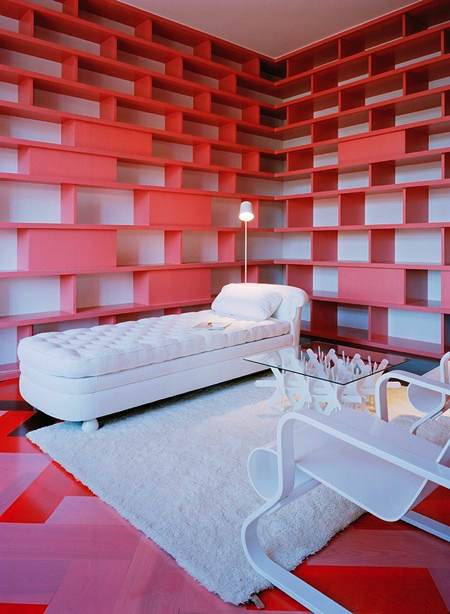
The overlapping colours transform the layout of the apartment and add a new structure of spaces linked to eachother across the original plan. The parquet floor also function as a uniting system that offer design possibilities. Once we had a set up of colours in different shades, we could develop each each room in relation to the others, every piece of parquet was defined to fit into the right postion, there was no random factor in the construction process.

We are always interested in finding ways to detail and produce architecture that combines contemporary industrial processes with the quality of crafted materials and details. When it succeds it means that the result is easy to build and comes across as very well constructed. The parquet is one example.

parquet: oversized and natural ash parquet floor, 20×60cm.

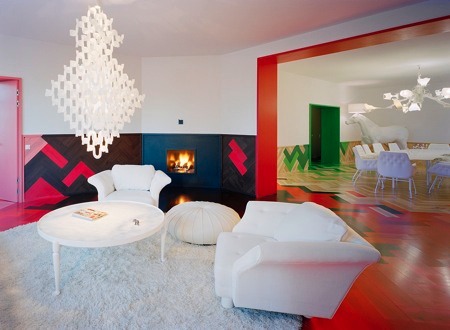
white furniture: when its all rendered in white, the physical design of each furniture is highlighted. At the same time it made it possible to create a coherent ensemble including pieces from very different designers and times.

Some features like the leaded windows are preserved also because it wouldn’t work for the exterior to take away those windows, its a protected building. Actually the only reason we could redo the interior is because it had already been altered, otherwise it had also been completely protected.

Client: They client had seen some of our projects including and thought our practice could do a contemporary interior other than the standard blond Scandinavian. They were clear about their admiration for Swedish designers such as Frank and that they were looking for something contemporary, even experimental. The brief consisted of an apartment for a family of four + a guest studio for visiting relatives and friends.

One-offs: in this apartment we did the Almost round-table, the Sweden dining table, the carrara hexagon table, the triangular childrens table, and the white Hexagon museum bench in the entrance, originally designed for the Kalmar Museum of Art.

Project name:
Humlegården apartment.
Architects:
Tham & Videgård Hansson Arkitekter / Bolle Tham and Martin Videgård Hansson.
Collaborators: Tove Belfrage, Helene Amundsen, Johan Björkholm, Karolina Nyström.
Dates:
Project 2006-2007, construction 2007-2008.
Address:
Engelbrektsgatan, Stockholm, Sweden.
Client:
Undisclosed.
Photographer:
Åke E:son Lindman.
More Dezeen stories about Tham & Videgård Hansson Architects:
.


–
Posted by Ali Morris


April 6th, 2009 at 1:15 am
Wellcome back in kindergarden…
April 6th, 2009 at 4:16 am
It is an intresting idea to use the color like that especially with this pattern in the wood. It gives the feeling of movement. However the colors are so bright andsome are dull; it is obvious that the daylighting haven’t been put in the considration and their effection in the floors.
From the images the daylighting has increases the brightness of the colors and this causes less comfort for the eyes and makes you feel that you spend so much energy. Besides some color like green give you a feeling you are sick.
I suggest if the colors have been used with the consideration of the daylighting; and in small amount and let the wood color to be the most and have only some touches of colors. Like the intrance in the middel it is so nice.
April 6th, 2009 at 5:09 am
amazing! so nice!
April 6th, 2009 at 5:22 am
aaaaahhhh my eyes…my eyes…
April 6th, 2009 at 5:25 am
¡fantástico!
April 6th, 2009 at 5:39 am
Jag tro att det e un-scandinavian. men bra concept!
April 6th, 2009 at 6:17 am
Pimps are gonna loooooooove this
April 6th, 2009 at 6:32 am
i can’t stop looking at these photos. i wanted to write a comment that actually had something to say, other than “WOW, this looks cool!”. but…what can i say, i’m speechless.
April 6th, 2009 at 7:09 am
Very interesing on pictures but I don’t know how long I would be able to live there
April 6th, 2009 at 7:22 am
This is really, REALLY nice…
April 6th, 2009 at 8:37 am
I love it!
But I´m not sure if I could live in there.
April 6th, 2009 at 9:16 am
this is extremely, extremely beautiful
April 6th, 2009 at 12:53 pm
definitely not for my taste. not bad though.
April 6th, 2009 at 1:25 pm
All it takes is a a bit of color to scare the living daylights out of people; at least judging by the typical commentary this site seems to attract.
Actually, the project is great, conceptually clear and well executed. No one is asked to live there but the people who own it or those who wish they lived in something other than a filing cabinet.
I see this project as the use of color as fresco, a rather typical use of decoration employed since the beginning of domestic architecture.
Excellent job. Must be great in Oslo too, where so often it is gray.
Terry Glenn Phipps
April 6th, 2009 at 1:33 pm
i like it, would love to live there!
April 6th, 2009 at 2:51 pm
TGP:
It’s not i Oslo, it’s in sunny Stockholm.
I like it quite a lot, btw.
April 6th, 2009 at 5:38 pm
that is one effing large apartment. and the project/colors – i dig it and wish i could handle color so well. i always opt out for white…borrrrrring.
April 6th, 2009 at 5:47 pm
i guess you could move from room to room depending on you mood.
a “mood house” if you will
April 6th, 2009 at 8:30 pm
çok güzel!!!
love it!
April 6th, 2009 at 9:38 pm
nice…but..
my eyes aaaaaa
April 6th, 2009 at 9:55 pm
lush lush lush!
April 7th, 2009 at 9:27 am
being in this house will make me sick.
April 7th, 2009 at 2:02 pm
every room is a nightmare on elm street, or a LSD trip for sure. is your concept- one flew over the cuckoo’s nest?
April 7th, 2009 at 4:06 pm
The colours are beautifully handled, the design is clear and sharp. Visually stunning. Bravo!
April 7th, 2009 at 9:10 pm
The first thing to say…..It`s diferent then the other stuff…..
And the second thing…………IT`S VERY, VERY NICE!!!!!!!!!!!!!!!!!
April 8th, 2009 at 2:46 am
There is that retro 70’s feel. But once the novelty wears off….
April 8th, 2009 at 7:36 pm
This is great, the new deal!
April 9th, 2009 at 10:25 pm
I really do apriciate people who have the guts to use colour, and i love they materiality of the project….. I am not convinced that this style is suited to daily life.
I think it would be great in a club or an shop…. for a home, i can imagine having a room or two like this, but i would also rather have some more nutral spaces…
April 17th, 2009 at 11:26 pm
very nice!
April 18th, 2009 at 2:59 pm
increible trabajo …………….. muy bueno
May 4th, 2009 at 2:15 pm
green one looks like sadistic dentist room in Poland in the 80’s…red one is awsome!loove it!
May 7th, 2009 at 4:28 pm
has a nice, Viennese feel to it, jatte snyggt(!)
May 8th, 2009 at 4:14 pm
this apartment gave me an impression of a beautiful art gallery, with pictures that should be hanging on the white part of the walls…
or a very friendly center for some studies… but it didn’t feel like the ‘cosiness’ of a home,
off course- it doesn’t mean that the owner will feel the same : )