Chips by Alsop Architects
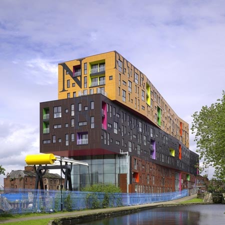
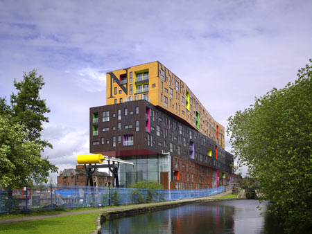
British architect Will Alsop of Alsop Architects has completed a residential building called Chips in Manchester.
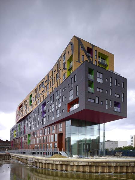
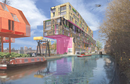
The eight-storey building, for developer Urban Splash, was conceived as "three fat chips stacked on top of each other."
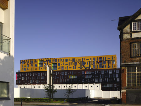
Each "chip" is covered in text referring to the area's history.
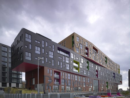
The building forms part of Alsop's urban plan for the New Islington area of Manchester and contains 142 one, two and three bedroom apartments.
Above photographs by Christian Richters.

Here's some more information from Urban Splash:
--
WILL ALSOP’S ‘CHIPS’ BUILDING COMPLETES IN NEW ISLINGTON, MANCHESTER
THREE FAT CHIPS STACKED ON TOP OF EACH OTHER.
A RESIDENTIAL DEVELOPMENT LIKE NO OTHER.
Quirky, bold and robust, ‘Chips’ forms the first major development for the Alsop-designed masterplan for New Islington in Manchester. New Islington, Manchester’s Millennium Community, is situated between the Ashton and Rochdale canals on the Northern edge of Manchester City Centre. Launched in 2002, Alsop’s Strategic Framework for New Islington, lays out an exceptional place, modeled around new canal arms and an inspiring landscape.

Commissioned by Urban Splash in 2002, Chips presents the first new apartments for sale in New Islington was designed by Will Alsop whose building was inspired by three fat chips piled on top of one another. The ‘Chips’ building comprises three equal-height, long, thin new build masses (Chips) approximately 100m long by 14m wide stacked and staggered upon one another creating an elevated ground floor and eight levels comprising 142 one, two and three bedroom apartments. The building is clad in a composite wall faced with a cladding covered in newspaper print with text that echoes the industrial heritage of the Ancoats area.
The design provides a mix of living and studio units and commercial space within a single project. The project defines a quality of living by combining outstanding design with technological innovation while embracing key concepts of sustainability, integration into the urban landscape and the provision of inspirational and sensational apartment units. The building’s apartment types range from studio spaces to three bed apartments. There is also a variety of differing external balconies. The apartments are planned internally around a central ‘pod’ unit, housing the bathroom and kitchen areas. The apartments can be open plan or sub-divided by the use of large folding screens. It marks another significant milestone for New Islington, which will become even more of a community once the residents of Chips move into their apartments in 2009.

CLIENT
Urban Splash Ltd
ARCHITECT
Alsop Architects:
Will Alsop, Duncan Macaulay, Edward Norman, Caroline Koo, Bonny Yu
STRUCTURAL ENGINEER
Martin Stockley Associates
M&E CONSULTANT
Quartzelec and Fulcrum
QUANTITY SURVEYOR
Simon Fenton Partnership
CDM CO-ORDINATOR
Rawlings Consultancy Services Ltd
LANDSCAPE DESIGN
Grant Associates
LIGHTING CONSULTANT
Pinniger & Partners
ACCESS AND ACOUSTIC CONSULTANT
Buro Happold
MAIN CONTRACTOR
Urban Splash Build