Roosendaal Market Square Pavilion by René van Zuuk Architekten
René van Zuuk Architekten have completed a pavilion for the pedestrianised central market square at Roosendaal in the Netherlands.
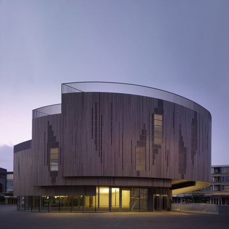
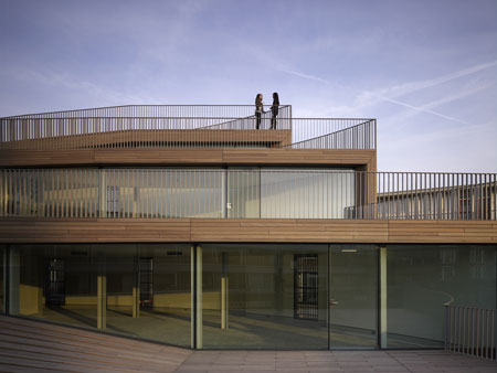
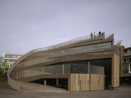
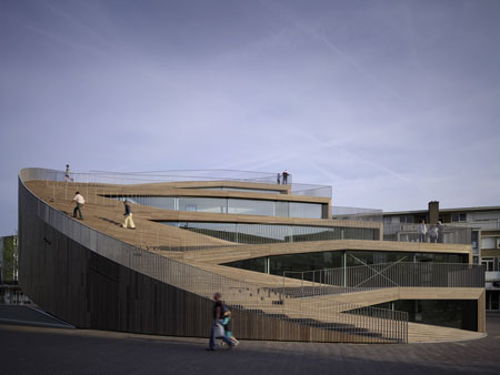
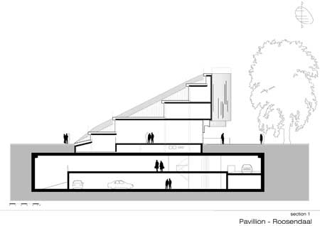
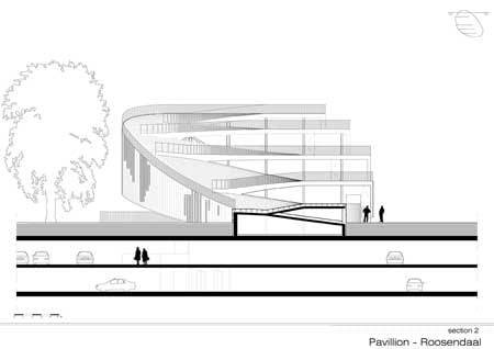
The pavilion, built over the entrance to an underground car park, features a rooftop performance area.
The pavilion also houses shops and offices.
The pavilion and car park are elements of ongoing improvements to the square, which was pedestrianised in 2001.
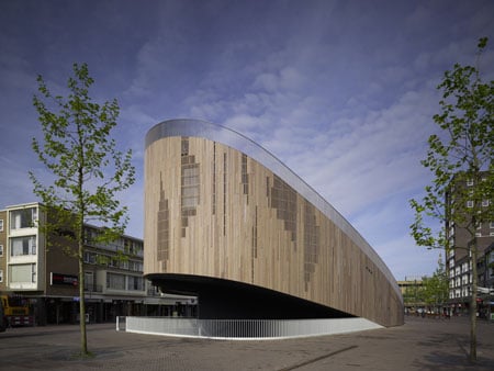
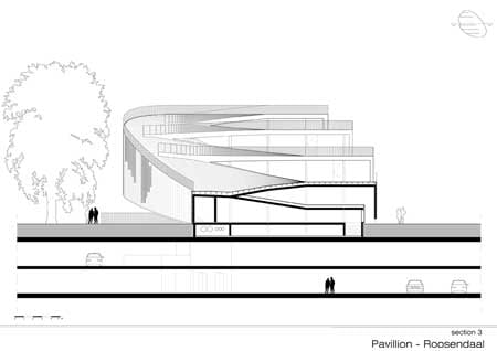
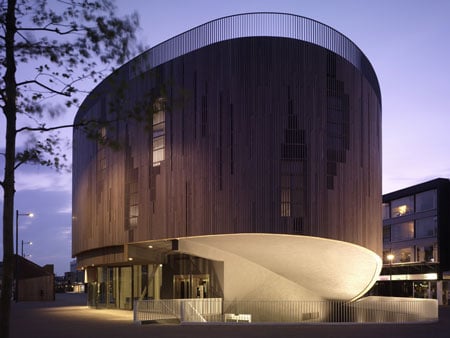
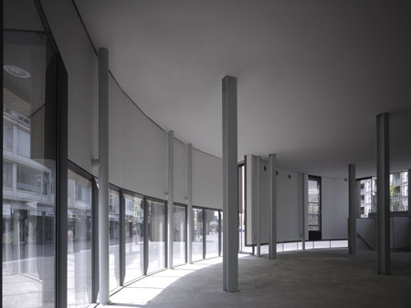
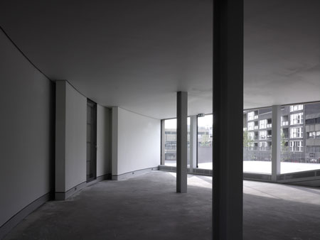
Over the main car park entrance, the cantilevered south aspect of the pavilion allows natural light to penetrate the two underground levels.
Photographs are by and copyright of Christian Richters.
Here's further information from René van Zuuk Architekten:
--
In 2001 the city of Roosendaal (a provincial town in the southwest of the Netherlands) decided to ban cars from the New Market in the centre of town by building a huge two storey underground parking.
In order to create a new public square the city of Roosendaal asked the urban design office Quadrat to make a proposition.
In their scheme they proposed to pave the square with red and brown brick, plant 15 trees, make three exits for the underground parking and as the most visible and important element they proposed a restaurant and coffee pavilion in the form of an oval.
In 2005 a public design and construction bidding for contractors was organised. Just before they had to submit their entry to the city, the municipality decided to include the pavilion as well.
Therefore they asked the office of Rene van Zuuk to make a design for the pavilion including the contract drawings over a very short span (5 weeks), due to these limitations there was no time to make big changes in the urban scheme and the location and the form of the pavilion was copied from the original urban proposal.
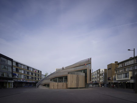
The idea behind the urban proposal was that the pavilion would divide the square in two parts in such a way that you would still have the feeling of being on one big square.
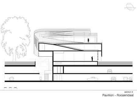
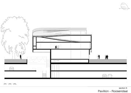
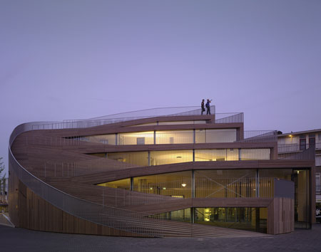
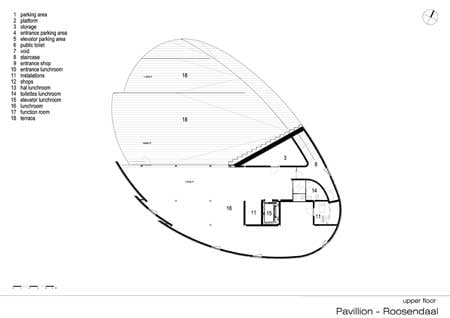
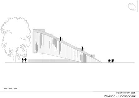
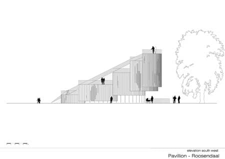
Because of the market activities which occupy the entire square twice a week, the terraces of the pavilion needed to be placed above the ground floor.
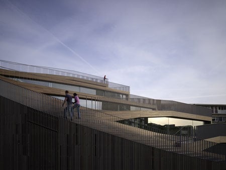
Originally the terraces could only be reached by going through the pavilion.
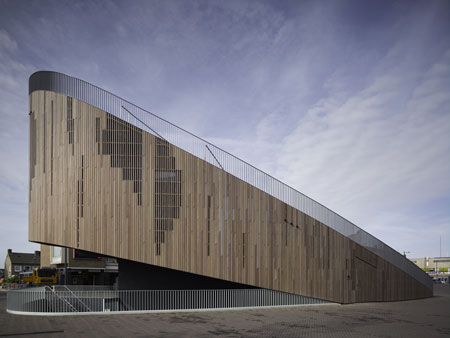
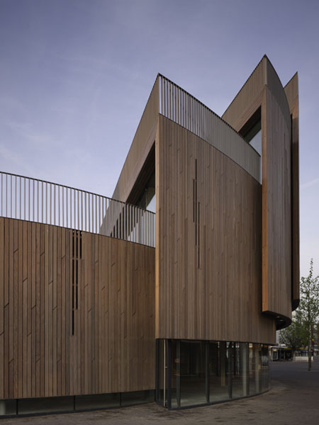
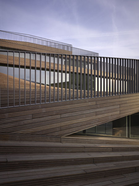
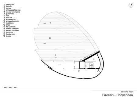
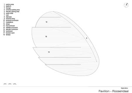
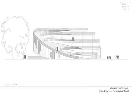
Rene van Zuuk decided to make the terraces accessible from the outside of the building as well so you can walk from the square up onto the sloped roof to the terraces letting the roof become a public area.
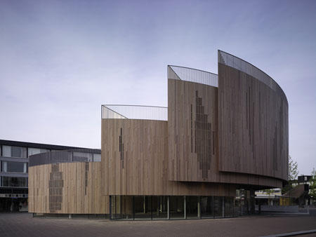
The entrances from the roof to the building are made by cuts in the sloped surface giving every floor its own terrace.
The rest of the roof acts as a big stage which allows artists to give a performances in front of the building.
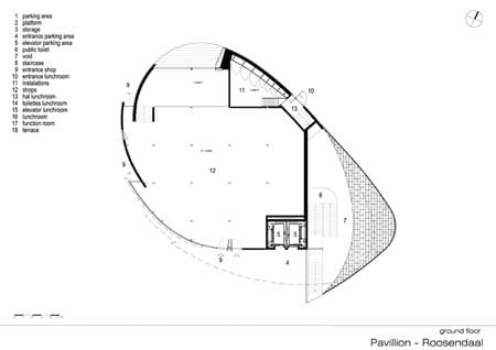
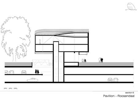
On the south side the pavilion reaches its highest point. This part of the building cantilevers over the main entrance of the parking garage allowing daylight to penetrate deep into the two levels below.
In order to make the cuts in the roof and to accommodate the cantilevering part of the building, the structure is made by a simple braced steel grid of 4.2m x 4.2m and 3 m high.
The orientation of the grid coincides with the location of the entrance of the main shopping passage. This results in a new direction on the square making the space more dynamic.
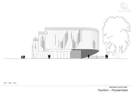
The original square dates from just after the war until the 1970's, the architecture was cold and the color monotonous. The new urban scheme is warm in nature thanks to the trees and use of brick.
It was obvious that the pavilion should blend in with this character and therefore wood was the most appropriate choice of material.
Because the quality of most of the original buildings around the pavilion is not that high, the urban scheme and the new pavilion have to work together as a catalyst to upgrade this part of the city.
Location: City Center Rossendaal / NL
Client: Gemeente Roosendaal / NL
Program: Pavilion – shops/lunchroom/office / entrance for parking area
Office: René van Zuuk Architekten b.v., Almere / NL
Design: René van Zuuk
Members of the design team: Jorrit Spel, Chimo Villa Belda
Usable floor area: 620 m2
Built-up area: 518 m2
Start of design: 06/2005
Completion: 06/2009