
Architectural photographer Leonardo Finotti has sent us images of a house overlooking the sea in Funchal, Madeira by Madeiran architect Paulo David.
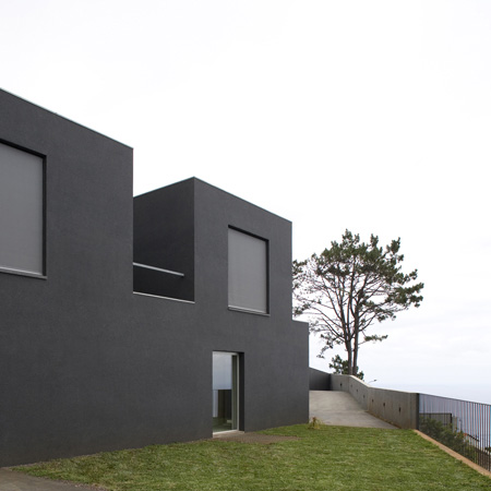
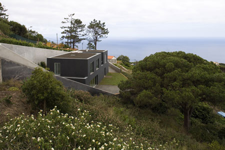
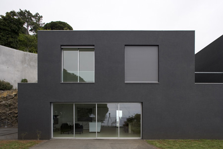
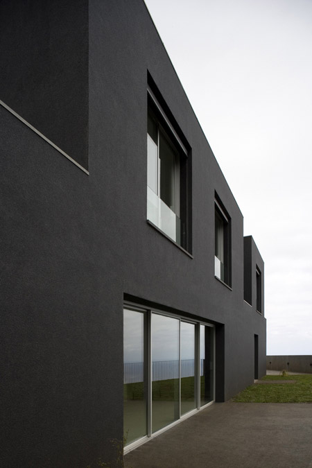
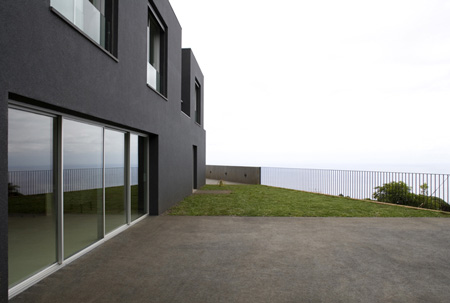
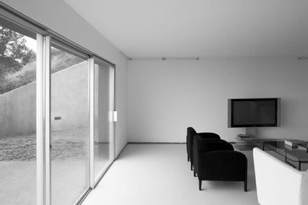
Casa Funchal 05, also known as “black and white house”, is deliberately austere, with flat, white interior surfaces and black exterior finishes.

See more Dezeen stories featuring architectural photography by Leonardo Finotti.

Here’s some text from Paulo David:
–
CASA FUNCHAL 05
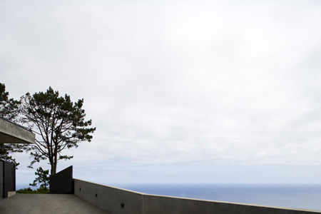
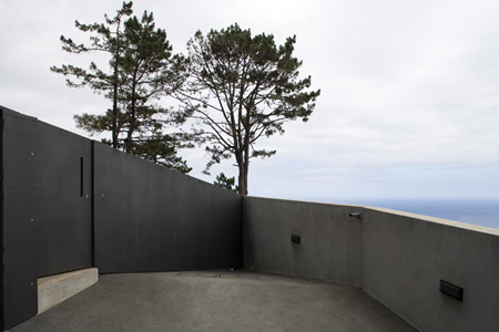
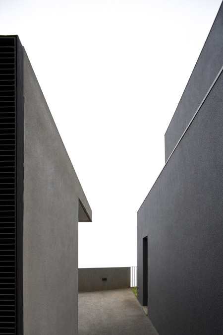
The orthogonal and abstract form contrasts with the irregular shape of the plot, which becomes a plateau. This encourages the observation and reiterates that in this island it is important to gaze out to sea.

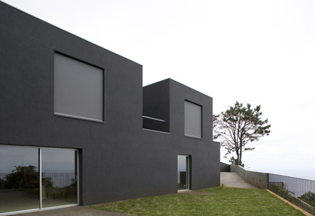
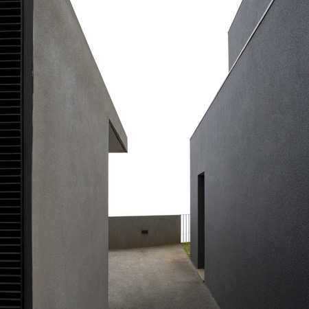
The section through the building sets up a dialog with the base rock, and this is reinforced by a slot in the upper floor that fragments the volume, creating two “bulges” resting on the main box that organises all the spatial functions and relationships in the house.

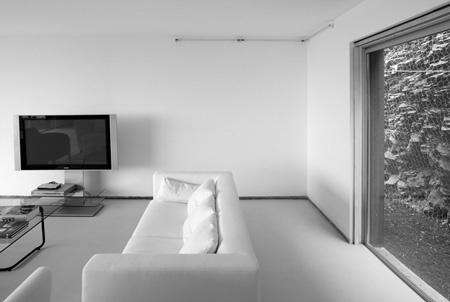
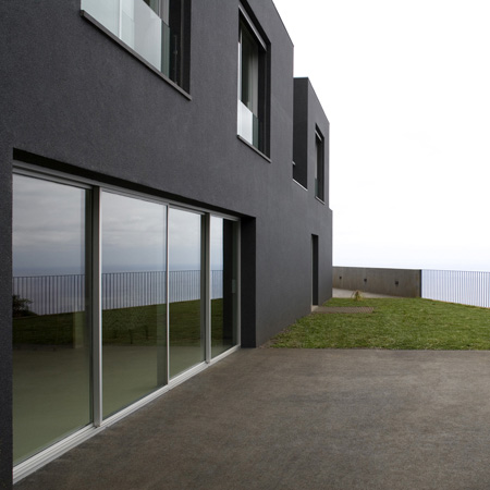
The area that is at the same level as the plateau defines the living space. It sets up “bridges” which extend living areas to the outside. A central body including the kitchen, bathroom services, storage and vertical access to the bedrooms defines the circulation system. The living room is in the void that this body creates.

The two “bulges” contain spaces for sleeping and are connected by a glazed volume. They have the character of watchtowers, and their openings frame fragments of what is largely a seascape.

The glazed circulation space of the upper floor and the link from the kitchen to the exterior are of materials that contrast with the roughness of the rest of the house.

The rough skin over the exterior combines a bonding agent with the selected and sorted basalt particles and this makes it black.

The chromatic uniformity is continued on the roof where volcanic ash is used.

Inside the aim was always austerity, using very few materials. Most surfaces are flat and white, contrasting with the external skin and allowing light inside the house.

Casa Funchal 05
Localização Neves – Funchal, Madeira, Portugal
Arquitectura Paulo David com Luz Ramalho
Estrutura Mário Rui

Instalações Eléctricas Fernando Sousa Pereira
Instalações Sanitárias Marco Coelho
Empreiteiro SS&G

Projecto 2002
Fim da Construção 2006
Maquete Hugo Dias
Fotografia Leonardo Finotti

–
Posted by Marcus Fairs


July 6th, 2009 at 9:45 am
pure design we call like modern vernacular project…
July 6th, 2009 at 3:22 pm
just feel like plain….boring
doesnt really fit to the site with such a good location.
July 6th, 2009 at 3:34 pm
.
square+black=house of detention.
white is the answer.
July 6th, 2009 at 5:11 pm
just fantastic!…an overwelming view with a sensitive touch over the landscape. i say that contemplating the sea horizont will never be a “boring” atittude…on the other hand, perhaps a visit to the island would be the answer! black vs white…..great attitude audacious, with dynamic caracter
July 6th, 2009 at 6:14 pm
…its a bit sad to see a huge contention wall behind it in order to make a flat house on a steep terrain…kinda kills the context no?
but overall its a “nice” project. nothing more, nothing less…
July 6th, 2009 at 7:23 pm
a very nice project. i think it is not beautiful, it is just very good in this context.
July 6th, 2009 at 7:37 pm
terrible sliding glass doors on the ground level
July 6th, 2009 at 10:16 pm
I am feeling a bit depressed with all this black and white a-contextual austerity. The project, as accomplished as it may be, does not even have that ‘typological’ autonomy which might somehow locate it in the World. It is simply blank. I do not understand those posts that talk about its beauty. What touches the human spirit here? I see surfaces: sophisticated in their profile, perhaps, but denying all entry, all possibility of relation. There is not even a blankness that turns one to its setting. if its blankness is supposed to turn one to look at the rest of the world, is that not a sad sort of project? And a terribly unsophisticated one at that? Who might occupy such a domain?
July 6th, 2009 at 10:58 pm
PS. I am not referring to the sophisticated and very human efforts of say, Mies, as exemplified in the Farnsworth House. That project, and others, seem to receive the phenomena of the natural world and look upon them. there is a relation. I point here to the utterly featureless blankness of the white interior, which suggests, instead, the death of the interior, the occupants, and the impossibility of any real contact with the world.
July 7th, 2009 at 1:18 am
I don’t like it…at all!
Looks like a freshman project, as it does not adapt to the surrounding area.
The decoration also looks very poor…
(Just my opinion)
July 7th, 2009 at 3:49 am
nice project! nothing more, nothing less!
July 8th, 2009 at 12:04 am
I like it, feels smooth and calm. It suits the hills and uses local materials. White would be boring.
July 8th, 2009 at 1:11 pm
siza meets black
July 9th, 2009 at 7:21 am
glamur